

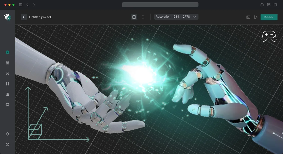
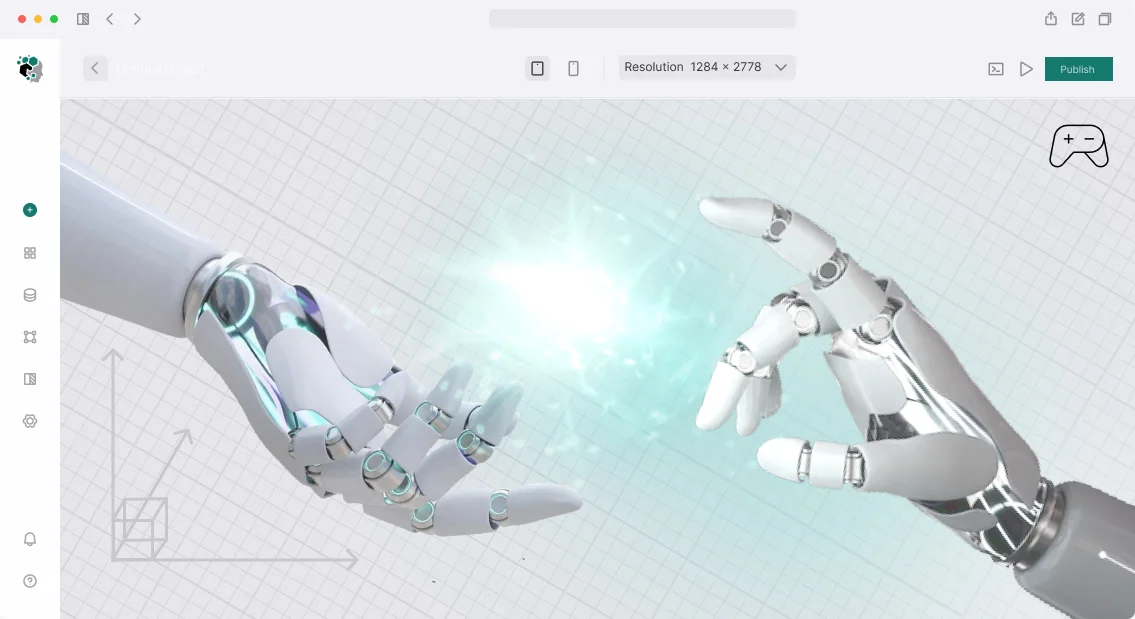


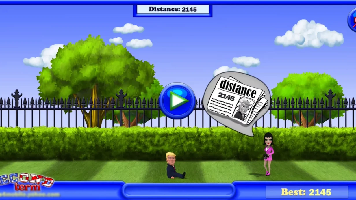
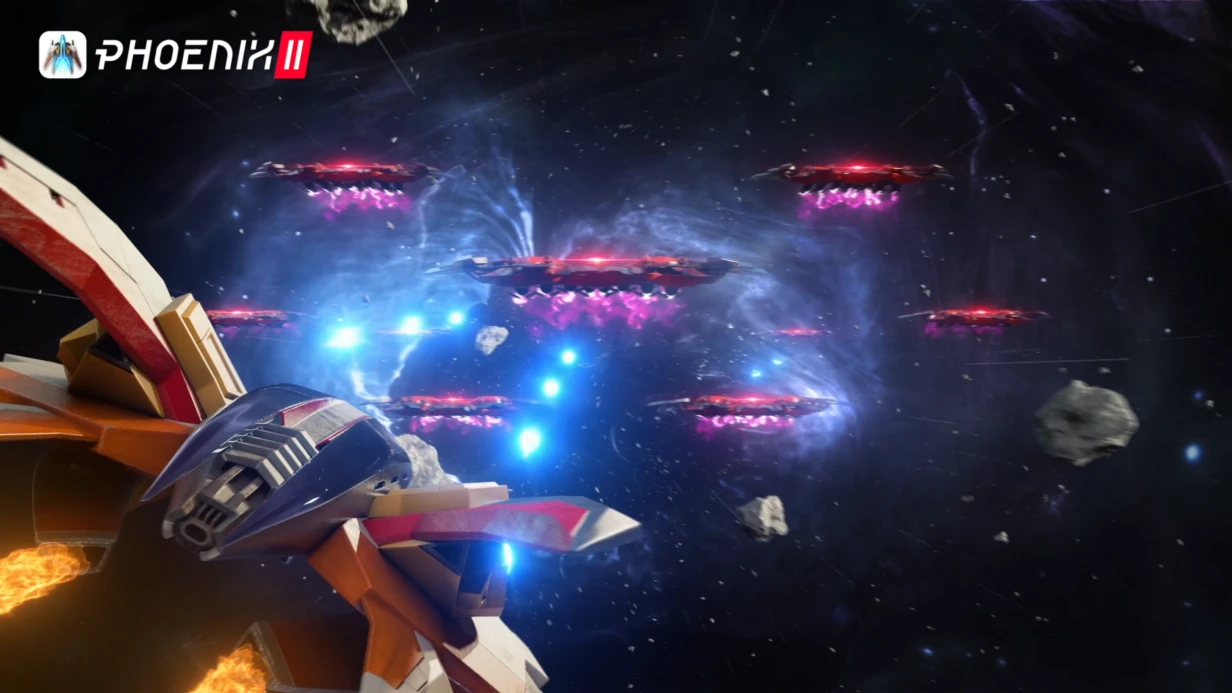
UI concept art: why players leave after the first screen
A player downloads the project, expects a strong impression — and hits the first screen. Buttons are scattered, the tutorial is unclear, the menu looks alien. During these minutes, a significant portion of newcomers leave without ever seeing what you invested in the gameplay.
New player churn often begins not in the game, but before it — on the start screen and in the menu. The graphics of the game interface are the first thing a person sees, and it either guides them by the hand or puts up a barrier.
Game menu design shapes expectations of quality before the player takes their first step — and by it they decide whether to stay.
UI concept art removes these risks at the development stage, not after release. We check whether the new player’s path to the main action is clear, whether elements are readable on different screens, and whether the meaning of buttons is lost at first glance.
A weak first screen becomes clear and manageable — without rework near the end of the project and arguments at the final build.
We cover this: from the first sketch to an approved set of screens that retain the player from the first minute. Our team has game projects across genres under its belt, and in each one we rely on real audience behavior, not developer taste.
Tell us about your game and whom you expect to see in it — we’ll get back to you with an estimate and a work plan for the interfaces.
What a studio gets when the interface is thought through in advance
A cohesive look for the project is the first and most noticeable benefit. When the appearance of menus, screens, and prompts is designed together with the concept art, the player sees a unified world from the first minutes, not a set of disparate windows. From this comes a sense of quality: such a project is looked after, trusted, and told to friends.
The second result is recognition of the game brand.
Recurring interface elements, the style of icons and frames, and a unified presentation of text work as a calling card: the player recognizes your game by a single screen — in a curated list, a walkthrough video, or an app store. Such a look lives longer than one game and carries over into sequels and marketing materials.
The third is a clear player journey. Thoughtful interface concept graphics answer in advance where to tap and what will happen: where to start, where settings are, where to buy, where the hint is.
The less the player thinks about buttons, the more they play — and the higher retention in the first sessions, where most of the audience is usually lost.
The fourth and most valuable for the studio is fewer reworks. Decisions on composition and screen logic are made at the sketch stage, when an edit takes hours, not weeks.
The art department and development follow one approved direction, release goes more smoothly, and contentious issues are closed before they turn into a crunch.
Formats of UI concept art for the project’s task
The interface style determines whether the player figures out the game in the first minutes and stays in it afterward. We create UI concept art in different scopes — from a few key screens to a full library for the entire project.
We choose the format for the scale of the task: the longer the production, the more important it is that new screens are assembled according to ready-made rules rather than drawn from scratch.
Which format fits which task
| Format | Who it suits | What it gives the client |
|---|---|---|
| A set of screens for a mobile game | A small team, fast launch | The player learns the menu without hints, less churn at the start |
| A library of components and rules | A large project with long production | A unified interface style; new screens are added without an artist |
| Style exploration, 2–3 directions | Prototype, visual language selection stage | The style decision is made before investment in production |
| Key game screens | Product team, working on metrics | Clear shop, progression, and combat interface — higher conversion and returns |
| Device adaptation | Preparation for launch and release on new platforms | The interface looks predictable on phone, tablet, and large screen |
You can start with the format that covers the nearest task — the rest is added as the project progresses, without reworking the already approved style.
How work on concept graphics proceeds: project stages
The project is divided into clear stages with checkpoints: at each one you see what has been done, approve the result, and only then do we move on.
This way, UI concept art doesn’t turn into a long correspondence, and the team doesn’t draw “for the drawer” things that will later have to be redone.
Stages of concept art development
- Brief and task analysis. We discuss the genre, audience, platforms, and mood of the game. We define which screens and interface states are needed first — from the main menu to the combat screen.
- Plan and references. We assemble the visual direction: mood, color, style, and examples that you and your players like. We agree on the scope of work and the order in which screens will be drawn.
- Approval of concept graphics. We show the first sketches and key elements. This is the best place to catch differences in taste — changing direction at this stage is fast and without rework.
- Drawing and revisions in concept art. We prepare final concepts for screens, icons, button states, and hints. We make revisions according to your list of requests while maintaining a unified style for all elements.
- Acceptance. We check the result against the brief: whether all screens are in place, whether the interface is readable, whether it is clear to a new player. You accept the work, or we send it back for revision.
- Handover of layouts. We deliver the concepts in a structured form convenient for artists and developers — with explanations of colors, sizes, and element behavior.
- Post-delivery support. We stay in touch: we help when the team starts assembling the interface in the game and draw any new screens in the same style.
This order saves your team’s time: you get involved at four short checkpoints instead of endless clarifications along the way.
What will be included in the delivery and what to do with it next
UI concept art is not a set of pictures “to look at,” but a working kit that the team immediately starts using to assemble the game. That’s why the delivery includes not only the visuals but also everything needed to apply them without us.
- Concepts of key screens: main menu, game screen, shop, settings — in several variants, so there is something to choose from.
- Element states: normal, pressed, disabled, waiting — the team doesn’t get stuck on details during assembly.
- Layouts for different screen aspect ratios, so the interface doesn’t fall apart on monitors, tablets, and phones.
- Interface files in editable form: layers, elements, font pairs — edits are made in minutes, without redrawing from scratch.
- Style guide: rules for color, fonts, spacing, and icons — by it, any new screen is drawn in a unified manner.
- Assembly diagram: dimensions, distances, hover and click behavior — the developer doesn’t need to guess from the picture.
- Presentation of the solution: what was done and why exactly this way — it can be shown to management, a publisher, or investors.
- Post-delivery support: a month for team questions and edits during assembly.
Then two sides use the kit: artists take the visuals and the guide, developers take the interface files and the assembly diagram. If the game grows and new screens appear, we help integrate them into the same style so the interface doesn’t fall apart.
Case study: an interface that retained players in the first minutes
The client — a small studio with the project Nebula Raiders — came with a working game: the test group liked the mechanics, but the live audience left before reaching the core.
Players got lost on the first screens, didn’t understand where to tap or why, and closed the app before the game could hook them. The task wasn’t “make it prettier,” but “give people back a clear path from launch to their first result.”
What the analysis of the first minutes showed
We broke the game’s start down into player actions and saw: the main buttons competed for attention, the tutorial explained the rules in text, and hints appeared later than a person had time to get confused.
UI concept art stopped being decoration and became navigation — we rebuilt the screen hierarchy, brought the key action into the center of attention, and replaced text explanations with visual cues.
Redesign results
Retention metrics shifted already in the next test: the share of players reaching the end of the tutorial almost doubled, and day-one retention gained about a third.
Early sessions became longer — people didn’t abandon the game on the first screens but made it to their first result and came back for the next one. The client extended the work, and we designed the remaining sections in the same logic.
The studio got an interface that doesn’t need explaining: a new player figures it out on their own, and the team spends less effort on support and answers. The design remained recognizable, but now it works for retention instead of fighting it.
How to choose an interface style for a game’s genre and audience?
Choosing an interface style starts not with tastes but with genre and audience. The genre sets the pace: in dynamic scenes, the player must read a hint instantly, while in calm, exploratory ones, the interface can unfold gradually and not interfere with immersion.
If the style fights the game’s rhythm, the player gets tired even when everything is drawn beautifully.
The game’s audience clarifies the details. Age, experience, and familiar device suggest element size, contrast, and information density: a newcomer needs clear hints, while an experienced player needs compact panels without unnecessary explanations. The same genre looks and works differently for different audiences, and that’s normal.
Testing the direction is a mandatory step before drawing the final kit. We prepare several style variants and look at them through the player’s eyes: where the needed button is found faster, which variant doesn’t distract from what’s happening, and which one is memorable. This way, the decision relies on people’s reactions, not on a dispute over tastes.
We separately make sure not to drift into someone else’s style. We analyze references as a source of techniques but assemble our own visual system for the specific game: otherwise the project starts being recognized by someone else’s game, not its own. Coherence here matters more than a trendy image.
Describe the task — genre, audience, devices — and we’ll get back to you with an estimate and a work plan for UI concept art.
Common client doubts before starting a project
No client wants to find out mid-project that deadlines have slipped and the source files stayed with the contractor. That’s why we discuss such points in advance — before work starts. Below are the doubts that come up most often.
How are development timelines structured?
Work proceeds in short stages: first we agree on the set of screens and navigation logic, then we show the first concept art, then we bring it to its final form. At each stage you see the result and influence it, rather than waiting for the “premiere” at the very end. The timeline depends on the scope — the number of screens and states is fixed in the plan.
What about revisions and refinements after delivery?
Revisions within the agreed scope are included in the work — we don’t count them as a separate service. If an expansion is needed after delivery — new screens, additional states, an updated style — we take it on as a separate task with a clear estimate. You won’t have to look for a new team and explain the product logic all over again.
Who owns the source files?
We hand over all source files to you: layouts broken down by layers, palettes, fonts, and interface elements in editable form. Your designer will be able to continue the work without us — the project isn’t held hostage. Handover is part of delivery and is not charged separately.
What guarantees are there for the project?
The contract fixes the scope, timelines, and acceptance procedure. If the result diverges from the agreed brief — we refine it at our own expense until we bring it into line.
After delivery we stay in touch: we answer the team’s questions and help when the product starts to evolve.
Let’s discuss the task and get back with an estimate and plan
Describe the task — and we’ll get back with an estimate and work plan, not general words. A short description is enough: what game, for what audience, which interface screens need to be drawn, and by what deadline you want to see a prototype. That’s enough to understand the scope and propose a solution.
What you’ll receive after contacting us:
- Task analysis: we’ll clarify whether you need UI concept art for one screen, a set of menus, or the entire game shell.
- Project estimate: timelines, scope of work, and terms — in one document, without additional payments along the way.
- Work plan: stages from the first sketches to the final set of layouts, with checkpoints where you review the result.
- Team: designers who have already drawn interfaces for game projects, and an art director in touch.
- Interim reviews: you see the style at an early stage and revise it while it costs minimal time.
- Development kit: layouts, button states, icons, and rules your programmers can use to assemble the interface without guesswork.
- Post-delivery support: refinement of screens when new mechanics and sections appear in the game.
A request for UI concept art is the first step, after which you have a clear plan in hand: what we’re doing, in what order, and when we’ll see the first result.
Tell us about the project in two or three sentences — we’ll get back with an estimate, timelines, and a proposal for the team composition.