

iOS Mobile App Screen Design (Human Interface Guidelines)
Apple rejects apps not just for code. Screens ignoring HIG — incorrect spacing, non-standard gestures, custom Back buttons over system navigation — get remarks at review under Guidelines 10.3 or directly from users via low ratings.
Designing for iOS is not just "make it pretty", it's understanding where the system provides behavior and where custom work is needed.
What HIG regulates in practice
Safe Area and Dynamic Island. Since iPhone 14 Pro, top safe area changed because of Dynamic Island. Content pinned to UIWindow.safeAreaInsets.top without accounting for this, gets covered by the island. In Figma set frames for current safe area on each device in lineup — SE 3, iPhone 15, 15 Plus, 15 Pro, 15 Pro Max.
Minimum touch target size. HIG requires 44×44 pt. Icon in 20pt with padding less than this causes misses. In Figma add invisible hit area layer over icon — this clearly shows in Handoff spec.
Typography scale. iOS supports Dynamic Type: user increases font in system settings, app must respect this. Use semantic text styles — Large Title, Headline, Body, Caption — instead of fixed sizes. Test layout at Accessibility size AX5 (largest) to ensure text isn't cut off.
Color system. System colors (label, secondaryLabel, systemBackground, systemGroupedBackground) automatically change on Dark Mode switch. Custom colors set via Color Sets in Asset Catalog with Any and Dark variants. Hardcoding #FFFFFF in code — direct path to broken Dark Mode.
How we build screens
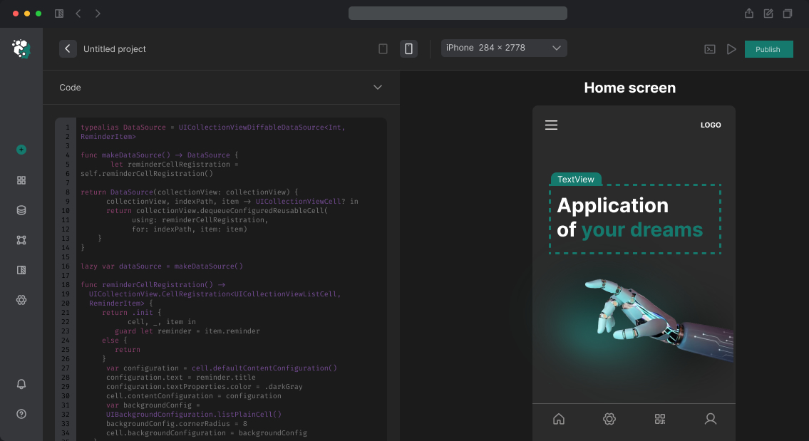
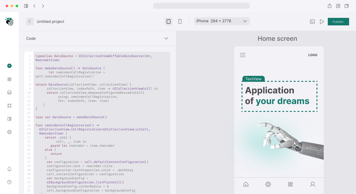
Work in Figma with iOS Design Kit (Apple official) or Figma UI3 components. For each screen — three frames: iPhone 15 (390pt), iPhone SE (375pt), iPhone 15 Plus (430pt). For iPad version — separate set.
Build components via Figma Auto Layout accounting safe area: top padding from navigation bar, bottom from Home Indicator (34pt on devices without Home button). UITabBar takes 49pt + safe area at bottom — must account for this in scrolling lists, else last element hides under tab bar.
Sheets (UISheetPresentationController) designed in two states: .medium detent (half screen) and .large (almost full). Drag handle displays standard system — don't draw custom without need.
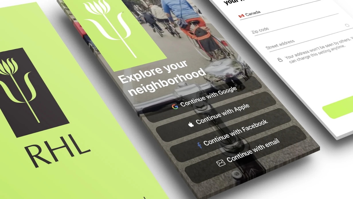
Navigation. Stack navigation: standard chevron Back with previous screen name. If text doesn't fit — chevron only. Custom X buttons for closing use only for modal presentations, not push. Matches HIG and reduces cognitive load.
What the work consists of
Audit existing screens for HIG compliance — if project exists. Reveals violations before design: non-standard navigation patterns, incorrect spacing, accessibility issues.
New screen design with Handoff: size annotations in pt, colors via semantic names, fonts with Dynamic Type level specified, component states (normal, pressed, disabled, loading).
Separately — pass Apple accessibility checklist: contrast (minimum 4.5:1 for text), VoiceOver support (focus order, accessibility labels), Reduce Motion (alternative animations).
Timeline
One screen design with all states and spec: 4–8 hours. Full app screen set (10–20 screens): 3–5 days. With ready design system — faster. Cost calculated after analyzing scope and screen complexity.