

Mobile App Design Adaptation for Different Screen Resolutions
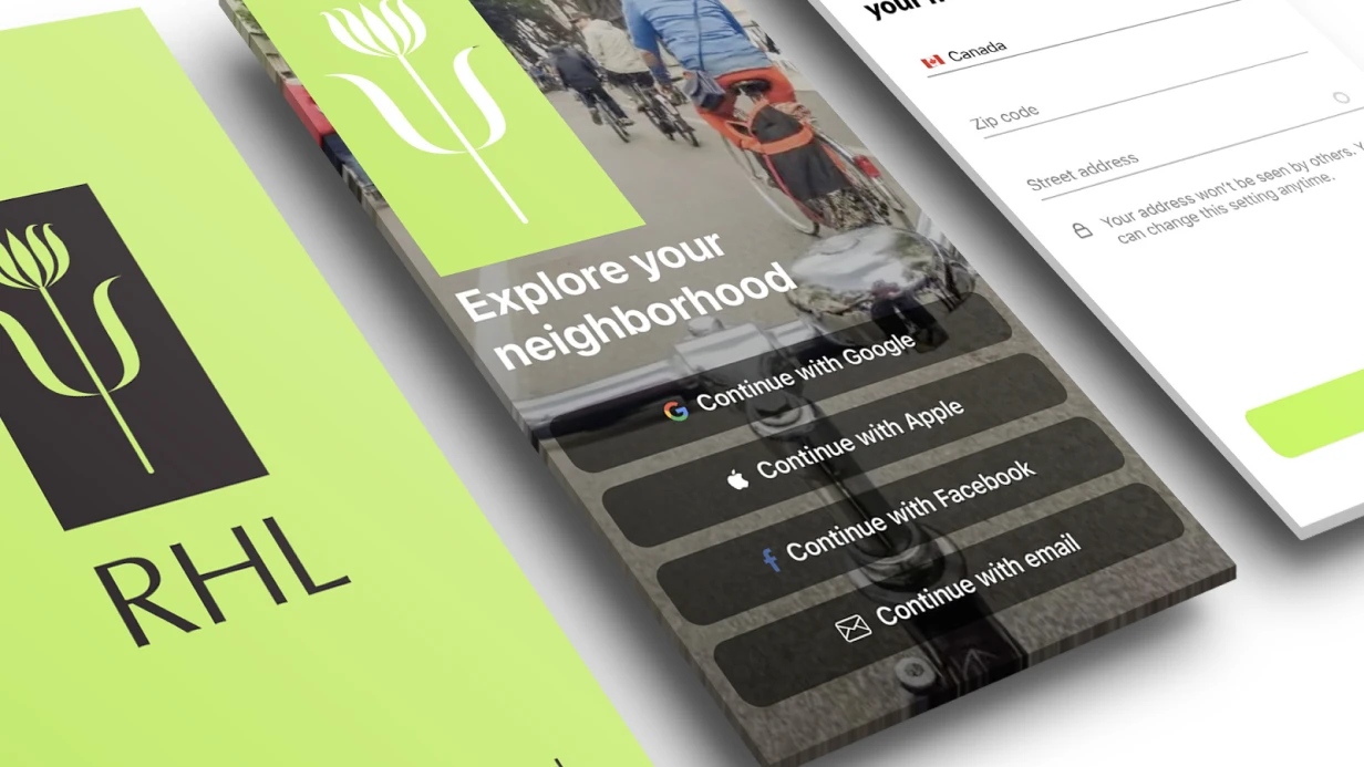
Mobile design made for one screen size — iPhone 15 Pro 393×852pt — is half the work. In reality app launches on iPhone SE with 375×667pt screen, on Android budget phones with 360×640dp, on flagships with 430pt width. Layout perfect on designer's frame cuts buttons on small screens and leaves empty fields on large ones.
What specifically we adapt
Key breakpoints — not sizes but proportions. iPhone SE with 16:9 aspect ratio versus iPhone 15 Pro Max with 19.5:9 — significant difference. Bottom-anchored elements (Tab Bar, floating buttons, sticky form footer) must work correctly on both.
Safe Area — separate story. On iPhone with Dynamic Island — 59pt top. On iPhone without notch (SE 3rd gen) — 20pt. On Android — notch varies or absent. Content "sticking" to status bar without Safe Area accounting guarantees App Store Review rejection.
Typography on small screens: 16sp text reads fine on 6-inch screen, but on 4.7-inch at 326 ppi — already on edge. Minimum body text size on mobile — 14pt/sp, and it's not recommendation but practical minimum for most fonts.
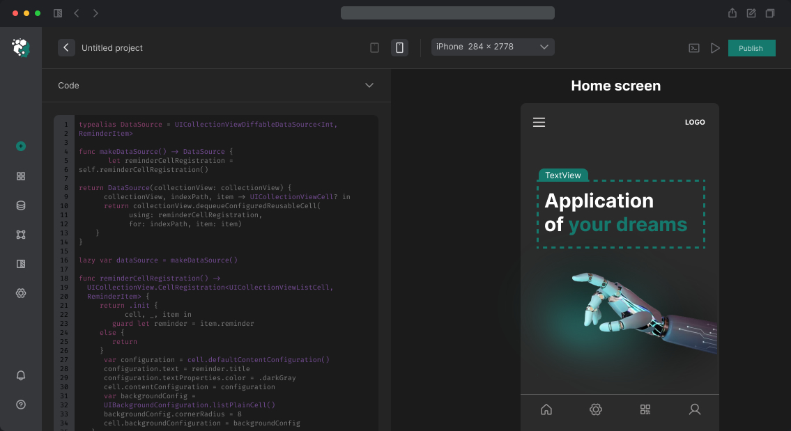
How we format adaptation in Figma
Create frames for control sizes:
| Device | Size (pt/dp) | Why |
|---|---|---|
| iPhone SE 3rd gen | 375×667 | iOS minimum |
| iPhone 15 / 14 | 390×844 | Main iOS |
| iPhone 15 Pro Max | 430×932 | iOS maximum |
| Android compact | 360×800 | Budget/mid segment |
| Android regular | 390×844 | Android flagship |
Check each key screen on extreme sizes. Not all 50 screens — only ones with content overflow, Bottom Sheet, complex forms, fixed-height images.
Timeline
Adapting existing design for 3–4 control sizes (key screens, not full project) — 1–3 working days. Depends on screen count and Auto Layout constructs used.