

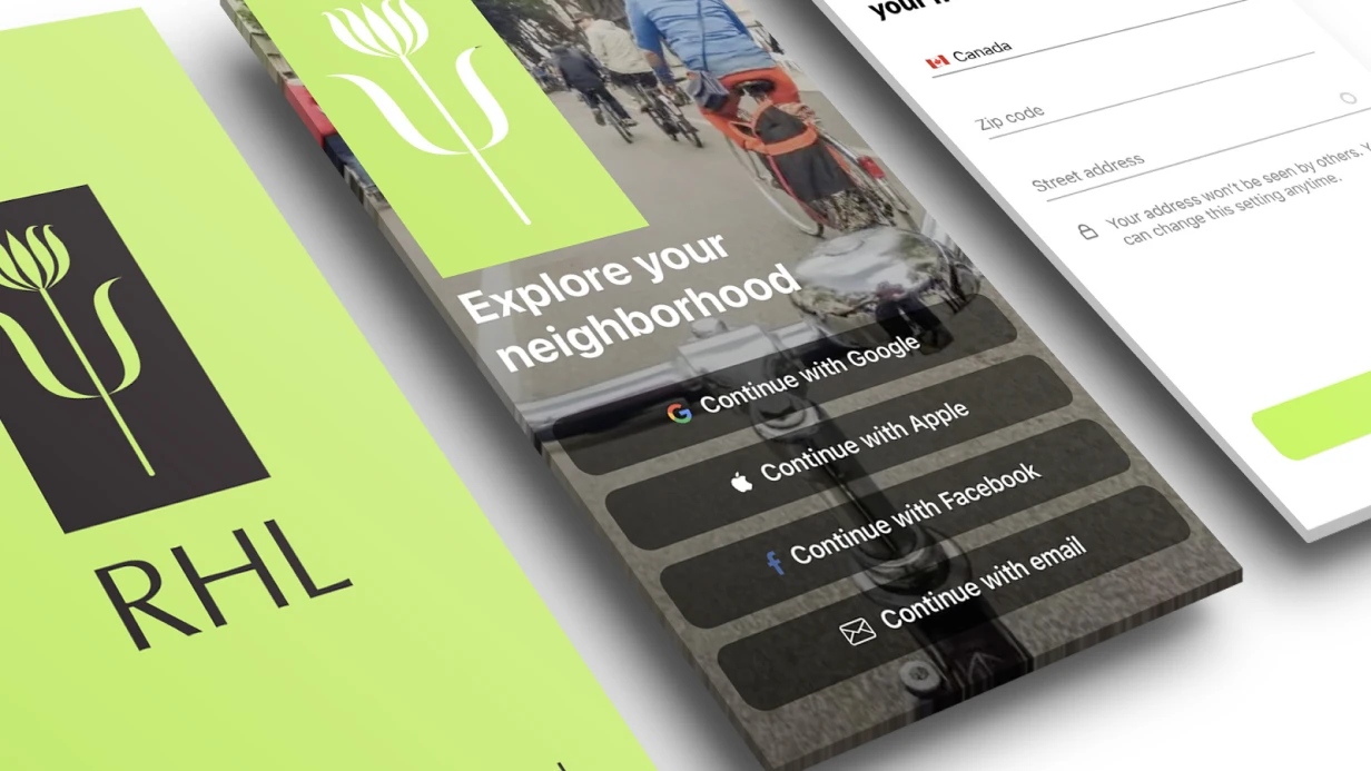
Tablet Design Adaptation (iPad, Android Tablets)
Stretching a phone layout to tablet screen — that's not adaptation. It's "letterbox mode": narrow content column in middle of large screen with empty fields. iOS shows such apps in compatibility mode, but App Store directly notes iPad support as separate quality metric.
Tablet UI — different paradigm
On 390pt width phone — content occupies all space. On iPad 11" with 834pt width — single-column layout looks sparse. On iPad Pro 12.9" — 1024pt — it's already closer to desktop screen than mobile.
Apple HIG for iPad recommends using horizontal space productively: sidebar + content (Split View pattern), two-column grids for catalogs and lists, modal dialogs instead of full-screen transitions (on large screen full-screen presentation for simple action looks overloaded).
For Android tablets Material Design 3 introduces Adaptive Layouts with three breakpoints: Compact (< 600dp), Medium (600–839dp), Expanded (≥ 840dp). At Expanded — NavigationRail instead of Bottom Navigation, List-Detail layout for master-detail pattern.
What changes in design
Navigation. Tab Bar on iPad becomes Sidebar (UISplitViewController on iOS or NavigationSuiteScaffold in Compose). Not just styling — different interaction pattern: user sees navigation and content simultaneously.
Typography and spacing. Minimum screen edge spacing — not 16pt but 24–32pt. Text column width — limited for readability: max 680–720pt for body text, even if screen allows more.
Images and media. On phone image takes full width. On tablet — it's either in grid (2–3 columns), or fixed aspect ratio within column. Hero images at 1024pt width with improper scaling — pixelated on retina or ugly crop.
Forms and modals. On iPad forms don't open full-screen — they show as .formSheet (768×960pt) or .pageSheet. Design must account: form with max-width and centering, not stretched full-screen.
Drag and Drop and Stage Manager. On iPad with iOS 16+ app can work in Stage Manager — resizable window, not fixed screen size. Design must work in width range, not just fixed breakpoints.
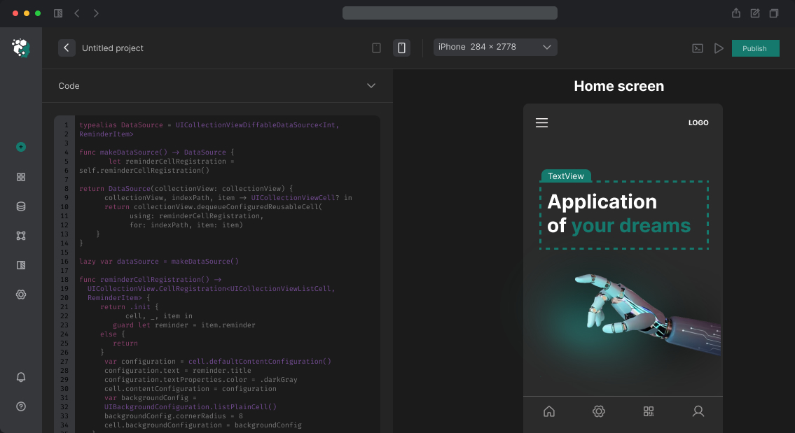
How we build in Figma
Separate frames for tablet sizes: iPad mini 8.3" (744×1133), iPad 10th gen (820×1180), iPad Pro 11" (834×1194), iPad Pro 12.9" (1024×1366). For Android: 600×960dp (Medium), 840×1280dp (Expanded).
Reuse components from existing UI kit without changes. Change layout: column count, spacing, navigation pattern. Sidebar — separate component with same data as Tab Bar, but different visual representation.
Adaptation doesn't mean "different design". Same colors, fonts, components — different arrangement in space.
Timeline
Tablet adaptation for mid-complexity app (15–25 key screens) — 2–3 working days. Depends on unique layout patterns count and Stage Manager / free-form window support need.
Cost — individually.