


Mobile App Empty States Design
An empty state is not decorative screen. It is the moment when user ends up in a dead end: no content, and unclear what to do next. Properly designed empty state gives direction. Bad one—just white screen or "Nothing found."
Three Types of Empty States Often Confused
It is important to distinguish them because each has different CTA and tone:
First-time empty—user first landed on screen, no data yet. Example: "Favorites" section for new user. Task: explain what will be here, show how to fill it. CTA: "Go to catalog," "Add first item."
User-generated empty—user did something and got empty result. Classic: search with no results. Task: help change query. CTA: "Clear filters," "Try different search."
Error-caused empty—data exists but failed to load due to network or server error. This is closer to error state (they overlap). CTA: "Try again."
Cannot mix these three—different illustration, different text, different button.
Illustrations
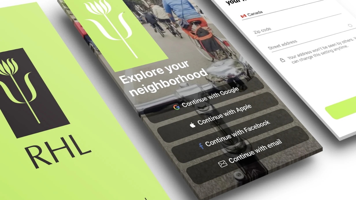
For empty states, vector illustrations or Lottie animations are optimal. Size: no more than 40% of screen height, so it does not dominate text and button. Illustration style should match overall app design language.
In practice: order set of illustrations for all main screens at once. Cheaper than individually. SVG format for export to React Native via react-native-svg, or Flutter via flutter_svg, or PDF vector for iOS/Android native.
Component Structure
[Illustration/Icon]
[Heading – briefly what happened]
[Subheading – what to do]
[CTA Button – specific action]
One button should be one. Two CTAs in empty state is indecision in design that user feels as confusion.
Component height is not fixed, but vertically centered in available screen space (minus navigation bar and tab bar).
Timeline—1 day for complete set of empty states for all main screens. Cost individually.