


Mobile App Information Architecture Design
When a user can't find the needed function in three taps — they leave. Not because the interface is ugly, but because information architecture (IA) was designed by the principle of "add to menu" instead of analyzing real user scenarios. This becomes most costly after release, when redoing the navigation tree requires refactoring the routing alongside.
Where IA breaks most often
Deep hierarchies — the most common mistake. An app with 4–5 levels of screen nesting without quick return to top — is almost guaranteed onboarding failure. On iOS the standard UINavigationController tolerates this, but the user — doesn't.
Another typical situation: content duplication across sections. Product team adds "Favorites", "History", "My Purchases" as separate sections, though from user's mental model perspective it's one object — "mine". As a result the app has three different ways to get to the same thing, and none is obvious.
Taxonomy errors — when categories intersect or don't cover all content — are discovered latest. Card sorting with 15–20 real users at IA stage removes most of them before they enter wireframes.
How we build architecture
Start with content and functions inventory. Every screen, every action, every data type — in a table. Typically we get 40–120 entities for average complexity app. Then — affinity mapping: grouping without regard to existing design.
Next — tree testing. Optimal Workshop Treejack tool or similar lets you check hierarchy without a single pixel of design. Test with 10–15 tasks, 20+ participants — and you already see where users get lost. This is incomparably cheaper than redoing ready prototype.
For mobile apps we separately develop:
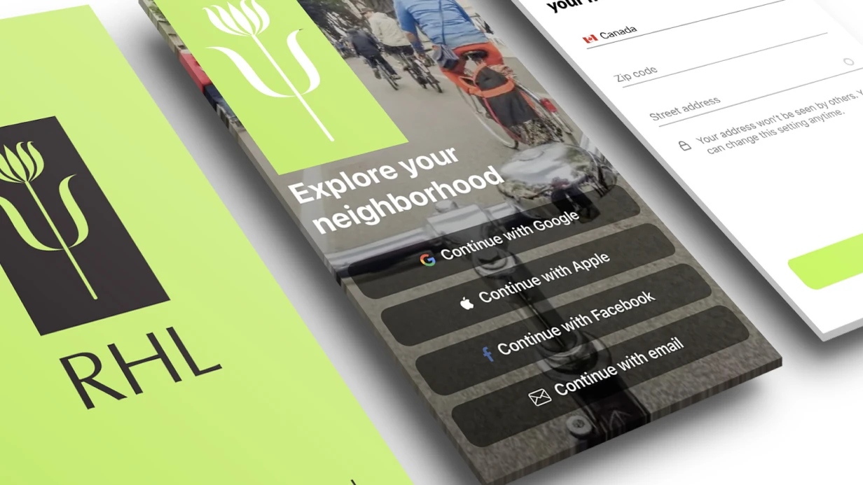
- Primary navigation — Tab Bar (iOS) / Bottom Navigation (Android) vs. Drawer. Rule: if more than 5 sections and unequal usage frequency — think differently.
- Secondary navigation — how user moves within section, where push, where modal, where contextual actions.
- Global entry points — search, notifications, profile. Their placement affects all other hierarchy.
- Edge cases — empty states, errors, onboarding. They often fall out of IA and get added chaotically later.
Output — structured scheme in Figma (FigJam) or Miro: visual tree with transition types and section priority. Not just a sketch, but a document the designer takes wireframes from and the developer takes routing structure from.
Artifacts and applicability
| Artifact | Tool | For whom |
|---|---|---|
| Content inventory | Notion / Google Sheets | PM, designer |
| Hierarchical scheme (sitemap) | FigJam / Miro | Designer, developer |
| Card sorting results | Optimal Workshop | UX researcher, PM |
| Tree test report | Treejack | PM, designer |
| IA document with reasoning | Confluence / Notion | Entire team |
IA document lives longer than it seems. A good document is used when adding new features 6–12 months later, when the original team has changed.
Timeline and stages
For simple app (10–20 screens) full cycle — 1 day: inventory + scheme + basic validation. For medium (30–60 screens) with card sorting and tree testing — 2–3 days. Complex enterprise apps or rebranding existing product with accumulated content — separate story, timeline discussed after audit.
Cost calculated individually after analyzing requirements and existing materials.