

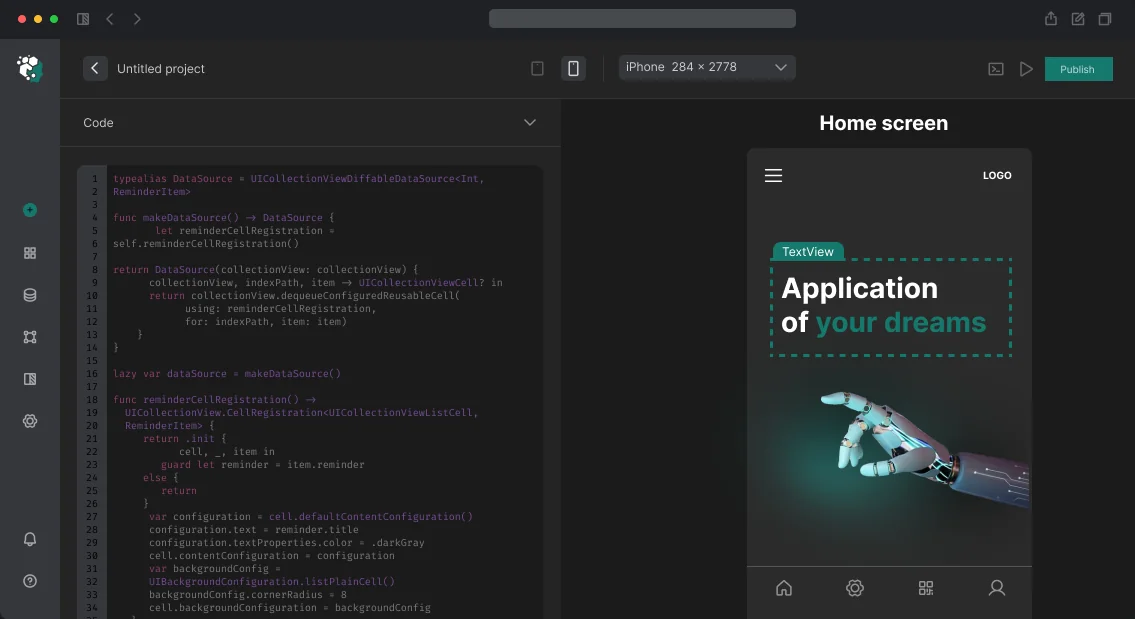
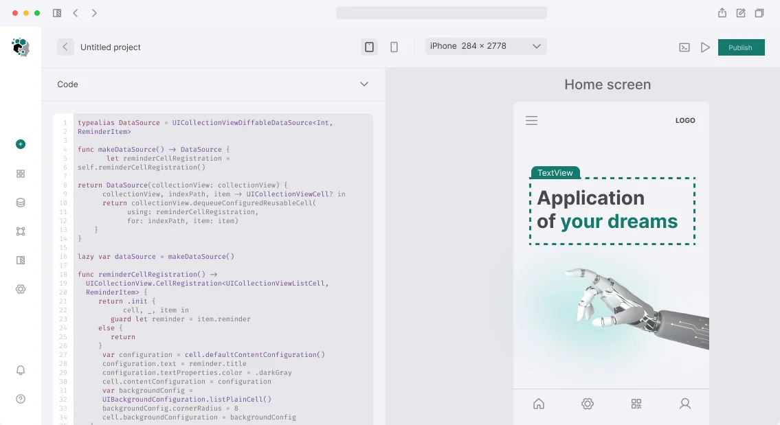
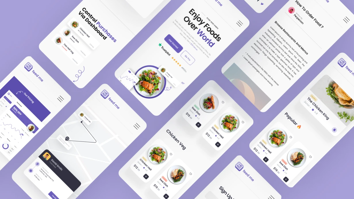
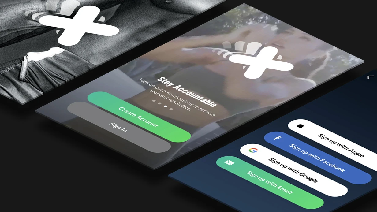
Interactive Figma prototype: where approval breaks
Static mockups get approved quickly: screens look cohesive, the client signs off, designers hand them over to build.
The problem is that a signed-off mockup describes appearance, not behavior — it doesn't answer what happens after a tap, where the user returns, or what they see if data isn't there yet. The difference shows at the first demo of a working app.
An interactive Figma prototype validates exactly what a static mockup hides: transition logic between screens, button states during loading, returns and undo actions.
This is also where dead-end scenarios surface — a screen with no exit except restart — and empty states: empty list, network loss, first login with no history.
During mockup approval these gaps are invisible because each screen is reviewed in isolation, not as part of the user journey.
The cost of such a mistake grows by stage. Fixing navigation on a prototype is a few links between layers; the same fix in a built app touches the navigation graph, error handling, stub screens, and retesting.
Usually it isn't one missed transition that surfaces, but an entire branch that no one can close without revising the scenario.
That's why a prototype is assembled not as a pretty demo but as a list of scenarios with explicit states. We break down how this closes in practice and what gets fixed in the prototype before build starts.
Measurable effect: fewer edits, shorter approval
An interactive prototype in Figma is not a set of static screens but a scenario with transitions, states, and branches. The client goes through the full user journey: registration, access recovery, payment, returning to an unfinished order.
Disputed points surface here, when an edit takes minutes in the mockup rather than days in finished code.
The main measurable effect is the share of edits after layout. As long as scenario logic is confirmed, changes concern texts, spacing, and presentation, not screen structure and navigation.
Rework moves to the start of the project: an edit at prototype level touches one layer, while in a built app it touches the interface, data exchange, and state handling at once.
Mockup acceptance goes by scenarios, not by pictures. Each step has described behavior: what the user sees on success, on error, on connection loss, and on repeat login. Approval speeds up because behavior is discussed, not taste preferences about button color.
A class of failures that is most expensive to find in production is also eliminated separately: empty states, repeated form submission, payment failure, expired session. All of this is visible on a clickable prototype — before the first line of code.
What changes in the project:
- edits after layout are isolated, not a stream;
- mockup acceptance takes one approval round;
- scenarios with errors and empty states are closed before development;
- rework doesn't surface at the build testing stage.
Prototype formats: clickable mockup, scenario, components
The prototype format is chosen not by beauty, but by the type of uncertainty that needs to be removed before development starts. An interactive Figma prototype is assembled with different depth: from transitions between screens to a component library with states and variants.
A typical mistake is chasing depth where static transitions are enough, or vice versa: showing a clickable mockup where the entire scenario logic needs to be tested.
| Option | When it fits | Limitations |
|---|---|---|
| Clickable mockup | Approve screen structure, navigation, and visual hierarchy; test the path through main sections | Doesn't test logic: branching, network errors, loading states, and empty screens remain out of frame |
| Scenario prototype | There is a disputed area — registration, payment, access recovery; need to walk the path with branches and returns | Requires pre-described transition conditions; part of the logic is reproduced conditionally, without a server side |
| Component library | There are many screens and the product is growing; mockups need to be handed to development without discrepancies between states | Doesn't replace testing on real data: behavior with large volumes and failures is visible only in a working build |
In practice, formats build on each other.
First, a clickable mockup fixes the frame and navigation agreements, then a scenario prototype prototypes the interface in disputed areas, and a component library turns decisions into a reusable set — development uses it to assemble screens without guesswork. They should be separated by the question they need to answer, not by scope of work.
The boundary of any prototype is the same: it describes interface agreements but doesn't test load, real data, and behavior on device. Everything that depends on server responses and performance is confirmed on the built app.
Therefore we discuss in advance which prototype limitations we consciously accept and which risks we close with separate checks.
Work stages: from scenario analysis to handoff to development
We assemble the prototype after user roles and their scenarios are fixed: otherwise interactive becomes a set of pretty screens that can't test logic. Then work proceeds in sequential stages — each closes a risk that is more expensive to fix at the next step.
Work order
- Scenario audit — analyze user tasks and mark states: empty screen, loading, error, no permissions. The output is a list of branches the prototype must show.
- Screen map — fix the structure, state differences, and all transitions. The map removes disputes about navigation before drawing mockups.
- Building interactive in Figma — clickable transitions, modals, forms with input validation, gestures. The prototype behaves like an app, not a presentation.
- Device testing — open the build on real phones with different screen sizes. Check tap areas, scroll, keyboard behavior — what isn't visible on the mockup.
- Prototype acceptance — walk through the scenario step by step with the client, collect feedback as a list, make edits, and close with a rerun.
- Handoff to developers — give the screen map, states, and rules: transition conditions, texts, validation logic.
- Support — answer team questions during layout and update the prototype if requirements change.
Each stage ends with an artifact by which the result can be checked, so the prototype remains a working document after development starts.
Handoff artifacts: documentation, specifications, accesses
After delivery, the client team receives not an archive of images but a working tool: a file that can be edited without us, and the rules by which it lives.
We hand over source files with granted rights, state descriptions, and a library assembled so a new screen is built from ready blocks, not drawn from scratch.
- Working mockup files — all prototype pages in Figma, including interim scenarios and discarded branches, with version history enabled; nothing remains in the contractor's personal space.
- State specification — for each screen, the empty state, loading, error, offline, field and keyboard behavior, and transition logic between steps are listed.
- Component library — elements with variants and auto layout, style tokens for color and typography; editing an element propagates across all mockups at once.
- Interactive scenario map — links between screens, return points, and branches, so the flow can be checked and edited without building the app.
- Edit regulations — when a new component is created, who approves a library change, how versions are fixed, and what counts as a breaking change.
- File accesses — view and edit rights for the client team and contractors, tied to the workspace, not to a specific designer's account.
- Supporting agreements — grid, spacing, layer and page naming rules: a new designer continues in the same logic.
Handoff is closed with an act: list of files, links, composition of granted accesses, and open questions on development. The check is simple — a person not involved in the project assembles a new screen from the library and asks us no questions.
Case: how we reduced edits at the layout stage
The client is a vehicle rental service with an account, payment, and notifications. Scenarios were approved using static mockups: screens looked ready, but transitions between them, loading states, and error handling were never tested.
The first comments came during build — when rework touched navigation and logic, not the mockup layer, and cost many times more.
What we did
We assembled an interactive prototype in Figma across four end-to-end scenarios: login and registration, order placement, cancellation, return.
We separately worked through what usually surfaces at layout — empty states, connection loss, repeated form submission, keyboard behavior, system dialogs. The client and support walked through the prototype as a live app and left comments before the first line of code existed.
What changed
Comments after layout became 8 instead of 41 — and almost all about texts and spacing, not transition logic. Acceptance iterations — 2 instead of 5: disputed areas were closed on the prototype, not on ready builds.
Acceptance time shrank from three weeks to one, and rework stopped entering the development cycle, where each one drags re-build and testing behind it.
How does a live scenario differ from a static screen mockup?
A static mockup is a snapshot of one screen state. It shows composition, grid, and typography, but not what happens after a tap: where the button leads, how the form ends, and what to show while data hasn't arrived. Therefore a mockup answers "how it looks", not "how it works".
The interactivity of a prototype in Figma adds behavior to the picture: linked transitions between screens, separate interface states — loading, empty list, error, disabled action — and interface feedback to every user action.
Logic is tested through a live scenario: the team and client walk the full user journey and see where it breaks.
| Option | What it tests | Where it falls short |
|---|---|---|
| Static mockup | Composition, grid, texts | Transitions, states, order of steps |
| Clickable prototype | Navigation and scenario branches | Behavior under network delays |
| Prototype with states and data | Logic as a whole: loading, errors, returns | Precise animation and platform gestures |
A static mockup is enough when discussing visual style, interface density, and wording. As soon as branching appears in the scenario — login, access recovery, payment — screen snapshots stop proving anything.
Testing logic on a prototype costs less than editing an already built app: a discrepancy in step order or a lost return is visible at approval, before behavior spreads across dozens of screens. Below we break down how such a prototype is assembled.
Common technical doubts before starting work
Before starting, the same set of questions usually surfaces — from mockup readiness to how prototype logic reaches development. We answer those that most often stop launch.
We don't have ready mockups — where will you start?
We start with a scenario map: analyze user tasks and assemble the screen structure before drawing details. The first clickable prototype is built from standard blocks and tests transition logic while the visual part is still in progress. We connect mockups in iterations by priority.
We have our own component library — will you work with it?
Yes. We connect your library — colors, fonts, button and field states, grids — and assemble the prototype on its elements. If states are missing (loading, error, empty value), we supplement them and give you a list of additions so the prototype doesn't diverge from the product.
Scenarios will change during the process — is that rework?
No. Transitions and states are edited inside the prototype: branch logic changes, not the rendering of all screens. One version remains current, the previous one is saved for comparison — you can see what exactly changed.
How is prototype logic handed off to development and what about support?
Together with mockups we hand over a transition map: conditions, element states, behavior on error and empty response. The developer receives a behavior description, not a set of images.
Then we support the prototype: when the product changes, it is updated and remains a working document for the team.
Let's discuss the task and come back with an estimate and work plan
To assemble a prototype that tests a hypothesis rather than just scrolls nicely, we need context: what role the app plays and by what scenario you will accept the result. At the meeting it's enough to talk through this verbally — design and structure we'll take on ourselves.
For a start, it's useful to have at hand:
- list of key user scenarios — what a person does from entry to result and which steps are critical for you;
- platform priority: one or both, how navigation and system element behavior differs;
- constraints: app store rules, mandatory login, offline work, payments, notifications;
- accesses: Figma project with view rights, brand book, fonts and logos in source files;
- what already exists: ready mockups, drafts, findings from past research, user feedback;
- integration points and external data so they look plausible in the prototype;
- who on your side makes interface decisions so edits don't go in circles.
Next — scope estimate and work plan. We'll come back with a stage breakdown, composition of clickable transitions, and a list of clarifying questions if something is missing. We'll fix the next step right on the call: who sends what and by what date.