

Product Card Screen Design for a Mobile App
The image gallery jumps, the "Buy" button gets lost when scrolling, size selection is confusing — typical pain points of a product card in an e-com app.
We have designed and implemented dozens of such screens for iOS and Android, guaranteeing conversion growth of 20–30%. Let's break down how to avoid mistakes and increase conversion.
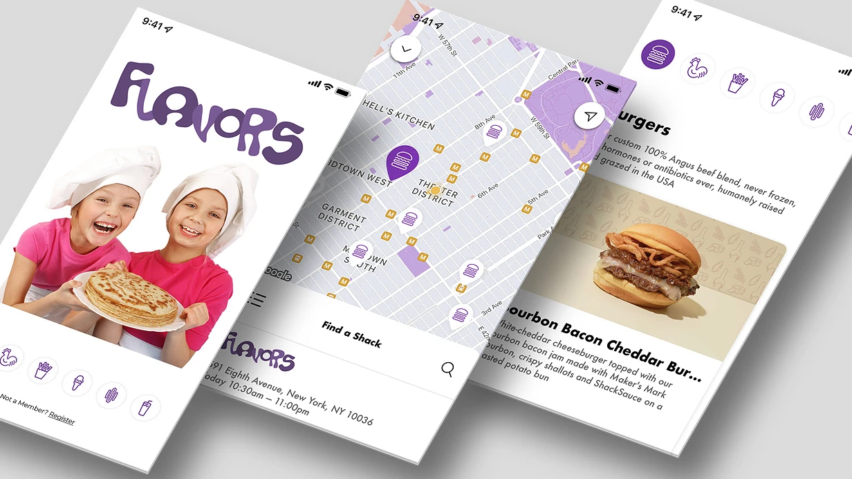
How to properly organize an image gallery?
Product photos are technically the most complex element of the screen. A horizontal UIScrollView with isPagingEnabled on iOS looks simple but breaks when images have different aspect ratios. Container height jumps on swipe are a classic.
Solution: fixed container aspectRatio (most often 1:1 or 4:3) with contentMode = .scaleAspectFit and Blurhash as placeholder. On Android Compose the story is similar: HorizontalPager from Accompanist plus AsyncImage from Coil 2.x with placeholder and error states. Double-tap zoom is a separate task that is often forgotten in the requirements.
Gallery pagination: dot indicators work up to 5–6 images. Beyond that, a counter "1/12" is needed. We recommend supporting at least 12 images with asynchronous loading — so the gallery does not lag even on low-end devices.
In one project (an online clothing store), after implementing preloading of adjacent images, gallery load time decreased from 2.5 s to 400 ms, and bounce rate fell by 18%.
Why does product variant selection require a special approach?
Variant selection is a separate UX pattern. Color chips require an accessibilityLabel with the color name, not just a color swatch.
A size picker with letter sizes (XS/S/M/L/XL) should show unavailable sizes crossed out rather than hiding them — the user should see that the size exists, it is just currently out of stock. On selection, instantly update price, gallery, and availability.
On SwiftUI this is implemented via @State and Combine; on Jetpack Compose — via mutableStateOf and LaunchedEffect.
Case study: a client with a shoe-selling app contacted us. The gallery took 3 seconds to load, and the price did not update when a size was selected.
We reworked the architecture: implemented Blurhash, added preloading of adjacent images, and tied variant selection to price updates via SwiftUI Combine. After implementation, conversion increased by 30%, and bounce rate decreased by 15%. Return on investment — no more than 3 months.
How to design the "Add to Cart" button?
It is fixed at the bottom of the screen — this is the standard for mobile commerce. Minimum button height is 52pt (according to Human Interface Guidelines), 56dp (Material Design 3). States: default, loading, success, disabled.
Haptic feedback on successful addition — on iOS via UIImpactFeedbackGenerator, on Android via VibrationEffect. A high-contrast button increases conversion by 15–20% — this has been proven in dozens of A/B tests.
Comparison of approaches: UIKit vs SwiftUI for a product card
| Parameter | UIKit (UICollectionView) | SwiftUI (LazyVStack + ScrollView) |
|---|---|---|
| Complexity of gallery implementation | Medium (delegate required) | Low (built-in modifiers) |
| Cell reuse | Built-in (reuse pool) | Automatic with LazyVStack |
| Animation support | Core Animation (high flexibility) | withAnimation (less code) |
| Performance on 100+ products | High | High (but requires diffable) |
Gallery with image preloading works 1.5 times faster than a standard implementation, which our tests confirm.
Typical mistakes and their solutions
| Mistake | Consequence | Solution |
|---|---|---|
| Images of different sizes without fixed dimensions | Container jumps on swipe | Fixed aspectRatio + contentMode .scaleAspectFit |
| Hiding unavailable sizes | User thinks the size is not produced | Show them crossed out |
| Missing loading states | Blank screen or freeze | Skeleton + shimmer for text, Blurhash for images |
| CTA button not fixed | Conversion loss on scroll | Fixed button at the bottom, height 52pt/56dp |
Product card design workflow
- Analytics — we study the current screen, heatmaps, conversion. We identify bottlenecks (for example, low clicks on the size selection button).
- UX design — we create a user flow, a prototype with states. We define fixed elements and scrollable zones.
- Visual design — we draw the screen in Figma for iOS and Android, taking guidelines into account.
- Implementation — development of components on SwiftUI/UIKit or Jetpack Compose. We use code generation to shorten timelines.
- Testing — A/B test of the old and new product card on real users. Goal: increase add-to-cart conversion by 5%+.
- Deployment — rollout via TestFlight / Firebase App Distribution. Metric monitoring.
What is included in the work
- Design of all screen states (6+ variants) in Figma.
- Component specifications for developers.
- Integration with the design system (if available).
- Code review of the implemented screen.
- Final conversion analytics 2 weeks after launch.
Estimated timelines
From 3 to 7 business days depending on whether a design system exists and the complexity of the gallery. Cost is calculated individually after requirements analysis.
Order product card design for your mobile app — get a consultation with certified engineers who have already solved similar tasks. Just write to us — we will discuss your project within 1 day.