


Mobile App Screen Map
Screen Map is not another document for documentation's sake. It's the first artifact that turns requirements list into visual structure: how many screens in the app, how they connect, how to reach each one. Without it the designer draws wireframes blind, and the developer learns about missed screens during routing implementation.
What Screen Map includes
Screen Map is not a flowchart with branching logic and not a prototype. It's a flat inventory of screens showing navigation links. On typical map you see:
- all unique app screens with names and purpose
- transition type — push, modal, tab switch, deep link
- common screens (e.g., modal date picker, error toast) called from multiple places
For mid-complexity iOS app typically 25–45 unique screens. For Android of similar scale — roughly the same, but with different patterns: Back Stack instead of Navigation Stack, Bottom Sheet instead of action sheet.
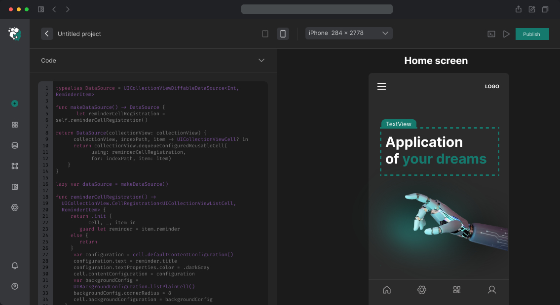
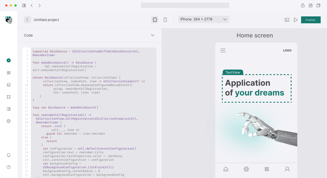
Draw in FigJam or Miro — the tool doesn't matter, the map must be readable without explanations. Each block — screen with name in SectionName/ScreenName notation, each arrow — transition type.
Why this before wireframes
Without Screen Map the designer starts drawing "from home screen" and adds screens as they go. Result — by prototyping time it turns out onboarding isn't connected to main flow, profile settings live in two different places, and payment error screen isn't designed at all.
Screen Map prevents this chaos. One day of work now — saves 3–5 days of fixes during design phase.
Timeline
Screen map for 20–40 screen app is done in 1 working day. Result — FigJam/Miro file, PDF export, optionally — structured table with each screen description.