


Mobile App UI Kit Development
UI kit is a component library in Figma from which designer assembles screens like from constructor parts. Without it each new screen starts from zero: copy-pasting buttons from old files, manual color sync, spacing differences between screens. With UI kit — screen assembles from ready components in an hour, not a day.
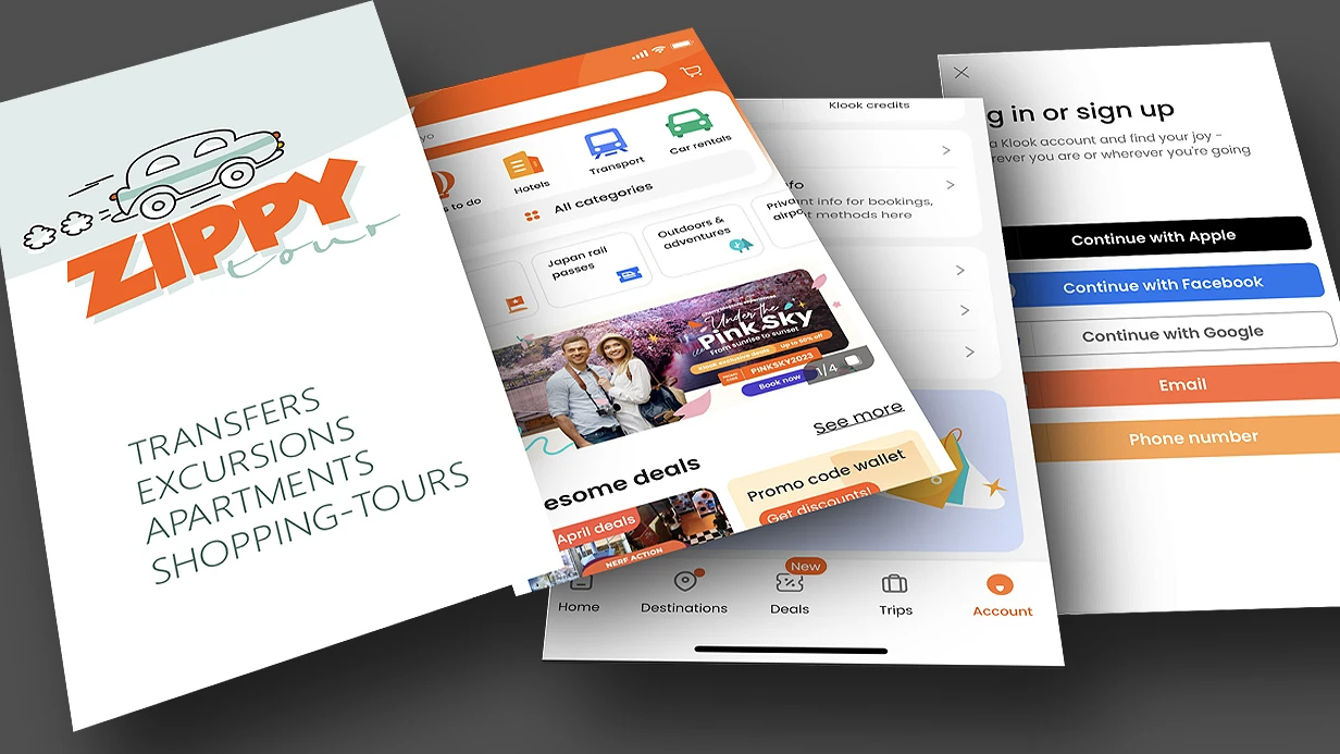
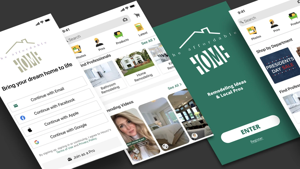
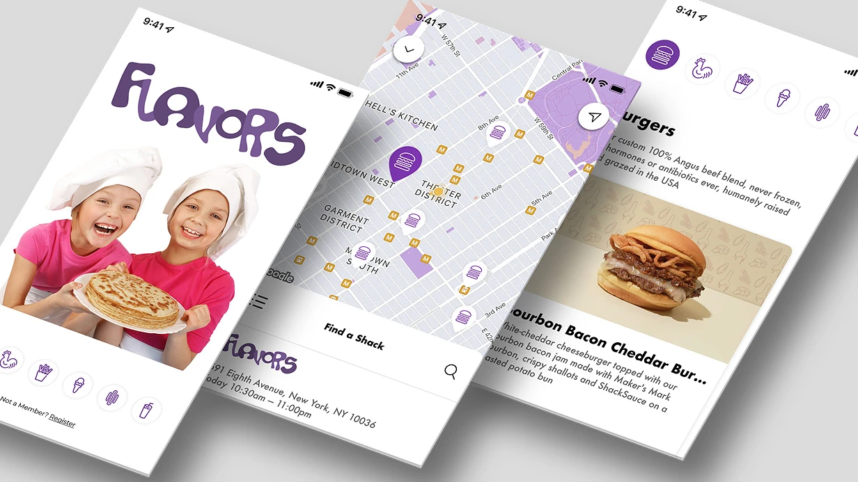
What mobile app UI kit includes
Basic layer — design tokens: colors (primary, secondary, surface, error, on-surface etc. per Material Design 3 or custom system), typography (fonts, sizes, line-height, letter-spacing for each style), shadows, border-radius, spacing grid (4pt or 8pt base step).
On top of tokens — atomic components:
- Buttons — Primary, Secondary, Tertiary, Destructive; sizes Large/Medium/Small; states Default/Hover/Pressed/Disabled/Loading
- Input fields — with label, placeholder, helper text, error state, success state; with icons left/right; single-line and multiline
- Navigation — Tab Bar (iOS-style and Material Bottom Nav), Top App Bar with variations (with search, with action icons), Drawer
- Cards — basic card with several layout variants (horizontal, vertical, with media)
- Lists / List Items — with icon, with avatar, with trailing element, divider variants
- Badges and Tags — status, numeric, text
- Bottom Sheet / Modal — basic container with handle
- Toasts and Snackbars — success, error, warning, info
- Empty States — with illustration and CTA
- Loading States — skeleton screens for cards, lists, text
How to build components in Figma
Each component — Auto Layout at all levels. Critical: components must stretch under content, not have fixed sizes. Input field with short and long helper text — one component, not two.
Variants and Component Properties — for managing states and configs without duplication. Button with 4 types × 3 sizes × 5 states = 60 variants in one master component. Designer selects needed config via Properties panel, not copy components.
Naming — strict: ComponentName/Variant=Value, State=Value. Important not just for order but for Figma Variables binding and developer reading spec.
Dark theme — if project includes it — implement via Figma Variables (Mode switching). One component set, two color schemes. Not file duplication.
Documentation inside kit
Each component — separate frame with documentation layer: when to use, when not to, component anatomy. Not "pretty", but functional: new designer or developer opens kit and understands rules without call.
Connection to development
UI kit in Figma — source of truth for code. For React Native — kit components match components in StyleSheet or Styled Components / NativeWind. For Flutter — widgets in ThemeData and custom widget library.
Kit tokens can be exported via Tokens Studio plugin (plugin) to JSON and synced with codebase via Style Dictionary. Removes manual color and typography sync between design and code.
Timeline
Basic UI kit for mobile app (without design-token pipeline) — 3–5 working days. Depends on component count, variant complexity and dark theme presence.
Cost calculated individually after scope evaluation.