

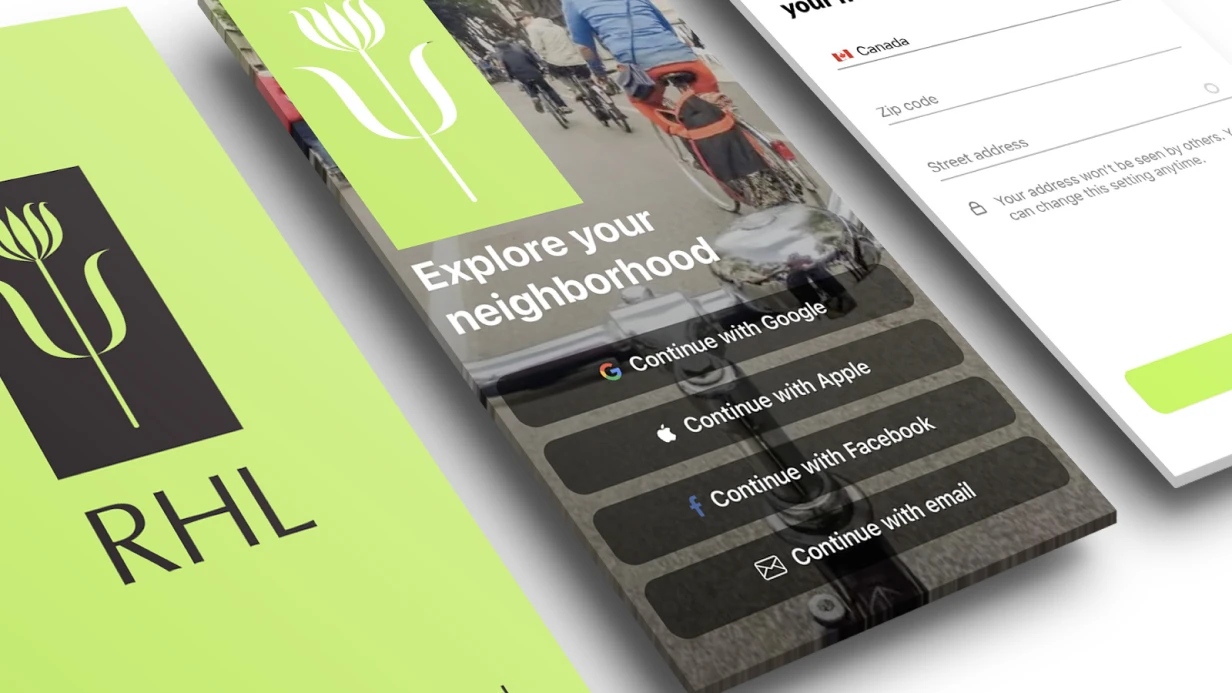
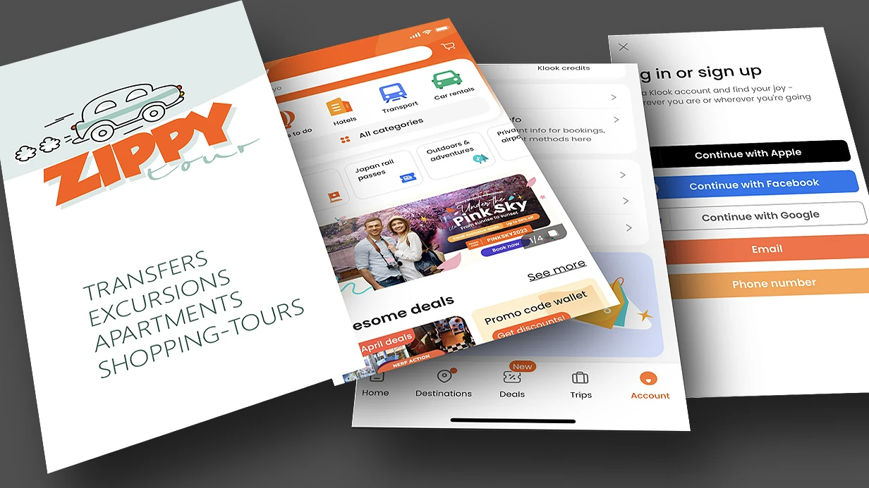
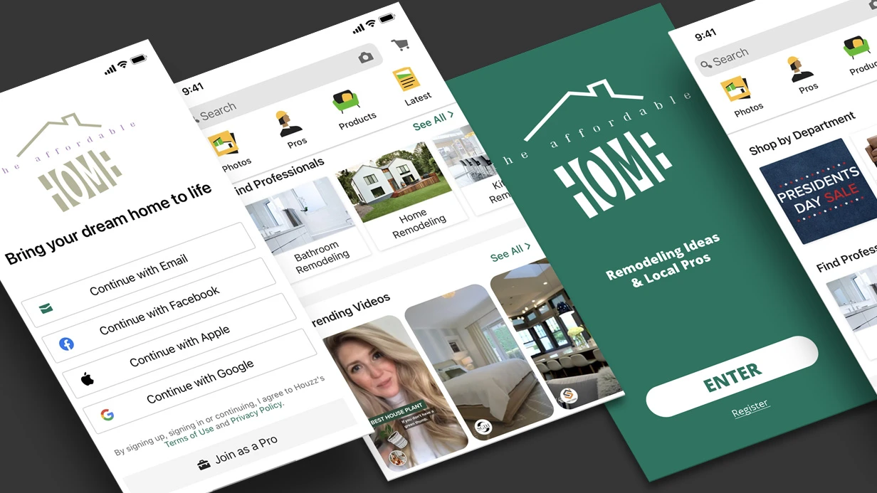
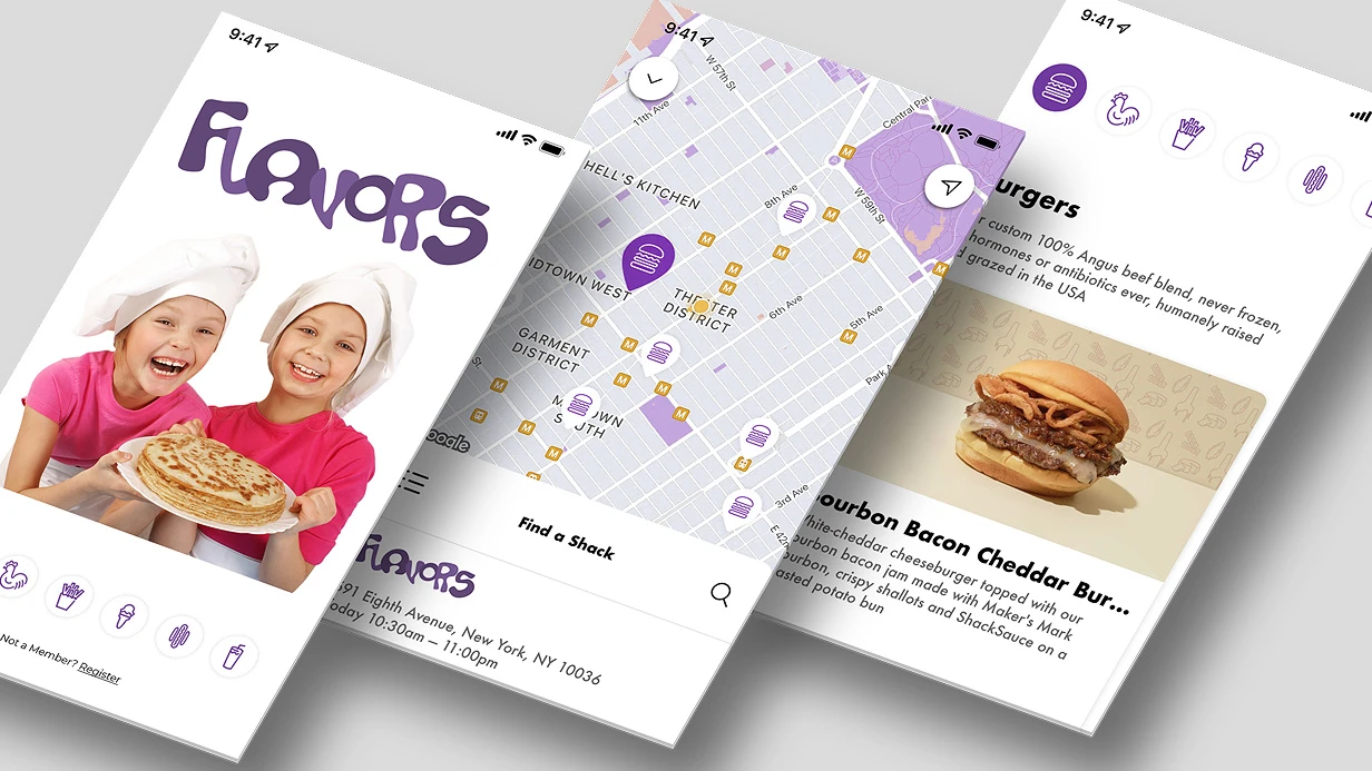
Mobile app profile design: where users are lost
The main loss occurs not on the first screen, but on the profile screen — in the personal data entry block.
The user has confirmed the number, seen the interface, and is ready to move on, but the form requires date of birth, city, delivery address, and gender as one mandatory set. Every field without a clear reason is a fork where some people simply close the app.
Worse, the form state is not saved: you minimize the app, return after a call — the fields are empty, and the code must be requested again. An abandoned registration is then not restored, because an incomplete account is not marked as incomplete anywhere.
This also leads to lost repeat orders: the person returned, saw the same empty form, and either placed an order as a guest or went to a competitor.
This persists because of fragmented screens. Profile, addresses, payment methods, and notifications live in separate sections with their own validation rules and field formats.
An engineer edits one block without knowing that the neighboring one requires the same data differently — and the share of completed profiles drops again.
We start with a journey map: where the user stops, which fields they skip, at which step they return to the app. Then we restructure the filling process so that only a minimum remains mandatory, and the rest is requested as needed — during checkout, not at sign-in.
What reworking the account screen changes
The account screen is not an informational section, but a node through which the path to an order and repeat engagement passes.
Therefore, edits here are measured not by “it became clearer,” but by shifts in specific values: path length to the target action, share of forms completed to the end, volume of support requests, and share of returning users.
We start with the path. When the profile inserts a saved address, phone, and payment method, checkout loses several steps: the person does not enter what the system already knows.
Usability studies of forms by Baymard Institute show that checkout is abandoned mainly because of extra fields and an unclear sequence of steps, not because of filling out forms itself.
The second layer is support load. Order status, transaction history, current contacts, and notification settings on one screen remove typical scenarios: “where is my order,” “how to change the address,” “why didn’t the email arrive.” These requests leave the first-line flow.
The third layer is return. Saved data and an explicit entry point for repeat purchase shorten the path to seconds, and this affects retention and repeat order share more strongly than any advertising campaign.
We take measurements before and after on comparable segments so as not to attribute the result to seasonality. If there is no shift in the numbers, the edit is not considered done.
Implementation options: ready-made blocks, custom assembly, hybrid
The choice of how to assemble the profile screen determines not the appearance, but the cost of the next edit. The account screen is not one layout, but a set of states: guest, authorized user, loading, network error, empty profile, different roles and plans.
The more states and blocks (security, payment methods, devices, subscriptions), the more noticeable the difference between the three implementation approaches.
In practice, the choice is not based on “which is prettier,” but on the editing mode you plan: one-time assembly for launch, ongoing improvements within the product, or a mixed scenario.
| Option | When it fits | Maintenance constraints |
|---|---|---|
| Standard components | The screen is typical, deadlines are tight, one platform is prioritized | Platform widgets dictate the grid, spacing, and animations; on the second platform the screen is assembled anew, and a non-standard state block breaks the familiar list behavior |
| Custom block library | The profile grows with sections, edits are ongoing | Higher start-up cost: a unified style set, block versioning, and checks are needed. Without discipline, the library sprawls into copies |
| Hybrid approach | Most of the screen is typical, 1–2 blocks are unique | Requires an explicit boundary: what lives on standard components and what lives in its own layer. Mixing without a rule results in double maintenance of the same area |
Over the long run, the cost of owning a screen is determined not by the first release, but by the number of places where one edit must be repeated.
Therefore, before choosing, we break the profile down into blocks and states, compare them with platform constraints, and only then fix what we take ready-made and what we assemble ourselves — this way, screen maintenance does not turn into rewriting from scratch with every update.
How the work is structured: from screen inventory to handoff of layouts
A user profile is not one screen, but a set of states: guest, authorized user, paid subscription, empty data, loading error, connection loss. We start with an inventory of all states and only then draw — otherwise layouts have to be redone when half of the markup is already done.
- Screen audit. We collect the current set, mark duplicates, outdated states, and data gaps. The output is a list of screens with priority and notes on what we carry over unchanged and what we rewrite.
- Transition diagram. We fix entry and exit points, display conditions for each state, returns after errors and authorization. The diagram becomes the basis both for navigation and for checks during acceptance.
- Layout assembly. Grids and spacing on a unified scale, button and field states, long names, large avatars, dark theme. We check every element in advance for overflow and clipping.
- Device check. We review layouts on real screens of different sizes, with large system fonts and safe areas taken into account. This way we catch unreadability and overlaps before development, not after release.
- Handoff to development. Layouts are marked up by components in Figma: spacing values, font styles, scroll behavior, comments on animation and data loading are specified.
- Post-assembly verification. We compare the implementation with the layout on devices and document discrepancies as a list — edits come in batches, not in endless iterations.
This sequence keeps the interface predictable: development receives not a picture, but a description of behavior — and does not waste time on guesswork.
What you have after delivery: layouts, components, and rules
After the profile is delivered, you are left not with a set of pictures, but with a working system: a component library, styling rules, and interface documentation. Using this kit, any development team can assemble the screen without verbal explanations or chat correspondence.
- Component library — input fields, avatars, toggles, buttons, and pop-ups are brought together into a common set with size and spacing variants. A new screen is assembled from ready-made blocks rather than drawn anew.
- Styling rules — grid, font styles, color roles, and radii are fixed as variables. Changing the accent color is done in one place and propagates automatically across all screens.
- Field states — for each element, idle, focus, input, filled, disabled, and loading are described. The developer does not have to guess what a field with an invalid value looks like.
- Error messages — texts, icons, and hint placement for each validation: empty mandatory field, invalid phone format, short password, save conflict.
- Behavior with long data — what to do with a two-line name, a missing avatar, an empty contact list, and a connection drop during loading.
- Interface documentation — spacing specification, rules for shortening texts on narrow screens, element traversal order, and logic of transitions between profile sections.
- File structure — layouts are organized by screens and states, components are named so that names match entities in the code.
Case study: reworking the personal account of a delivery service
In the delivery service Tochka Dostavki, the account screen was built up in iterations: promo code, address, and time preference fields were added to registration.
By the time of the review, the form occupied five screens, nine fields were mandatory, and the share of completed registrations held at 41% of started ones. The main loss occurred at the address step: manual entry of entrance, floor, and intercom code cut off entry into the app.
We reworked the mobile app profile design so that the account is created on one screen, and the rest is filled in as the order progresses.
The address is pulled from geolocation and confirmed with one tap, the number — by a code from a message, and an incomplete profile is saved as a draft when leaving the app. Secondary fields were moved to the editable part of the profile and marked as optional.
Metrics before and after: completion time decreased from 3:40 to 1:05, drop-offs at the address step — from 38% to 11%, completed registrations grew to 68%. The share of profiles with a saved address rose from 61% to 92% — the courier stopped calling to clarify the entrance.
What the scenario analysis delivered
Support load on the topic of registration fell threefold: requests like “I can’t save the address” and “confirmation doesn’t arrive” practically disappeared.
We separately carved out access recovery — previously, changing the number meant a new account for the client with loss of order history.
We kept the account screen linked to behavioral data: we looked at which field people stop at and edited the form rather than guessing at the causes.
This approach is applicable to any app with registration — first we capture the completion picture, then change the profile design and check the result against the same metrics.
What to do if the account screen is already coded and needs improvement?
If the profile screen is already coded and working, rewriting it entirely is almost never necessary: new requirements are usually covered by targeted edits.
The problem is different — an edit in the avatar or settings block imperceptibly breaks the behavior of neighboring elements, and a week later interface regression surfaces on devices with small screens or long names.
The sequence starts not with edits, but with an inventory. We record which screen states exist now: data loading, empty profile, network error, edit mode, saving. We separately note which blocks are reused on other screens — changing them will affect more than just the account.
Next, we capture the current behavior as a baseline: base sizes, spacing, element order with different data volumes, behavior under system font enlargement.
This is needed to distinguish real regression from an intentional change — without a baseline, a dispute over “it was always like that” cannot be resolved.
We make the edits one at a time and in isolation: one block, check, next. If an edit requires touching a shared element, we first look at all places where it is used; otherwise the account screen will drag along checkout or the notification list.
We put the improvement plan in writing: what we change, what we consciously leave as is, which scenarios we recheck after each edit. This way the screen is updated without rewriting, and regression risk is closed by checks, not hope.
Frequently asked questions about compatibility, states, and analytics
Before work begins, the client almost always accumulates the same questions: how the mobile app profile design will behave on older devices, what the user sees while data has not arrived, and whether the tracking markup will be enough to calculate the funnel later. We answer briefly and to the point — so as not to return to this in the middle of the work.
How to check device compatibility?
We design the profile on an adaptive grid: one layout describes compact and large screens, and we separately fix safe areas for the notch and system panels. We agree on the minimum supported system version before the first screen — the available set of components depends on it.
Which interface states need to be designed?
In addition to a filled profile, we design skeleton loading, an empty profile, a network error with retry, partially filled fields, and a read-only mode. These are separate layout layers, not a note in a comment.
How are analytics events marked up?
Profile view, field edit, save, exit cancellation — we agree on the event list together with the layout and deliver it as a table: name, trigger, parameters. Development implements them according to this table, and analytics later compares the actual flow with the expected one.
Is dark theme a separate design?
No, it is a second set of color tokens on top of the same structure. A palette defined by variables allows you to assemble a dark theme without redrawing screens, and we check contrast against accessibility standards.
How is profile design acceptance carried out?
We compare the implementation with the layout on an agreed list of devices and scenarios: transitions between states, long names, missing part of the data, dark theme. We record discrepancies as a list and close them before release.
Let’s discuss the task and come back with an estimate and plan
An estimate is accurate when it relies on real materials, not on a brief retelling of the task. Below is what to send about the profile screen and what we do at the first step, so that you immediately see the scope of work and the sequence of actions.
- Task statement: why the profile screen is needed, what actions the user performs, and what is considered a successful result.
- Source materials: current layouts or screenshots, field composition and where the data comes from, whether there is a design system or component library.
- Screen states: filled and empty profile, loading, network error, no access, edit mode.
- Platforms and constraints: both mobile platforms, dark theme, different screen sizes, accessibility and localization.
- Roles and permissions: what the profile owner sees, what other users see, which fields are hidden or read-only.
- Current problems: user complaints, screen metrics, bottlenecks in navigation and saving changes.
- Timelines and priorities: what is needed for the nearest build and what can be moved to the second stage.
The first step is analysis of materials and a screen map: a list of states, a transition tree, a list of components with behavior rules. As a result, you receive a scope estimate, a staged plan with approval points, and open questions that need to be closed before the start. Describe the task — and we will come back with an estimate and plan.