

Mobile App Wireframe Prototypes
A wireframe is a screen without color and final typography, but with precise placement of all elements, zone sizes, content priority. It answers "what's here and how is it arranged" before the designer spends time on visual treatment. Redoing a wireframe — hour of work. Redoing a ready mockup — day plus team conflict.
What wireframe fixes
On good wireframe you see: content hierarchy (what's main, what's secondary), interactive zone sizes (minimum 44×44pt per iOS HIG, 48×48dp per Material Design), scrollable area behavior, space for system elements — status bar, home indicator, navigation bar.
Often missed moment — states. Wireframe is needed not just for "normal" screen state, but for: empty state (no data), loading state (skeleton or spinner), error (inline validation, toast, full-screen error), maximum fill (long username, 99+ notifications).
Tools and detail level
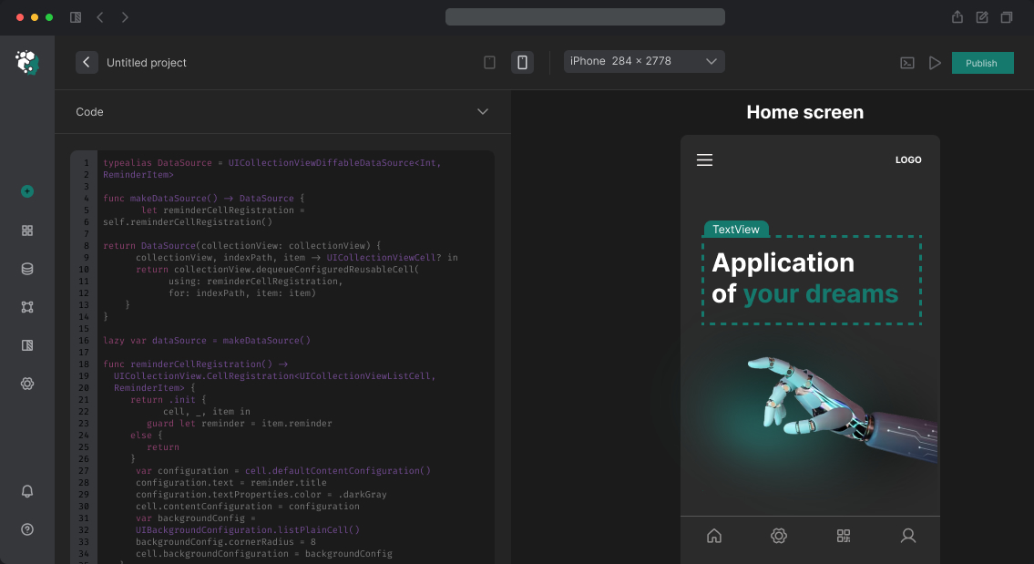
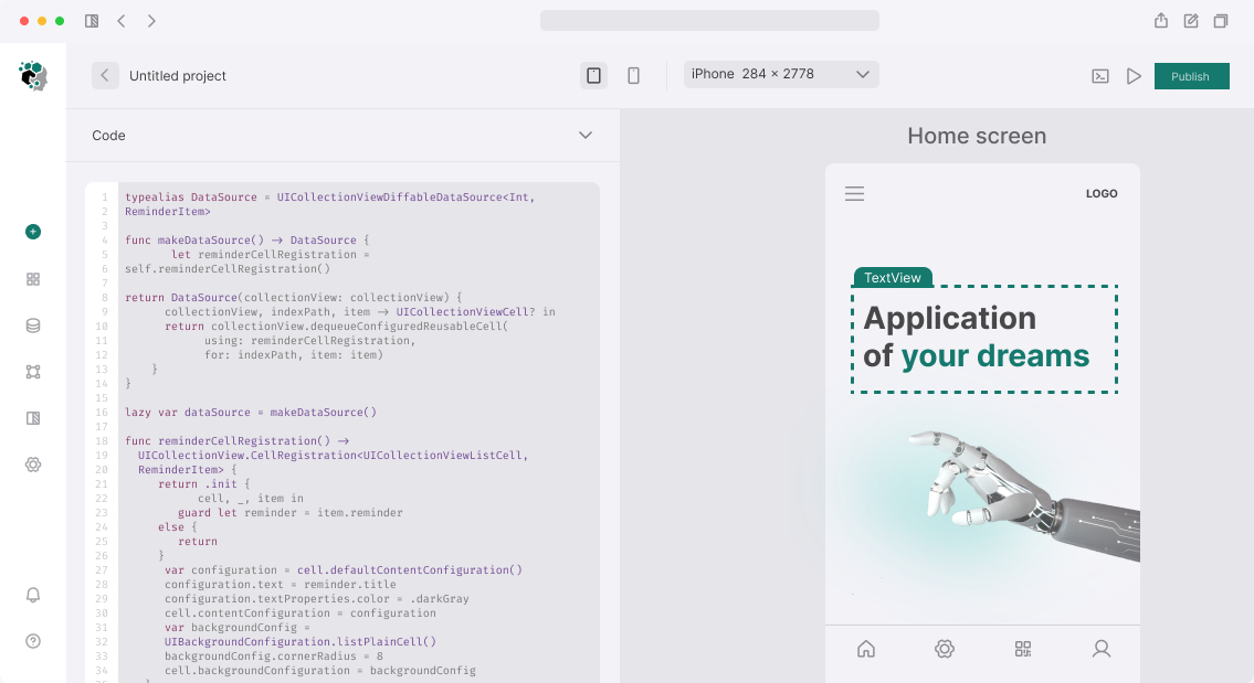
For wireframes we use Figma — low-fidelity components from wireframe kit libraries. Don't write real text, use lorem ipsum only for length, not meaning. Colors — grayscale. Icons — generic placeholder.
Detail level depends on task: if wireframe goes straight to development without intermediate design — do mid-fidelity with real spacing and sizes. If it's tool for concept agreement — low-fidelity enough.
Typical mistakes
Main mistake — wireframe ignoring Safe Area on iOS (camera cutout, home indicator on notch iPhones). Content that looks normal on 390×844 frames ends up cut off on real device. Set Figma frames to real device sizes with Safe Area overlay enabled.
Timeline
Wireframes for 10–15 screens with main states — 2–3 working days. Includes: Figma file with frames, annotations to key elements, PDF for agreement.