

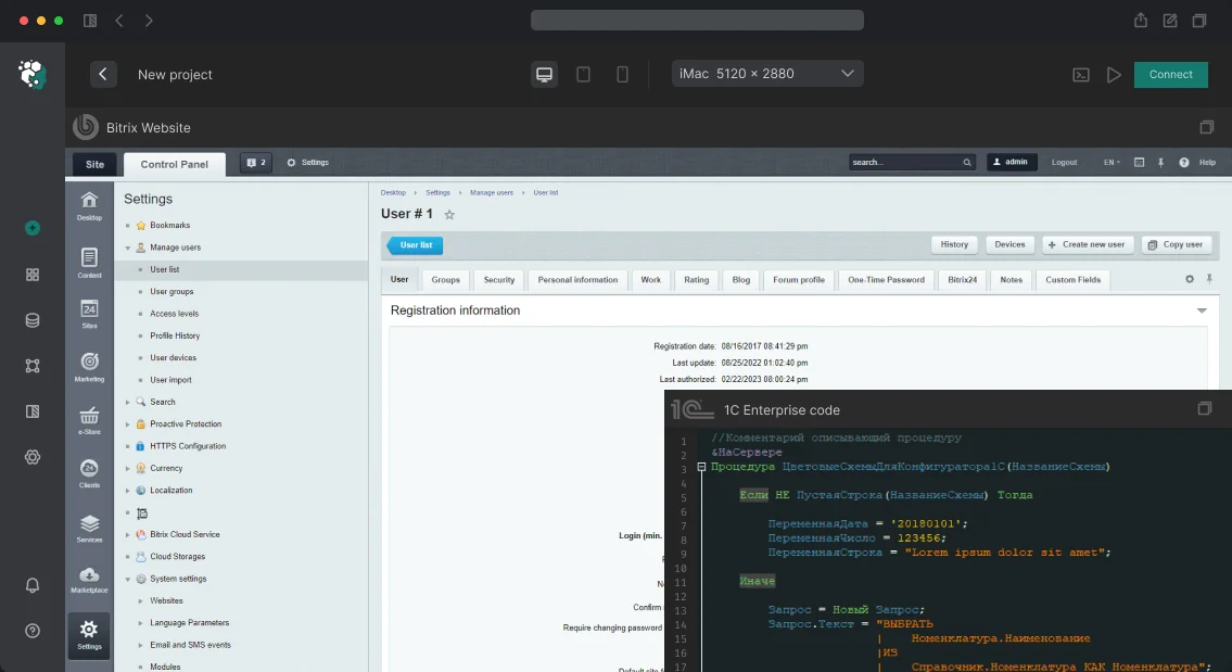
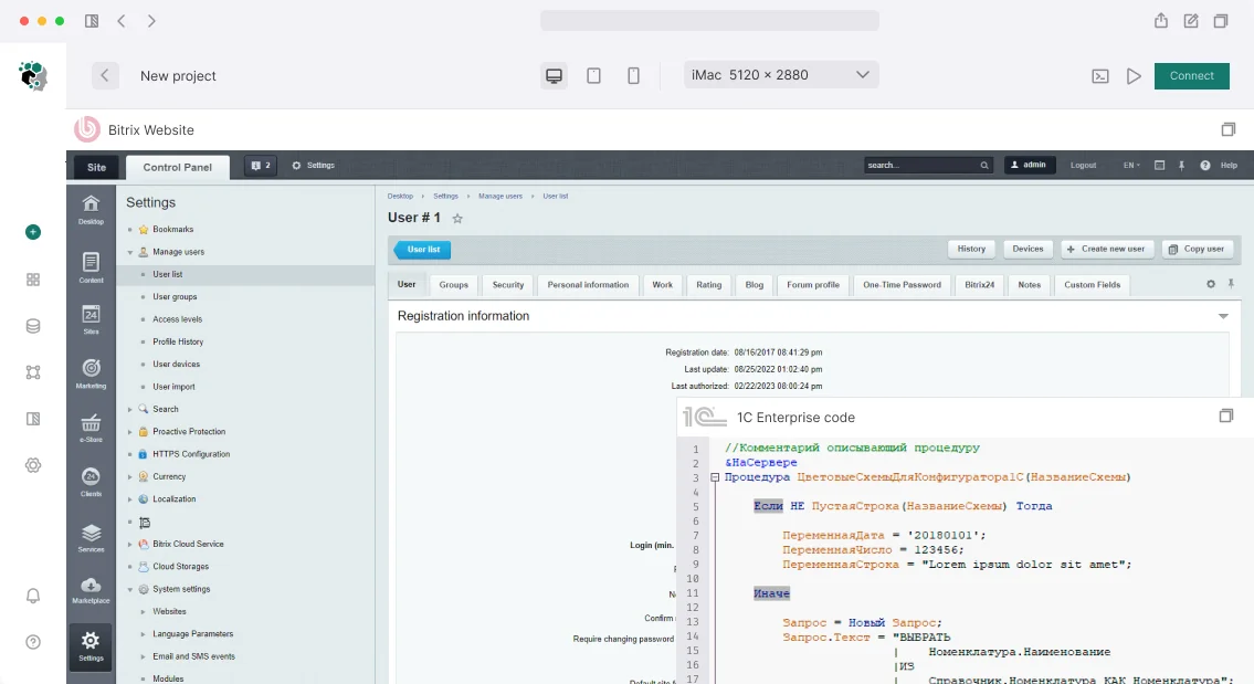
Developing an interface for integration with Bitrix24? Ready-made UI kits don't account for the portal's design system — you manually adjust styles, colors, and spacing. Bitrix24 UI Kit solves this: its React components automatically inherit the portal theme. We use @bitrix24/b24ui to build interfaces — from buttons to complex dashboards that are indistinguishable from native ones. Get a consultation — we'll evaluate your project in one day.
What problems does Bitrix24 UI Kit solve?
Standard UI frameworks require manual adaptation to the portal theme, RTL, and Bitrix24 specifics. Bitrix24 UI Kit eliminates this: components inherit portal styles, including dark theme. Development with it is 2–3 times faster than writing from scratch. Built-in RTL and multilingual support reduces code volume by a third. With ready-made components, you save up to 40% on interface development budget.
How to integrate Bitrix24 UI Kit with React?
Integration is done via the @bitrix24/b24ui package. It contains ready-made React components that automatically pick up the portal theme through <cite>B24ThemeProvider</cite>. For working with REST API, use @bitrix24/b24jssdk with full TypeScript typing. Installing one package replaces manual adaptation of each component.
import { B24ThemeProvider, Button, Input, Table } from '@bitrix24/b24ui'; Example of theme setup and token usage
function App() {
  return (
    <B24ThemeProvider>
      <Dashboard />
    </B24ThemeProvider>
  );
}

// Hook for theme awareness
function ThemeAwareComponent() {
  const { theme, isDark } = useB24Theme();
  return <div className={isDark ? 'dark-specific' : ''}>...</div>;
}
The theme syncs with the portal via BX24.getTheme() and the theme change event — when the user switches theme in Bitrix24, the app reflects the change instantly.
How to customize Bitrix24 UI Kit components?
Customization is possible in two ways: by passing props (e.g., color, size) and by using CSS variables for design tokens. If you need to extend functionality, create a wrapper component that inherits UI Kit styles. Design tokens are available as CSS variables: --b24-color-base-3, --b24-radius-md, --b24-font-family. The full list is in the official documentation.
Theme setup and initialization
Use B24ThemeProvider for automatic synchronization. The useB24Theme hook returns the theme object and an isDark flag. When the theme changes on the portal, the app updates without reloading.
Case study: KPI dashboard for a sales department (from our practice)
Client — a large sales department with 30 managers. They needed a KPI dashboard with real data from Bitrix24 CRM. The interface had to be stylistically indistinguishable from the portal, support dark theme, and require no training. Components used from UI Kit: Table for manager list, Badge for statuses (completed/not), Avatar for photos, Select for period, Button for export. Custom components built on top of UI Kit: KPI progress bar (via UI Kit CSS variables), sparkline charts (Recharts styled to Bitrix24 palette), rating table with drag-and-drop sorting. Data fetched via REST API CRM using @bitrix24/b24jssdk with async requests and caching. Result: users don't perceive the dashboard as a third-party app — the interface blends in organically. Development time reduced by 40%, overall cost 2.5 times lower than building from scratch.
Comparison: custom UI vs. Bitrix24 UI Kit
| Criteria | Without UI Kit | With Bitrix24 UI Kit |
|---|---|---|
| Portal theme adaptation | Manual, 2-3 days | Automatic, 0 days |
| RTL support | Additional development | Built-in |
| Consistency | Must check with design | Guaranteed |
| Code volume | High | Low (components ready) |
| User training | Required | Not required |
What's included in the development
- Requirements audit and component plan compilation
- Project setup: @bitrix24/b24jssdk, @bitrix24/b24ui, TypeScript
- Component development: base (from UI Kit) + custom (on top of design tokens)
- Dark theme support, testing in both variants
- Documentation of custom components for the support team
- Source code delivery, deployment instructions
Popular Bitrix24 UI Kit components
| Component | Purpose | Customization props |
|---|---|---|
| Button | Button | size, color, rounded, loading |
| Input | Input field | size, placeholder, error |
| Table | Data table | columns, data, sortable |
| Badge | Status badge | color, size |
| Modal | Modal window | size, closeable, footer |
| Notification | Notification | type, duration |
Process overview
- Analysis — study requirements, prototype
- Design — determine component composition, customization
- Implementation — write code, use B24ThemeProvider
- Testing — check all states (light/dark theme, RTL, multilingual)
- Deployment — deploy the app on the portal, set up CI/CD
Timeline and cost
Basic set of screens on UI Kit — 1–2 weeks. Custom design system on top of UI Kit tokens — from 3 weeks. Cost is calculated individually after requirements audit. We've completed over 20 projects on Bitrix24 — we guarantee quality and deadlines. Contact us to evaluate your project in one day.