

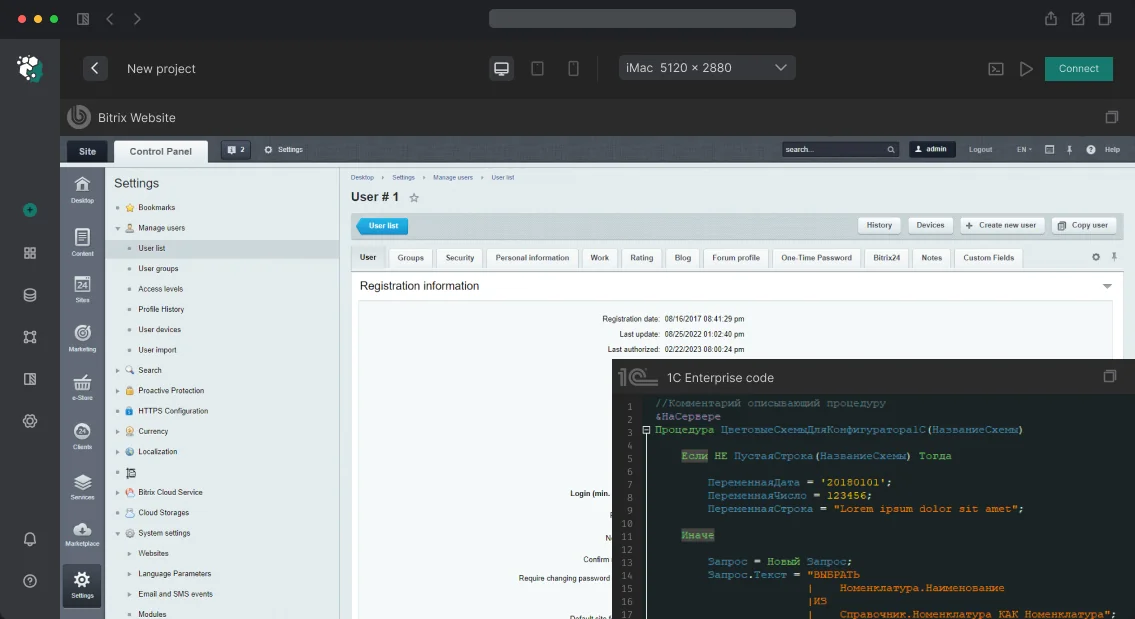
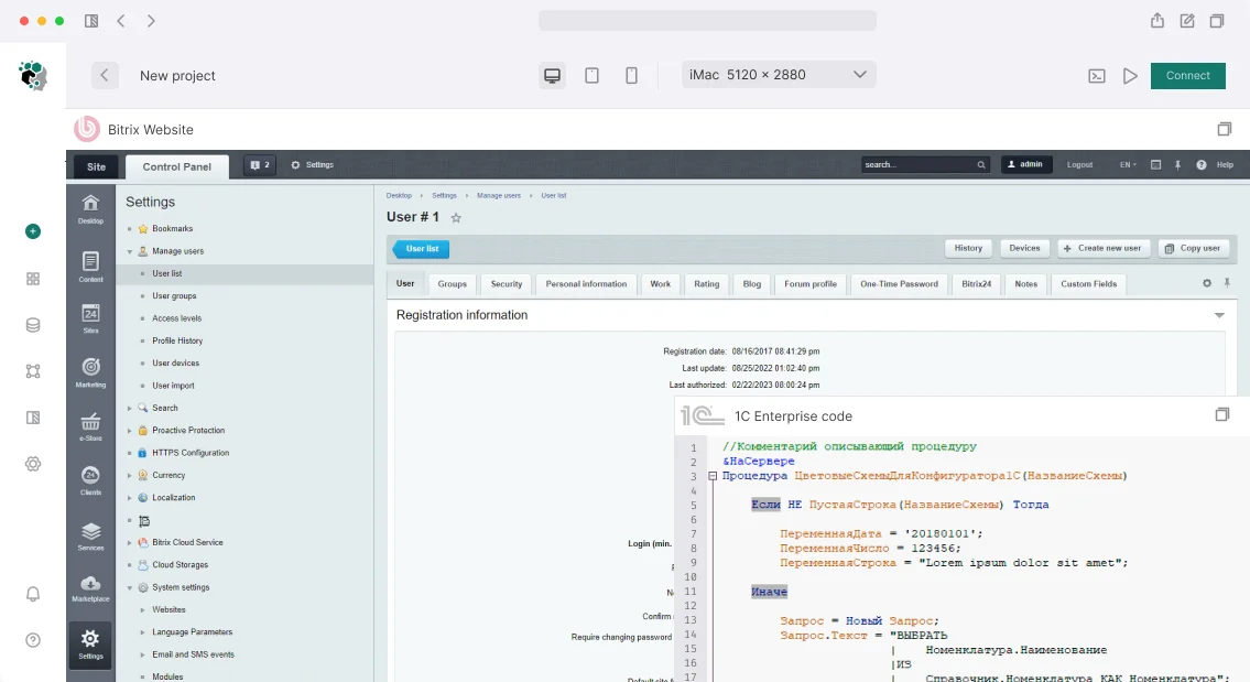
Why the Bitrix dark theme breaks the layout and the admin panel
The dark theme on Bitrix breaks not because of the idea itself, but because of how the template is built.
Most ready-made solutions were written for a light palette: colors are hardcoded in dozens of places — in template styles, in component settings, in inline attributes that are output directly from the code.
Toggling a single variable won't work: some blocks will go dark, some will stay white, and instead of a neat theme you get a patchwork quilt.
The first source of problems is a conflict with the template styles. The cascade in Bitrix is often overridden by specific selectors and !important, so a global theme switcher loses to rules written for a specific block.
The second is the inline colors of components: news, catalog, forms, and the cart often pull shades from module settings or from the style attribute rather than from a shared design palette. Until the palette is moved into a single layer, any new component brings back light patches.
A separate story is style caching. Bitrix aggregates and compresses CSS, and also caches components; after edits, the browser and the server keep serving the old files.
An engineer changes the colors, but nothing moves on the site — and it looks like "the theme doesn't work," even though the problem is in the caching layer and static file versioning.
Finally, the absence of a single palette turns the task into endless tweaking. When colors are scattered across the template, components, and module settings, every change drags along a dozen pinpoint fixes, and the Bitrix dark theme remains a set of hacks.
Let's break down how this is solved systematically — through a single design layer, overriding component styles, and proper handling of the cache.
What a correctly implemented dark theme delivers
A correct dark mode is not a color inversion applied with a filter over finished markup, but a separate set of values for background, text, and borders, wired in at the template level.
When the theme is defined through variables rather than hard-coded in every component, switching modes happens instantly and requires no page rebuild. That is precisely why a correct implementation starts with a template audit and moving colors into a single layer.
The first measurable effect is reduced eye strain during long working sessions. In interfaces where an operator spends several hours in front of the screen, a bright light background forces the pupil to constantly readjust.
A dark scheme with well-calibrated text contrast removes that strain: the brightness difference between the background and the elements remains readable but stops "hitting" the eyes by the end of a shift.
The second effect is a unified look for the public-facing area and the admin panel. Often the dark theme is built only for the front end, while service sections stay light, and moving between them produces a sharp jump.
If the palette is described with shared variables, both zones use the same logic: the administrator sees the same mode as the visitor, and the interface does not split into two inconsistent halves.
The flash of a white background on load is addressed separately. It occurs when the theme is applied by a script after the page has already been rendered: the browser manages to show a light background and then repaints it.
To prevent this, the selected mode is locked in before the first paint — then the page opens directly in the desired scheme, with no flicker. This is noticeable on slow connections and when navigating between sections.
Finally, contrast is checked against formal accessibility criteria, not "by eye." A dark background is easy to make attractive and at the same time unreadable: gray text on near-black formally looks stylish but fails the check.
We verify the "background — text" and "background — control" pairs against the contrast ratio so that the theme remains usable, not just striking.
Approaches to implementing dark theme: comparison of methods
We compare four approaches that are actually used on projects: overriding design variables, a separate dark template, a user toggle, and auto-detection based on the device's system setting.
The choice depends on how deeply the template is customized and whether the visitor needs manual theme selection.
| Option | When it fits | Limitations |
|---|---|---|
| Overriding design variables | A standard or lightly customized template, unified markup | Requires discipline: all colors must be moved into variables, otherwise "white spots" remain |
| A separate dark template | Heavily customized design, complex blocks and components | Duplication of markup, double maintenance with every content update |
| A user toggle | Manual selection and preference persistence are needed | Requires state storage and correct operation without "flashing" on load |
| Auto-detection based on the system setting | Mass traffic from mobile, minimal action from the visitor | Does not account for manual selection unless combined with a toggle |
Design variables versus a separate template
Overriding variables is the cheapest path in terms of maintenance: colors, backgrounds, borders, and shadows are set in one place, and the dark theme is enabled by switching the set of values.
A separate template gives full freedom in composition, but every content edit is made twice, and discrepancies between the light and dark versions accumulate.
Toggle and system setting
The user toggle stores the visitor's choice and applies it before the page is rendered, so there is no flash of a light background.
The device's system setting sets the default theme, and the manual choice overrides it — this combination produces predictable behavior for both new and returning visitors.
In practice, a hybrid is most often used: design variables as the base, a toggle with persistence, and the system setting as the default value.
Stages of implementing a dark theme on a website
Implementing a dark theme on Bitrix is not "flipping a switch" but consistent work with the template and components.
A Bitrix dark theme affects the markup, styles, and display logic, so we proceed through stages where each next one builds on the result of the previous one.
- Template audit. We look at how the styles are structured: how many colors are hard-coded in the markup and inline attributes, where variables are used, which components inherit the styling. We record the list of places that will need to be switched to a single source of colors.
- Building the palette. We form two sets of values — for light and dark mode: background, surfaces, text, borders, accents, states of buttons and links. We check the contrast of text against the background so that readability does not drop.
- Setting up variables. We move the colors into a single layer of variables and switch them by mode — via a class on the root element or a theme attribute. We replace hard-coded colors with references to variables so that switching modes does not require editing every page.
- Checking components. We go through the typical blocks: forms, cart, personal account, pop-up windows, tables, content editor. We check each component in both modes — this is exactly where "white spots" on a dark background most often come up.
- Testing. We look at behavior at different resolutions and in the main browsers, check hover and focus states, readability of images and icons. Separately, we check that the user's choice is saved between visits.
- Handover. We deliver the configured template, a description of the variables and the rules for adding new colors, so that the team can develop the theme without us.
Such a sequence eliminates rework: the palette and variables are set before editing components, and testing catches inconsistencies before deployment to the production website.
What the client receives after setup
After setting up the dark theme, you receive not a set of scattered edits, but a package that allows the theme to be developed further and handed over to another contractor without losing context. Below is what exactly remains in the project.
- Style files — a separate set of styles for dark mode, assembled so that the light theme is not affected. The edits are not smeared across the main style file: they can be disabled with a single line if you need to restore the previous look.
- Palette scheme — a color mapping table: which interface element in the light theme becomes which in the dark one. With it, a new developer does not pick shades by eye but takes a ready-made value.
- Switching instructions — how to enable the mode manually, how it picks up the device's system setting, and where the user's choice is stored. Plus the procedure to follow if switching stops working after an update.
- Editing guidelines — the rules by which the theme can be changed further: where to add new colors, how to check the contrast of text and background, and what to do when a new block or section appears on the site.
- List of tested pages — an inventory of templates and typical pages on which the mode has been tested: home page, catalog, product page, forms, account area, cart. It shows what exactly is covered by testing and what appeared later and requires a separate pass.
- Contrast report — which "text — background" pairs have been checked for readability and where it was necessary to deviate from the original palette so that the labels remain distinguishable.
The package closes the main risk of a dark theme — it lives only until the first update or new block, after which light patches appear again.
When there is a palette scheme and editing guidelines, any site enhancement immediately takes both modes into account, and the theme does not have to be redone from scratch.
Case Study: How We Eliminated Style Conflicts on a Portal
What It Was Like Before the Intervention
A corporate portal on 1C-Bitrix with several content editions: some pages were built with the visual editor, others with legacy component templates.
When dark mode was enabled, a classic set of issues surfaced: headings and tables remained on a light background, some text became unreadable, and cards in blocks "fell apart" — fixed paddings and backgrounds were defined in different places.
The cause was style conflicts. The theme overrode variables at the site template level, but nested components pulled in their own stylesheets with hard-coded colors.
Selector priorities overlapped, and the final appearance depended on the order in which files were loaded on a specific page.
What We Changed
We consolidated the palette into a single set of variables: text colors, backgrounds, borders, and hover states were moved into one layer, and components were switched to these variables instead of direct values.
For pages that couldn't be rewritten without breaking the layout, we added an isolation layer — it overrides colors only within the container and doesn't affect the rest of the portal.
We also addressed typography separately: text and background contrast was raised to a readable level, and block sizes and paddings were tied to shared values so the grid doesn't fall apart when switching modes.
What It Became
Dark mode was enabled uniformly across the entire portal: switching doesn't break a single page, and content is fully preserved — texts, tables, attachments, and media stay in place. Style conflicts are gone because the color source is now single.
Repeated complaints about unreadable text and broken blocks stopped, and new components are immediately built in both themes without additional work.
How dark theme differs in the public area and in the admin panel
Dark theme in the public area and in the admin panel are two independent layers that are handled by different tools. The public area lives inside the site template: the color scheme, backgrounds, text contrast, and element states are defined in the template and its styles.
Switching is usually done via a separate class on the page's root element, and the user's choice is saved in a cookie or the browser's local storage so that the theme is not reset when navigating between sections.
Here everything is under the developer's control: any components can be overridden, but every change affects the markup and requires testing on all page types.
The admin panel is structured differently. Its appearance is defined by the product's system settings, not by the site template, and it follows the general interface rules.
This means that an attempt to "push" the public area's styles into the control panel breaks service elements: filters, tables, edit forms, pop-up windows.
The admin panel is designed for a predictable appearance, and interfering with it through the site template almost always leads to unreadable fields and broken scenarios.
Hence the main difference in configuration. The public area is a task for the template and the frontend: its own color variables, carefully handled hover and focus states, separate refinement of contrast for text and icons.
The admin panel is a matter of working with system settings and, if necessary, targeted adjustments through the built-in interface extension mechanisms, without overriding the base markup.
These approaches must not be mixed: what is appropriate on the storefront turns into a regression in the control panel.
The practical takeaway: dark theme for visitors and for staff is configured separately and tested separately.
First the public template is stabilized, then it is separately verified that the admin panel's system settings do not conflict with it and remain readable on all working screens.
Common technical concerns during implementation
A dark theme is not a "switch on top of the site," but a second set of values for existing styling variables.
If the template is built on CSS variables and tokens, the mode is added by changing a single attribute on the root element: colors, shadows, borders, and states update themselves.
If the styles were written "head-on" — with fixed values across dozens of files — we first extract them into tokens, otherwise any edit turns into manual trial and error.
Will the layout break
It is not the theme that breaks, but the places where color was hardcoded into the markup or an image. Our engineers go through all component templates, forms, tables, modal windows, and the captcha, checking text and background contrast.
A separate risk area is content from the visual editor: there, colors come in inline and override the theme, so we set priority rules for them. After the edits, we run a regression across key pages in both modes.
What about installed extensions and the template
Third-party modules and off-the-shelf solutions often render their blocks with their own styles — we connect them to our tokens with targeted overrides, without touching the logic.
A full template rework is rarely needed: usually a theme layer and fixes to problematic components are enough. If the template is old and the styles are scattered, it is cheaper to extract the common values into a single layer than to maintain two sets manually.
Can the theme be implemented so that rollback is a single edit?
Yes. The theme is connected as a separate style layer and an attribute on the root element, so disabling it restores the previous look without edits to the markup and content.
Before rollout, we record the current state in the version control system — reverting to it takes minutes.
What about contrast and accessibility?
We check the ratio of text to background for primary text, secondary text, and links, as well as hover and focus states. Dark mode must not degrade readability — otherwise it harms both users and rankings.
Let's discuss your dark theme task
To come back with an estimate and a plan rather than generalities, we need to understand the context of your project.
A dark theme on Bitrix is rarely "just a toggle": the scope of work depends on which template the site is built on, how many custom components there are, and how the markup is structured. So we clarify the details first, then estimate.
What we clarify at the start
- Which template and edition are used: a ready-made template, a custom one, or an assembly built on components — this determines where we fix styles and where we rewrite logic.
- Whether the dark theme is needed as a manual toggle, following the device's system setting, or both modes.
- Whether there is a design mockup in a dark palette or the colors need to be derived from the current light theme.
- Which sections are critical: catalog, personal account, forms, Bitrix24 admin panel — each has its own specifics of contrast and states.
- Whether the user's choice needs to be saved between sessions and across different devices.
What to send for an estimate
- A link to the site or a test environment with access where the current markup can be reviewed.
- Access to the repository or template archive if changes will be made to the code.
- Dark theme mockups, if available, or references you are guided by.
- A list of pages and components that must support dark mode.
- Data about the current stack: core version, modules in use, style builder.
How we'll come back with an estimate
After receiving the data, we will analyze the template, assess the scope of changes in styles and components, and determine the timelines.
You will receive a work plan with stages: markup audit, designing the palette and variables, implementing the toggle, contrast testing, and rollback if necessary.
Describe the task and send the access credentials — we will come back with an estimate and a plan within the agreed timelines.