

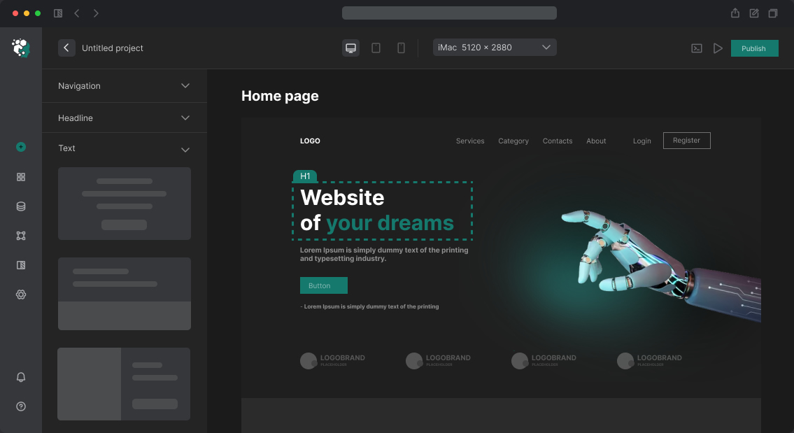
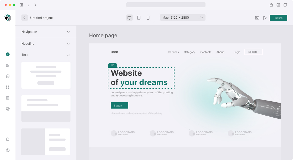


Designing Login and Registration Forms for Website
Login and registration forms are points of maximum friction. Poor design here directly converts to lost users: according to Baymard Institute, up to 23% of users abandon registration due to overly complex forms.
Components and States
Design covers not just the "empty" form, but the entire set of states:
- Placeholder and label (inline vs floating label)
- Focus state with clear outline
- Validation error (inline, below field, red border)
- Successful completion (green checkmark or neutral indicator)
- Button loading state (spinner + disabled)
- Successful completion (success screen or redirect)
Floating label (label inside field, moving up on focus) is a popular pattern, but works poorly with browser autofill: label and value overlap. For most sites, static label above the field is more reliable.
Registration: Minimum Fields
Rule: registration via email requires maximum two fields — email and password. Name, phone, birthday should be collected after first login, in onboarding flow. Each additional field reduces conversion by 4–8%.
Social Buttons (OAuth)
If login via Google, GitHub, Apple is supported — buttons must match provider brand guidelines. Google requires exact compliance: white background, Google logo SVG, text "Sign in with Google" without abbreviations. Apple requires black or white option, no colored modifications. Violating rules can result in OAuth app blocking.
Timeline
Designing login and registration forms in Figma with all states, desktop + mobile: 1–2 working days.