

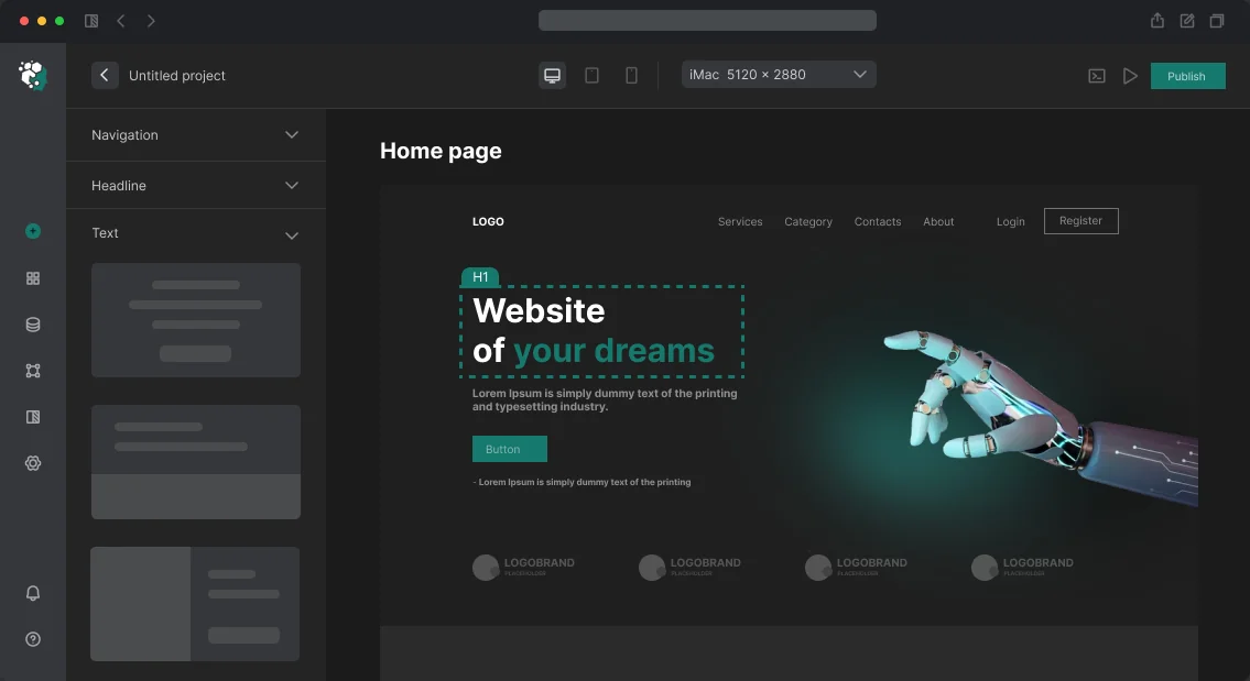
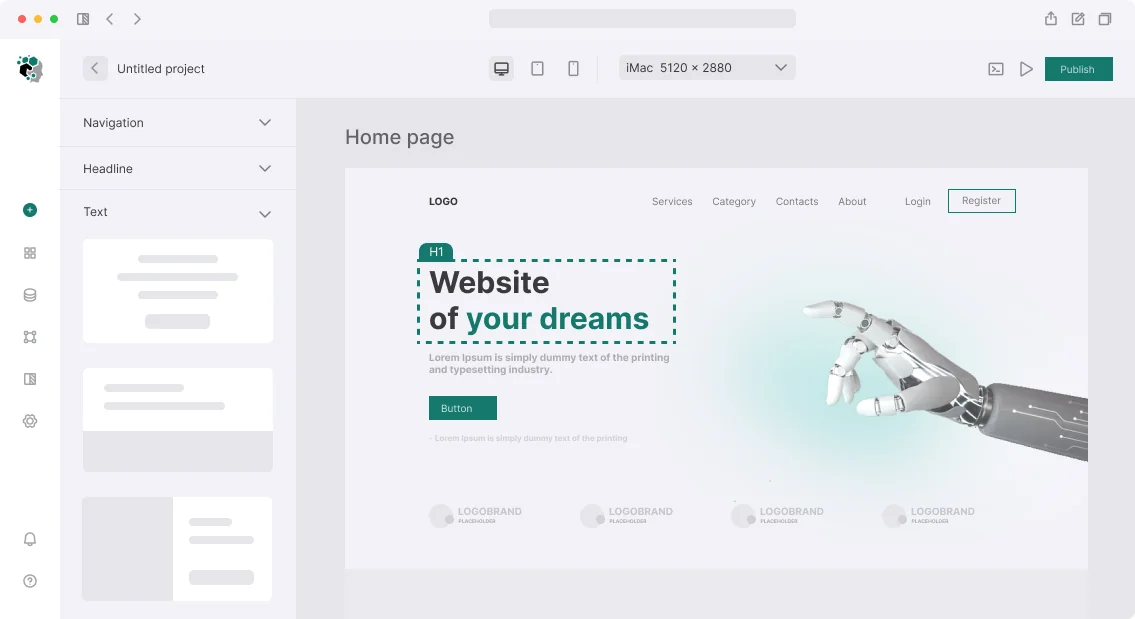




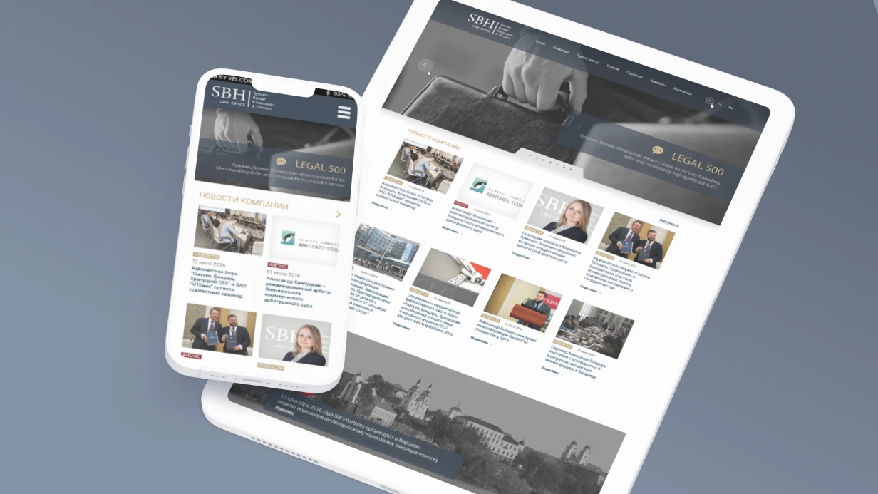

We design high-conversion product cards for online stores. Every unrealized purchase is a lost conversion. Online stores lose up to 30% of orders due to poorly designed product cards: slow galleries, unclear variant selection, lack of trust. Product card design directly addresses these issues. For example, for an electronics store, we redesigned the card: added a 360° gallery, sticky CTA, and review block. Conversion grew by 35% in two weeks, and average check by 12%. When designing a product card, we eliminate obstacles step by step and increase sales by an average of 25–40%. Our product card design services start at $800. Get a consultation for your product card now.
How Product Card Design Increases Conversion
It's on the product page that the user decides to buy. The design must remove all obstacles between "I'm interested" and "add to cart": provide complete information, show the product from all sides, answer questions before they arise. A well-designed card turns a casual visitor into a buyer. A/B tests show that a card with a quality gallery converts 1.5 times better than one without it. Our cards convert 2 times better than typical competitor solutions. We have completed 100+ projects with 5+ years on the market.
How Product Gallery Boosts Sales
The gallery is the most important element. Users don't buy what they can't see. According to research, a gallery with zoom increases purchase likelihood by 30%. On desktop, we use a main image of 600–800px with a vertical thumbnail strip on the left and zoom on hover (lens zoom or lightbox). On mobile — a horizontal swiper with indicator dots, pinch-to-zoom on tap, and full-screen view on swipe up. We add quick preview on thumbnail hover — this speeds up selection. Video reviews can boost conversion by an additional 15%.
Gallery content types:
| Type | Purpose |
|---|---|
| Studio shot (white background) | Details, official view |
| Lifestyle photo | Usage context |
| 360° view | Full inspection |
| Video review | Demonstration in use |
| Zoom details | Textures, seams, materials |
| Photo with dimensions | Helps with size |
Why Product Card UX Matters for Sales
Even with great design, poor usability kills conversion. 80% of users don't read long descriptions to the end — structure information in tabs. Time to first purchase decreases by 20% if you add checkout step indicators and clear CTAs. Using lazy loading for images reduces initial load time by 40%. Implementing critical CSS improves LCP by 15%.
Variant Selection
Color — visual swatches, not dropdown. Unavailable variants should be crossed out with a diagonal line, not hidden. Hover shows a preview of the photo change. Size — pill buttons with a modal size chart. Other variants — dropdown or radio buttons. When selected, price, availability, images, and SKU update. This reduces decision time by 25%.
Price and Promotion Block
Discounted price is displayed in large font, with the old price crossed out next to it. Savings are shown in currency or percentage. For time-limited promotions, use a countdown timer. A discount timer is only appropriate for real-time promotions — fake urgency destroys trust and violates advertising regulations. Displaying savings like "Save $120" increases click-through.
Shipping and Availability Block
Dynamic block that changes based on geolocation. Example: "In stock (142 pcs)." Show delivery times by courier ("tomorrow if ordered by 18:00"), pickup points, cost. Input field for city personalization. This reduces cart abandonment by 10%.
Description and Specifications
Structured description with tabs: "Description" (marketing text + features), "Specifications" (parameter table), "Reviews (48)", "Questions (12)". Specification table:
Manufacturer Apple
Model MacBook Pro 14"
Processor Apple M3 Pro, 11 cores
RAM 18 GB
Storage 512 GB SSD
Display 14.2", 3024×1964, 120 Hz
Battery 70 Wh, up to 18 hours
Weight 1.61 kg
Warranty 1 year
Reviews Block
Critical trust element. 94% of buyers read reviews before purchasing (BrightLocal). Structure: overall rating large + star distribution (horizontal bars). Filters: by star count, with photos, verified. Review cards: name, date, rating, text, photo/video, "Helpful?" button. Pagination or "Show more." Review form available for authorized buyers. Verified reviews increase conversion by 25%.
Sticky CTA on Mobile
The "Add to Cart" button fixed at the bottom of the screen when scrolling below the product area. Implementation with CSS using is-hidden class and sticky positioning:
Example CSS for sticky CTA
.product-cta-sticky {
  position: fixed;
  bottom: 0;
  left: 0;
  right: 0;
  padding: 12px 16px;
  background: #fff;
  box-shadow: 0 -4px 16px rgba(0,0,0,0.12);
  z-index: 100;
  display: flex;
  gap: 8px;
}
.product-cta-sticky.is-hidden {
  transform: translateY(100%);
}
Related Products
Three patterns: "Similar Products" (from the same category), "Bought Together" (collaborative filtering), "Recently Viewed" (history from localStorage). Carousel, not grid. This increases average order value by 18%.
What is Microdata and How It Affects SEO
Structured data using the Product schema helps search engines display price, availability, and rating directly in search results. Microdata can increase CTR from search by 15% (Search Engine Land). Additionally, using srcset for responsive product images improves page speed. Implementing critical rendering path optimization reduces FOUC by 30%.
Example JSON-LD markup
{
  "@context": "https://schema.org",
  "@type": "Product",
  "name": "MacBook Pro 14\" M3 Pro",
  "description": "Apple MacBook Pro laptop",
  "sku": "MRXU3LL/A",
  "brand": {
    "@type": "Brand",
    "name": "Apple"
  },
  "offers": {
    "@type": "Offer",
    "price": "189990",
    "priceCurrency": "RUB",
    "availability": "https://schema.org/InStock",
    "itemCondition": "https://schema.org/NewCondition"
  },
  "aggregateRating": {
    "@type": "AggregateRating",
    "ratingValue": "4.8",
    "reviewCount": "142"
  }
}
Impact of Elements on Conversion
| Element | Conversion Lift |
|---|---|
| Gallery | +20–30% |
| Reviews | +15–25% |
| Sticky CTA | +10–15% |
| Microdata | +5–10% |
Together these elements yield a conversion lift of up to 50%. Order a product card development and get a conversion boost.
What's Included in the Work and Timelines
Stages:
- Analytics: study user behavior, competitors, niche patterns.
- Design: wireframes for desktop and mobile, user flow.
- Visual design: in Figma, all states (hover, active, disabled, error).
- Frontend: responsive HTML/CSS/JS, CMS integration,
intersection observerfor lazy loading. - Testing: A/B tests on conversion, measure LCP/CLS/INP.
- Deployment and handover.
Timelines: basic design (desktop) — 3–4 days. Full project (desktop + mobile, all blocks, sticky CTA, cross-sell) — 6–10 days. We guarantee a result: a card that increases conversion by 15–30% compared to typical solutions. Our experience: 100+ projects completed, 5+ years on the market. Contact us for a project estimate — we'll show examples and calculate the cost.