

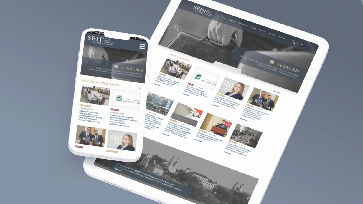
Over 60% of online course students use smartphones at least part of the time. Typical problems: tiny buttons (less than 44 pixels), slow video loading, loss of progress on switching. According to Google, 53% of mobile sessions leave a page if it takes longer than 3 seconds to load. An LMS with poor mobile UX loses up to 70% of users. We develop mobile interfaces that keep the student engaged: navigation, video, assignments — everything works on 375px. In one project, after implementing the mobile version, student engagement increased by 40%. This is not just "make it not break" but a rethinking of interaction.
Why Mobile First is Key to a Responsive LMS Interface
Mobile First means designing from the smallest screen upward. On 375px, priority is: current lesson, progress, next step. Everything secondary goes to additional screens. This ensures key functions are always at hand. Compare with the Desktop First approach:
| Aspect | Desktop First | Mobile First |
|---|---|---|
| Start development | From desktop (1024px+) | From mobile (375px) |
| Feature priority | All features at once | Only key features |
| Mobile performance | Often low | High by default |
| Speed to primary actions | Slower | Faster (bottom bar) |
| Offline mode | Added later | Considered from the start |
Which Gestures and Touch Interactions are Critical for LMS?
Navigation on mobile is built on gestures. Key ones:
- Swipe left/right — switching between lessons (react-swipeable)
- Pull to refresh — updating assignment lists
- Long press — context menu (save lesson, copy link)
- Pinch to zoom — for images and diagrams
import { useSwipeable } from 'react-swipeable'; function LessonSwipeNavigator({ onNext, onPrev }) { const handlers = useSwipeable({ onSwipedLeft: onNext, onSwipedRight: onPrev, trackMouse: false, delta: 50, // Minimum swipe distance preventScrollOnSwipe: false, // Don't block vertical scrolling }); return <div {...handlers} className="touch-pan-y">{/* content */}</div>; } All gestures must be configured so they don't block vertical scrolling — a common mistake that degrades user experience.
Navigation: Bottom Tab Bar vs Side Menu
On desktop, a side menu with the full course tree. On mobile, a bottom tab bar with 4–5 icons. According to User Experience studies, bottom tab bar outperforms side menu on mobile by 2x in speed of accessing sections.
function MobileBottomNav() { return ( <nav className="fixed bottom-0 left-0 right-0 h-16 bg-white border-t border-gray-200 flex items-center justify-around safe-area-inset-bottom // iOS notch support md:hidden"> {/* Hide on tablets+ */} <NavItem icon={<HomeIcon />} label="Courses" to="/" /> <NavItem icon={<BookOpenIcon />} label="Lessons" to="/lessons" /> <NavItem icon={<CheckSquareIcon />} label="Assignments" to="/assignments" /> <NavItem icon={<UserIcon />} label="Profile" to="/profile" /> </nav> ); } Video Player on Mobile
Video takes 100% of screen width. On rotation, automatically goes fullscreen (or offers). Control buttons are enlarged to 44×44px (minimum Apple Human Interface Guidelines).
function MobileVideoPlayer({ src, posterUrl }) { const videoRef = useRef<HTMLVideoElement>(null); // Auto-fullscreen on rotation for iOS useEffect(() => { const handleOrientationChange = () => { if (screen.orientation?.angle === 90 || screen.orientation?.angle === 270) { videoRef.current?.webkitEnterFullscreen?.(); } }; window.addEventListener('orientationchange', handleOrientationChange); return () => window.removeEventListener('orientationchange', handleOrientationChange); }, []); return ( <div className="relative w-full aspect-video bg-black"> <video ref={videoRef} className="w-full h-full" src={src} poster={posterUrl} playsInline // Important for iOS: don't open system player controls preload="metadata" /> </div> ); } How to Test Mobile LMS Interface?
We test on real devices: iPhone SE (375px), Android mid-range (360px), iPad (768px). We use BrowserStack or physical devices. We run Lighthouse Mobile audit: Performance > 75, no layout shift on mobile. Additionally, we test gesture behavior and offline mode. Our experience: 5 years in LMS development, over 50 projects. We guarantee the interface will be equally convenient on all devices.
Offline Mode with PWA and Service Worker
A critical feature for LMS: student on the subway without network. Progressive Web App + Service Worker cache viewed lessons:
// service-worker.js — caching videos and materials self.addEventListener('fetch', event => { if (event.request.url.includes('/api/lessons/')) { event.respondWith( caches.open('lessons-v1').then(cache => cache.match(event.request).then(cached => { if (cached) return cached; return fetch(event.request).then(response => { cache.put(event.request, response.clone()); return response; }); }) ) ); } }); Offline video is a more complex task (file sizes). Solution: a "Download for Offline" button downloads the lesson into IndexedDB via the file-system-access API or native storage (React Native).
Touch Target Sizes and Accessibility
/* Minimum 44×44px for all interactive elements */ .btn, a, button, [role="button"] { min-height: 44px; min-width: 44px; padding: 12px 16px; } /* Assignments on mobile — large cards instead of table */ @media (max-width: 768px) { .assignments-table { display: none; } .assignments-cards { display: flex; flex-direction: column; gap: 12px; } } Adaptation of Complex Elements
| Element | Desktop | Mobile |
|---|---|---|
| Course navigation | Side panel | Bottom sheet or Drawer |
| Forum | 2 columns | 1 column with filter |
| Gradebook | Table | Student list → details |
| Answer editor | Fullscreen Tiptap | Simplified markdown editor |
Common Mistakes in LMS Mobile Adaptation
- Ignoring safe-area-inset for iOS
- No alternative navigation for tablets
- Incorrect gesture handling interfering with scrolling
- Too small touch targets (less than 44×44px)
- No offline access to viewed materials
Process of LMS Interface Adaptation
- Analytics and prototyping — define critical scenarios on mobile.
- Navigation and gesture design — choose patterns (bottom tab bar, swipe, etc.).
- Component development — bottom tab bar, video player, offline cache.
- PWA integration — Service Worker, manifest, icons.
- Testing on real devices — check gestures, offline, performance.
- Documentation and access transfer — architecture description and instructions.
- Post-launch support — monitoring and fixes.
What You Get After Adaptation?
- Fully adapted interface for mobile devices (375px+).
- PWA with offline access to lessons.
- Documentation on architecture and deployment instructions.
- Access to source code and repository.
- Training for your support team.
- Guarantee (5 years experience, 50+ projects).
Timelines
Adaptation of existing LMS interface for mobile: navigation, video player, lesson and assignment list — from 7 to 10 days. PWA with offline lesson caching — additional 3 to 5 days. Cost is calculated individually. To evaluate your project, contact us — we'll prepare a commercial proposal within 1 business day. Get a consultation for your project — we'll assess complexity and timelines.