





Multi-Page Corporate Website Design with Atomic Design System
Corporate websites often need to serve multiple audiences—clients, partners, job seekers, journalists—each with different goals. Designing an interface that guides all of them without friction is a challenge. We solve this with atomic design and a Figma Variables–based design system, reducing development cost by 20–30% compared to page-by-page design and accelerating approval.
The Challenges We Solve
Typical problems include responsiveness across all devices, multi-language support, CMS integration, and image optimization for different breakpoints. A design system with variables and components solves these automatically—change a token, and all pages update. Budget savings can reach 40% during the coding phase.
For example, on a recent logistics company project, we reduced the number of unique page templates from 30 to 12 by building a flexible component library. This cut the design-to-development handoff time by 40% and eliminated rework on repeated elements.
Our Approach: Design System with Atomic Design
Creating layouts "one by one" is slow and expensive. The right approach: design system first, pages second. The atomic structure (based on the Atomic Design methodology) includes:
| Level | Content |
|---|---|
| Tokens | Colors, typography, spacing, shadows, border-radius |
| Atoms | Buttons, inputs, icons, tags, badges |
| Molecules | Service card, case preview, contact block |
| Organisms | Header, footer, services section, team block |
| Templates | Page grid, organism placement logic |
| Pages | Final layouts with real content |
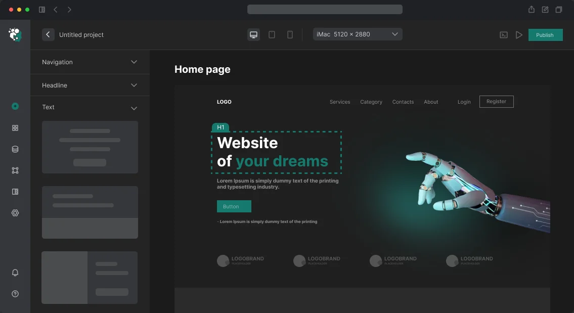
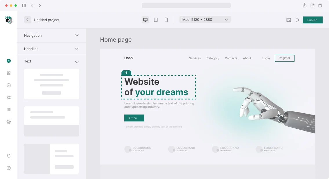
In Figma, we organize this through Variables for tokens and Component Properties for component variants. Switching between Light and Dark mode uses Variable Modes, not file duplication.
What's Included in a Corporate Website Design
A typical project covers 15–40 unique layouts. Not every page has a unique structure—some are built from reusable blocks. But these sections often require separate architecture:
- Homepage – hero section, brief product/service navigation, trust block (clients, numbers, certifications), CTA
- About Us – history, team, values, structure; often non-linear layout
- Services/Products – section template + card template + detail page
- Case Studies – listing + detail page with custom layout per case
- Blog / Press Center – listing, article, categories
- Careers – job listing, job page, application form
- Contact – map, form, details
Navigation for Corporate Sites
Navigation is the most common failure point. A mega menu with 40 items on hover is a classic antipattern. Good navigation solves multiple tasks at once.
The menu structure should reflect user goals, not the company org chart. Typical mistake: "About Us" → "Structure" → "Department X" → "Team". The user wants "who I'll work with", not an org chart.
For a corporate site with 50+ pages, we design navigation with two to three levels:
- Primary navigation: 5–7 items, no dropdowns
- Side navigation inside sections: for deep areas (services, documentation)
- Mega menu – only if there's a real need to cover 3+ subsections
Breadcrumbs are mandatory for sections deeper than level two. Anchor navigation for long service pages.
Mobile navigation is designed separately. A burger menu is not a solution for complex hierarchies. On mobile, a bottom navigation bar (for 4–5 key sections) plus a slide-out drawer with the full structure works better. Level switching uses slide animation, not full overlay replacement.
Typical Navigation Mistakes
Details
- Copying the company org chart into the menu - More than 10 menu items without grouping - Missing search on content-heavy sites - Ignoring touch targets on mobile (minimum 44×44 px)Grids and Breakpoints
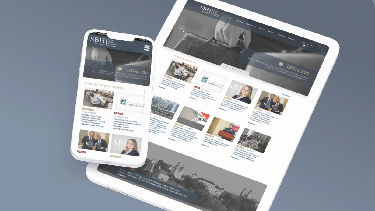
Corporate sites live on all devices. We design for three main breakpoints:
| Device | Width | Columns | Gutter |
|---|---|---|---|
| Desktop | 1440px | 12 | 24px |
| Tablet | 768px | 8 | 16px |
| Mobile | 375px | 4 | 16px |
If needed, we add a 1920px breakpoint for wide screens. Tablet grids can use 8 columns or 12 with increased gutter. On mobile, we use 4 columns with 16px margin. Content pages strictly follow the grid, while hero sections and special pages (cases) may break out for full-width elements.
Typography and Colors
Corporate style is usually defined by a brand book. If not, we create it within the project. Minimum set:
- Primary font: one sans-serif for UI (Inter, IBM Plex Sans, Manrope—good screen readability)
- Accent font: optional, for headings (display or serif)
- Size scale: 12/14/16/18/20/24/32/40/48/56px—at least 6–7 steps
Color palette: primary + secondary + neutral (grey scale) + semantic (success, warning, error, info). We check contrast against WCAG 2.1 AA for all text/background pairs.
Our Design Process
- Analysis, moodboard, direction approval – 3–5 days
- Design system (tokens, components) – 5–8 days
- Key pages (home, service, about) – 5–7 days
- Remaining pages (via templates) – 7–14 days
- Responsive adaptation for all layouts – 4–7 days
- Revisions and finalization – 3–5 days
Total: 4 to 8 weeks, depending on the number of unique pages and approval speed. Projects with extensive structure (30+ pages) and complex animations may take up to 10–12 weeks.
If you have a ready brand book, we use it as a base. If not, we build a visual system from scratch. Contact us to discuss your project—we will prepare a custom proposal.
Handoff to Development
Final Figma layouts include:
- Auto Layout on all components
- Correct constraints for responsiveness
- Exported assets for icons and images
- Dev Mode annotations for spacing and tokens
- Prototype with navigation transitions
Developers work directly with Figma via Dev Mode—measurements are taken from the design, not from manual specs. Get a consultation on your project—we will calculate timelines and budget.