

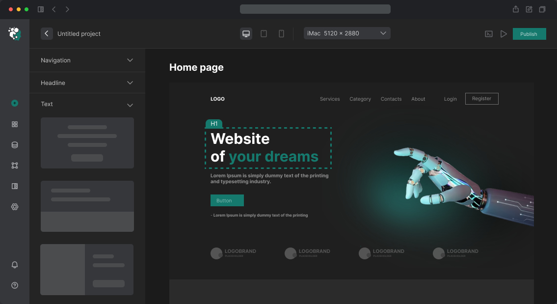
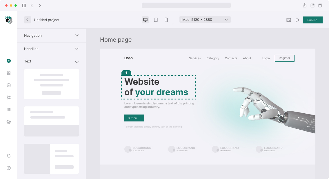
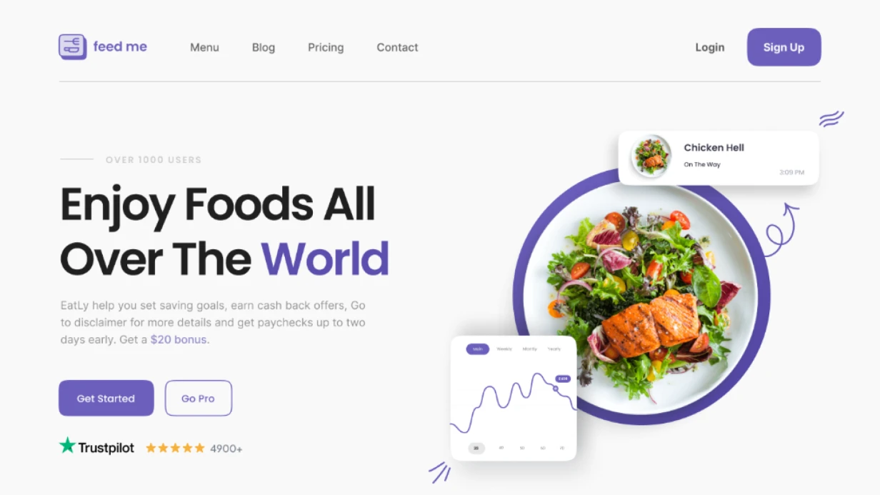

CTA Button and Call-to-Action Optimization on Website
CTA (call-to-action) — the point where user intent converts to action. A "Leave inquiry" button with the right context, color, position and text works fundamentally differently than the same button moved down the page or with text changed to "Submit". CTA optimization is not design for design's sake, but work with behavioral factors.
Diagnosing Current State
Before changing buttons, understand how users interact with them now.
Click tracking via GA4:
// gtag event to track CTA clicks
document.querySelectorAll('[data-cta]').forEach(btn => {
  btn.addEventListener('click', () => {
    gtag('event', 'cta_click', {
      cta_id: btn.dataset.cta,
      cta_text: btn.textContent.trim(),
      page_location: window.location.pathname,
      scroll_depth: Math.round(window.scrollY / document.body.scrollHeight * 100)
    });
  });
});
Heatmap analysis — click maps show click distribution. Common patterns:
- users click on non-editable text, mistaking it for a button
- ignore button because it doesn't look clickable
- click button they consider secondary instead of primary
Scroll depth — if 60% of users don't scroll to CTA, problem is position, not button.
Button Text: Most Important
CTA text should describe action result, not the action itself. The difference:
| Weak Text | Strong Text |
|---|---|
| Submit | Get audit |
| Learn more | View cases |
| Sign up | Start free |
| Buy | Get 30-day access |
| Request call | We'll call in 15 minutes |
Guidelines for length: 2–5 words. More and you lose focus and button looks cluttered. First-person verbs ("I want to get") sometimes work better than imperative ("Get"), but this is hypothesis for test, not universal rule.
Micro-copy under button reduces anxiety:
[Get pricing estimate]
No prepayment. We'll respond within 2 hours.
Or:
[Download template]
PDF, 12 pages. No registration.
Visual Design
Color. Principle is not "red is better than green", but "contrast to background and sufficient difference from other interactive elements". CTA should be the only element of that color. If all links and buttons are blue — highlighting CTA is impossible without changing color scheme.
Contrast check: color-to-background ratio — minimum 4.5:1 (WCAG AA). Online: WebAIM Contrast Checker. In Figma: Contrast plugin.
Size. Touch target on mobile — minimum 44×44px (Apple HIG), 48×48dp (Material Design). Internal padding usually 12px 24px for desktop, 14px 20px for mobile.
.btn-primary {
  display: inline-flex;
  align-items: center;
  justify-content: center;
  min-height: 48px;
  padding: 12px 24px;
  font-size: 1rem;
  font-weight: 600;
  line-height: 1;
  border-radius: 6px;
  background-color: var(--color-action-primary);
  color: var(--color-on-primary);
  cursor: pointer;
  transition: background-color 0.15s ease, transform 0.1s ease;
}

.btn-primary:hover {
  background-color: var(--color-action-primary-hover);
}

.btn-primary:active {
  transform: scale(0.98);
}

.btn-primary:focus-visible {
  outline: 3px solid var(--color-focus-ring);
  outline-offset: 2px;
}
Icons. Arrow next to "Proceed to checkout" button reinforces direction perception. But icon for icon's sake is noise. Rule: icon adds value text doesn't convey fast enough.
Position and Quantity of CTA
Above the fold. Main CTA should be visible without scroll on 90% of audience screen resolutions. Check via DevTools with various viewport sizes: 375px (iPhone SE), 390px (iPhone 14), 768px (iPad), 1280px (typical laptop).
Quantity. One primary CTA per screen. If secondary exists (e.g. "Watch demo" next to "Start free"), it should be visually subordinate — outline or text-only style, smaller size.
Repeat on long pages. Rule: CTA repeats every 2–3 content blocks. On 2000px landing — minimum 3 occurrences. Text can vary slightly: first — "Start", second — "Get consultation", third (after cases block) — "Discuss my project".
Sticky CTA on mobile. Fixed button at bottom when scrolling — increases mobile conversion but covers content. Implemented with position: fixed; bottom: 0 and hidden when footer reached:
const footer = document.querySelector('footer');
const stickyBtn = document.querySelector('.sticky-cta');

const observer = new IntersectionObserver(
  ([entry]) => {
    stickyBtn.hidden = entry.isIntersecting;
  },
  { threshold: 0 }
);

observer.observe(footer);
Button States
Complete state set for production button:
- default — base appearance
- hover — background/shadow change, cursor: pointer
- active / pressed — slight scale reduction (0.97–0.99)
- focus-visible — visible outline for keyboard navigation
-
loading — spinner + "Sending..." text +
disabled, prevents resubmit - disabled — reduced opacity, cursor: not-allowed, aria-disabled="true"
- success — optional state after successful action
<button
  type="submit"
  disabled={isLoading || isDisabled}
  aria-disabled={isLoading || isDisabled}
  aria-busy={isLoading}
>
  {isLoading ? (
    <>
      <Spinner aria-hidden="true" />
      <span>Sending...</span>
    </>
  ) : (
    'Get estimate'
  )}
</button>
Urgency and Social Proof Near CTA
Elements placed near button affect conversion:
- "3 spots left this week" — scarcity (works if truthful)
- "Already 847 companies" — social proof
- "No obligation. Free 30-minute consultation" — barrier removal
- Avatars + customer names near button — trust via faces
Abusing false urgency ("00:05:00 remaining" timer that resets on reload) destroys trust and often violates advertising regulations.
Timeline
Audit + CTA optimization within existing design without page redesign — 2–3 working days. A/B hypothesis development, variant preparation, tracking setup — +2 days. Test support and results analysis — separate based on traffic collected.