

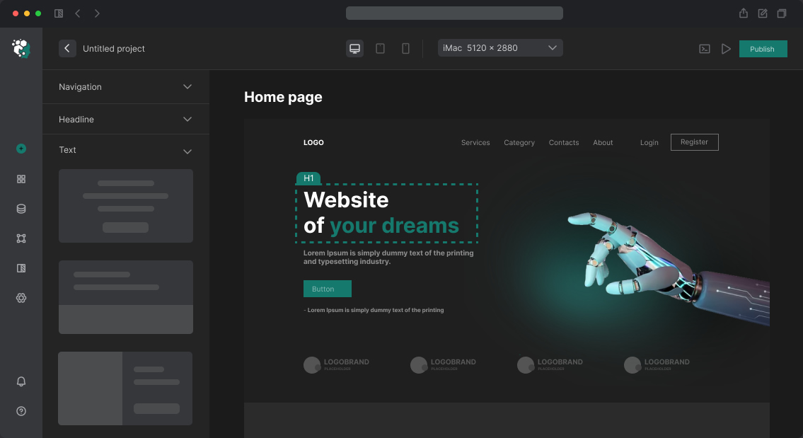
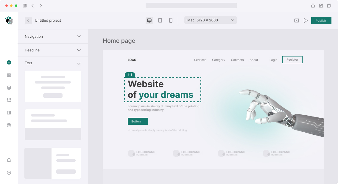

Website Custom Typography Development
Typography is not choosing a pretty font. It's a system: typeface, size scale, line height, tracking (letter-spacing), line width limit. Poor typography doesn't make text "ugly" — it makes it hard to read, and users leave without understanding why.
Font Selection
System fonts (-apple-system, BlinkMacSystemFont, 'Segoe UI', sans-serif) — fastest option: no loading, no FOUT (Flash of Unstyled Text). Fits product UI where font isn't part of brand.
Google Fonts — free, large selection, CDN. Minus: DNS request to external domain. Solution: self-hosting via @fontsource (npm packages for each font) or download and connect via @font-face.
Commercial fonts (Klim Type, Hoefler & Co, FontShop) — paid, unique, often web license is separate. Check webfont license mandatory: desktop license for font doesn't mean web usage right.
For UI font selection:
- Grotesques (sans-serif): Inter, Geist, IBM Plex Sans, Manrope, Plus Jakarta Sans
- Serifs: Georgia (system), Playfair Display (Google), Lora, Source Serif 4
- Monospace for code: JetBrains Mono, Fira Code, IBM Plex Mono
One-two fonts per project — rule. Three or more — only with clear role separation.
Type Scale (Size Scale)
Sizes are not arbitrary numbers but proportional scale. Popular bases:
Modular Scale with ratio 1.25 (Major Third): 12 → 15 → 19 → 24 → 30 → 38 → 48 → 60px
Tailwind CSS (default):
xs:12, sm:14, base:16, lg:18, xl:20, 2xl:24, 3xl:30, 4xl:36, 5xl:48, 6xl:60
For most projects 6–8 steps are enough. More important than size count is consistent application: one size — one role.
Line Height
Recommended coefficients:
- Headings (40px+): 1.1–1.2
- Subheadings (24–36px): 1.2–1.3
- Main text (16–18px): 1.5–1.6
- Small text (12–14px): 1.4–1.5
- Single-line UI elements (buttons, badge): 1.0–1.25
Line wider than 70–75 characters reads worse: eye loses line beginning next. max-width: 65ch on text blocks — good practice.
Letter Spacing (Tracking)
Main text: 0 or −0.01em (slightly compress Inter and similar fonts — they're optimized for large sizes). Large headings: from −0.02em to −0.04em — large text "falls apart" without negative tracking. All-caps labels: +0.05em–+0.1em — small caps without tracking reads poorly.
Responsive Typography
On mobile devices headings reduce. Implementation options:
Fluid typography (CSS clamp):
font-size: clamp(2rem, 5vw + 1rem, 4rem);
Size smoothly changes between minimum and maximum values.
Breakpoint-based — simpler, predictable:
- Mobile: H1 = 32px, H2 = 24px
- Desktop: H1 = 56px, H2 = 40px
In Figma — two Typography Scale components or use Variables for font-size.
Timeline
Typography system development (font selection and connection, size scale, line-height, letter-spacing, responsive, Figma Text Styles) — 2–3 days: font research and approval, scale building, Text Styles creation in Figma, specification for development.