


Developing Dark Theme (Dark Mode) for Website
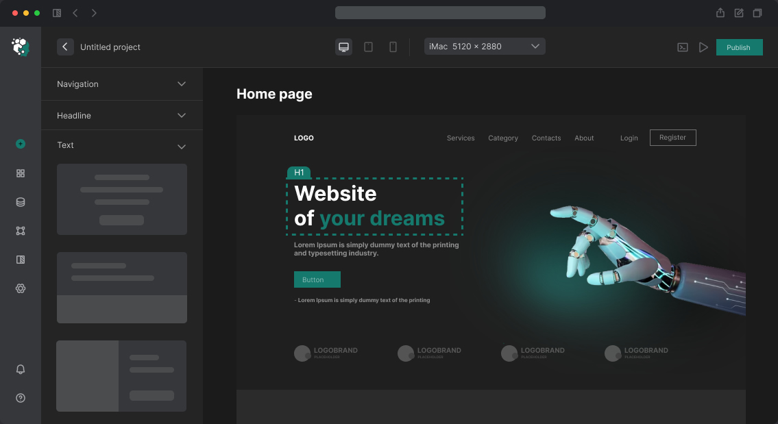
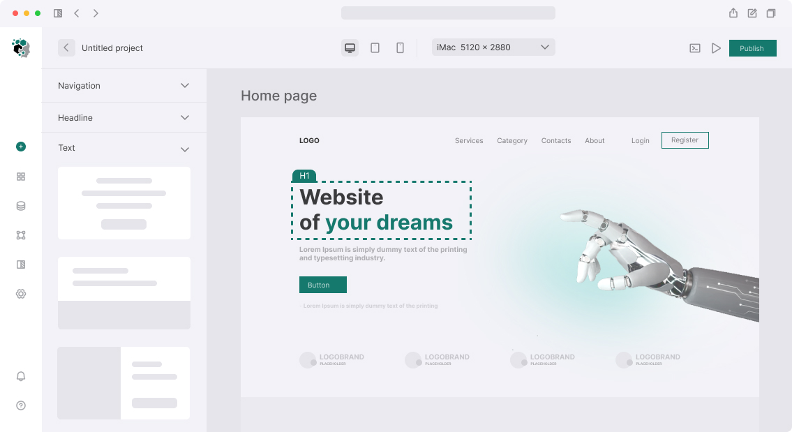
Dark mode is not color inversion. It's a separate color scheme that needs to be designed as carefully as the light one. Simple inversion (filter: invert(1)) produces unacceptable results: photos with negative, logos black-and-white, color accents inverted. Proper dark mode is reworking each color token.
Why Dark Mode is Harder Than It Seems
Light theme is built on white background with dark text — high contrast by default. In dark theme you need to create surface hierarchy without using white:
- Page background: darkest shade
- Surface (cards, panels): slightly lighter than background
- Surface raised (modals, dropdown): even lighter
- Surface overlay: lightest of neutrals
Typical scale for dark theme based on gray (Tailwind notation): gray-950 background, gray-900 surface, gray-800 raised, gray-700 overlay. Or custom values: #0F0F0F, #1A1A1A, #252525, #2E2E2E.
Design Through Tokens
Right architecture: don't hardcode colors in components, use semantic tokens.
| Token | Light | Dark |
|---|---|---|
--color-bg-primary |
#FFFFFF |
#0F0F10 |
--color-bg-surface |
#F9FAFB |
#1C1C1E |
--color-bg-raised |
#FFFFFF |
#2C2C2E |
--color-text-primary |
#111827 |
#F9FAFB |
--color-text-secondary |
#6B7280 |
#9CA3AF |
--color-text-disabled |
#D1D5DB |
#4B5563 |
--color-border-default |
#E5E7EB |
#374151 |
--color-accent-primary |
#2563EB |
#3B82F6 |
Note: accent color in dark mode shifts to lighter shade. blue-700 on white background is contrasting. Same blue-700 on gray-900 — no: WCAG AA contrast requires minimum 4.5:1 for main text. blue-500 on gray-900 — already passes.
Contrast Verification
Check each text/background pair by WCAG 2.1:
- Normal text (up to 18px regular / 14px bold): minimum 4.5:1
- Large text (18px+): minimum 3:1
- UI components (icons, borders): minimum 3:1
Tools: Figma plugin Colour Contrast Analyser, WebAIM Contrast Checker, axe DevTools in browser. In Figma Variables dark mode is not just "change colors manually" but Variable Mode switching.
Dark Theme Specifics: Shadows, Images, Icons
Shadows don't work in dark mode: shadow box-shadow: 0 4px 16px rgba(0,0,0,0.1) on dark background is invisible. Replacement: border: 1px solid var(--color-border-default) or lighter surface (elevation through color, not shadow).
Images and photos usually left unchanged. Sometimes add slight darkening: filter: brightness(0.85) — so bright photos don't "stand out" on dark background.
Icons — SVG with currentColor inherit text color automatically. PNG and raster icons — separate set or filtering.
Logos — often need light logo version for dark background. Separate asset, not automatic switching.
Theme Switching Implementation
Theme switching is implemented through CSS class on <html>:
:root { --color-bg: #fff; }
html.dark { --color-bg: #0f0f10; }
Or through prefers-color-scheme media query for automatic system mode. Best practice — both: system preferences by default + manual switching with localStorage save.
In Figma Variables → Modes: create Light and Dark modes for each token collection. Switching happens in prototype through Variable Mode Interaction.
Special Cases: Charts, Maps, Media
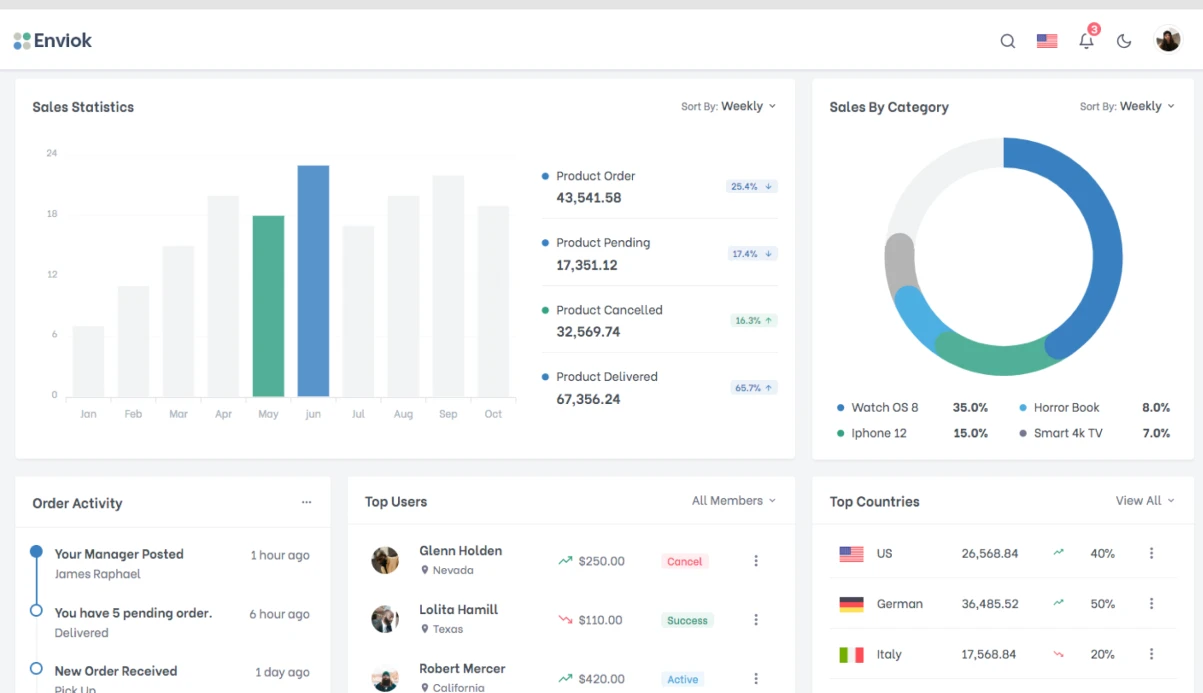
Charts (Chart.js, Recharts, D3) require separate color palettes for dark mode. Dark data series on light background aren't readable on dark. Usually need 2 sets of series colors.
Maps (Google Maps, Mapbox) — switch to dark style through separate mapId or style. Mapbox: style: 'mapbox://styles/mapbox/dark-v11'. Google Maps: separate mapId with dark style through Cloud Console.
Timeline
| Stage | Time |
|---|---|
| Audit existing light theme, token inventory | 1–2 days |
| Create dark palette and check contrast | 2–3 days |
| Rework all components for dark mode | 4–8 days |
| Specify switching and edge cases | 1–2 days |
Total: 8–15 days on project with ready light theme. If design system is built from scratch with two modes at once — adds 30–40% to overall design time.