

Homepage Design Development
The homepage is the most expectation-laden page on a website. Marketing wants to fit everything in, the CEO wants to see the mission, sales want the inquiry form, the SEO specialist wants keywords. Without clear hierarchy, you end up with a page that tries to say everything and says nothing.
The design task for the homepage is not to show everything, but to guide the visitor toward the target action while providing enough context for decision-making.
Homepage Anatomy
The structure consists of blocks, the order of which is determined by business model and audience. A typical sequence for B2B:
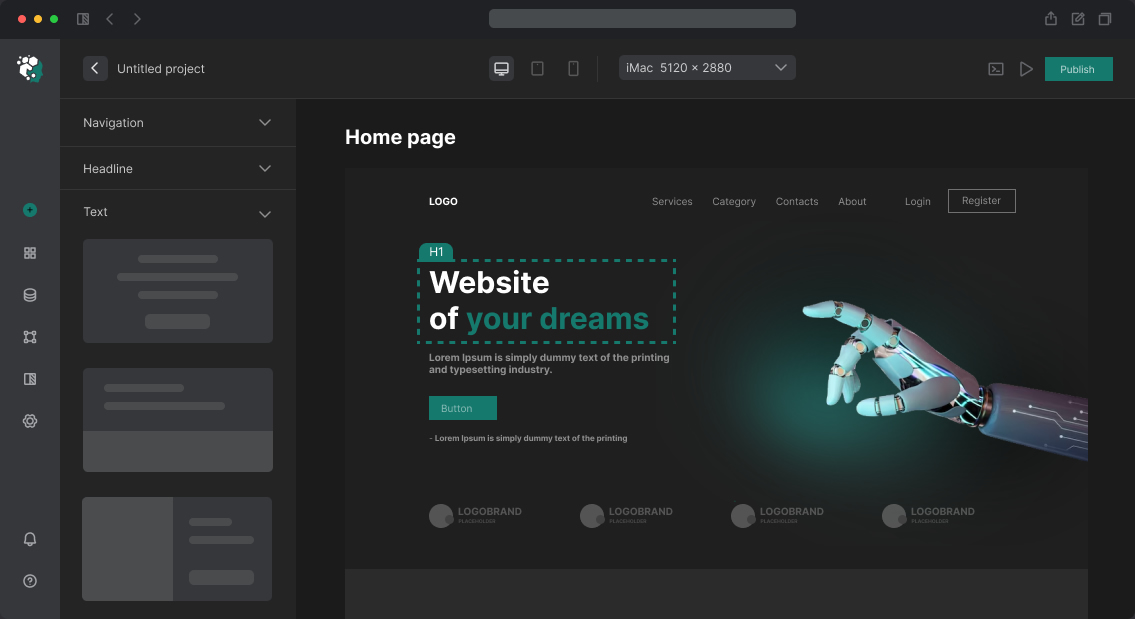
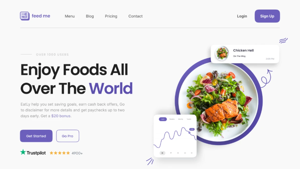
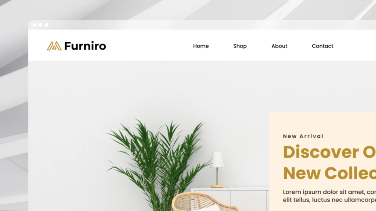
Hero section — first 100vh. Must answer three questions in 5 seconds: what is this, for whom, what to do. The headline is a concrete value proposition, not a slogan. CTA — one button, not three. Visual — product screenshot or real usage context, not stock handshake.
Social proof — client logos, metrics ("1200+ projects", "8 years on market"), Clutch/G2 ratings. Positioned immediately after hero — removes initial skepticism.
Product/service description — not a feature list, but problems solved. Feature → Benefit → Proof.
Offer details — how it works (3–5 steps), what's included, competitive advantages. Icons, illustrations, short descriptions work well here.
Cases and results — specific numbers, specific companies. "Increased conversion by 40%" is better than "help business grow".
Repeat CTA — at the end of the page for those who read through. Different format: feedback form instead of "Contact" button.
Footer — navigation, contacts, legal.
Deep Dive: Hero Section
Hero is the point of maximum attention and maximum exit decisions. Analysis of typical mistakes:
Abstract headline — "We create the future of your business" conveys nothing. "CRM for construction companies: from estimate to handover" — specific, addressed, contextual.
Two CTAs in hero — "Try free" and "Watch demo" simultaneously create choice paralysis. One primary CTA, second as text link or ghost button.
Auto-playing video background — pretty, but heavy (bandwidth), distracts from text, doesn't work on weak devices. Alternative: static video frame with play button or CSS/Lottie loop animation weighing 50–100 KB.
Vertical viewport on mobile — hero on desktop is horizontal (text left, image right), on mobile needs reordering: text top, image bottom, or remove image entirely.
Example of successful solution: for a warehouse management SaaS product, replaced abstract hero ("Optimize logistics with us") with hero featuring concrete metric in headline ("Reduce inventory errors by 73% in 3 months") and dashboard screenshot instead of illustration. Bounce rate dropped from 68% to 51%.
Animations and Interactivity
Animations on the homepage should strengthen the message, not be an end in themselves. Working patterns:
- Scroll-triggered animations — blocks appear on scroll (Intersection Observer API). Light fade-up 200–300ms is sufficient; complex sequence animations slow content perception
- Counter animations — numeric metrics "count up" when appearing in viewport. Library: CountUp.js or CSS @keyframes
- Hover micro-interactions — case cards lift slightly, buttons change color with 150ms transition
Heavy animations on JS libraries (GSAP ScrollTrigger, Three.js) — only if it's part of the brand and there's budget for optimization. Bundle bloats, LCP grows, Google PageSpeed falls.
Timeline
Designing a homepage across three breakpoints — 5–8 working days. Includes: concept + structure agreement, final design, animation annotations.