

Developing Light Theme (Light Mode) for Website
Light theme is the basic mode of most web products. Not because it's "better" than dark, but because historically all web typography and most UX conventions are built for light background. Contrast, readability, perception of hierarchy — all this is easier to provide on white surface if approached systematically.
Color Architecture of Light Theme
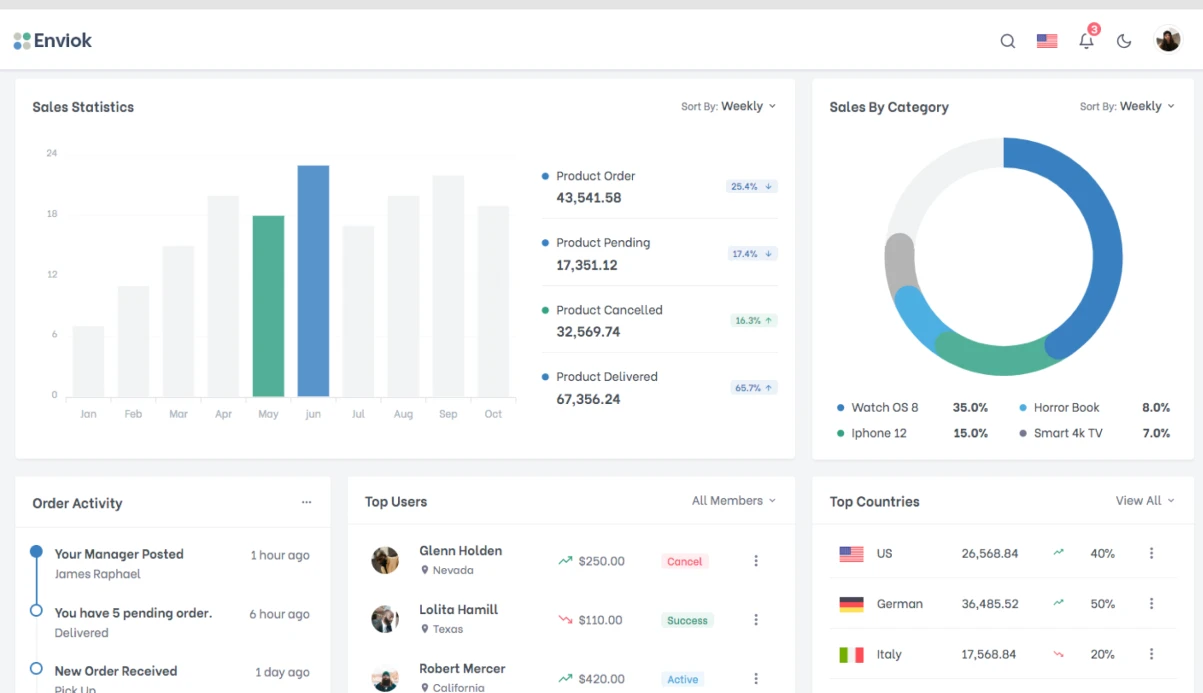
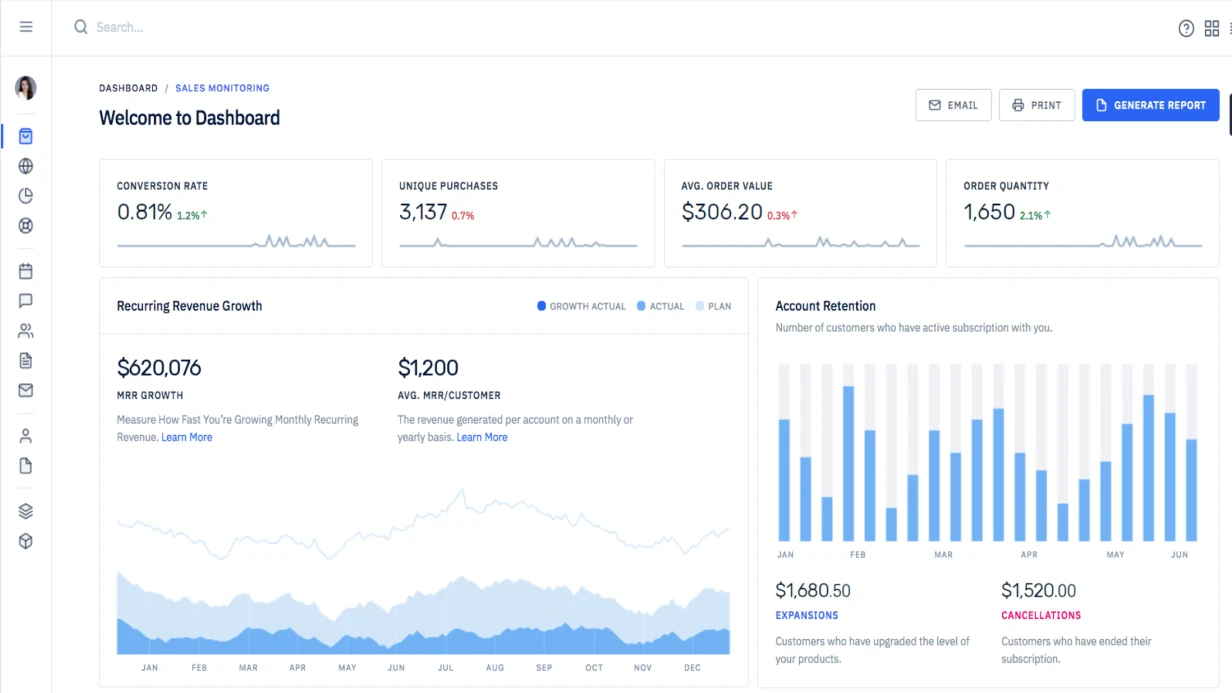
Good light theme is not just "white background and blue buttons". It's built on several surface levels:
-
Background:
#FFFFFFor off-white (#FAFAFA,#F9FAFB) — main page surface -
Surface: slightly different from background — for cards, panels (
#F3F4F6) -
Surface raised: for components above main content — dropdown, tooltip (
#FFFFFFwith shadow) - Surface overlay: for modal, drawer — with semi-transparent overlay on top
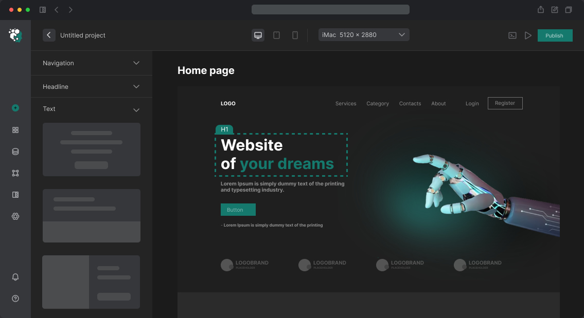
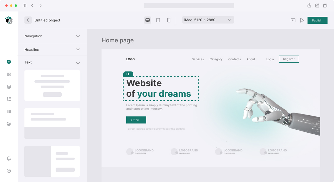
Many designers put #FFFFFF everywhere and get flat interface without hierarchy. Difference in 4–8 gray values creates depth without shadows.
Typographic Scale
For light theme, text hierarchy is built through:
-
Color: primary text
#111827, secondary#6B7280, disabled#9CA3AF - Size: H1 40–56px, H2 32–40px, H3 24–28px, Body 16px, Small 14px, Caption 12px
- Weight: Regular 400 for body, Medium 500 for label, Semibold 600 for H3-H4, Bold 700 for H1-H2
Never use pure black #000000 for main text on white background — too high contrast causes fatigue in long reading. #111827 or #1F2937 — optimal option.
Accent Colors and States
For buttons, links and interactive elements need state scale:
| State | Background | Text |
|---|---|---|
| Default | #2563EB (blue-600) |
#FFFFFF |
| Hover | #1D4ED8 (blue-700) |
#FFFFFF |
| Active/Pressed | #1E40AF (blue-800) |
#FFFFFF |
| Disabled | #BFDBFE (blue-200) |
#93C5FD |
| Focus | default + ring 2px #93C5FD |
— |
Semantic colors:
- Success: green-600 / green-50 (badge background)
- Warning: amber-600 / amber-50
- Error: red-600 / red-50
- Info: blue-600 / blue-50
Shadows in Light Theme
Shadows are the main tool for elevation in light theme (unlike dark where elevation is conveyed by surface color):
-
Shadow-sm:
0 1px 2px rgba(0,0,0,0.05)— subtle, for cards -
Shadow-md:
0 4px 6px rgba(0,0,0,0.07), 0 2px 4px rgba(0,0,0,0.06)— dropdown, tooltip -
Shadow-lg:
0 10px 15px rgba(0,0,0,0.1), 0 4px 6px rgba(0,0,0,0.05)— modal, popover -
Shadow-xl:
0 20px 25px rgba(0,0,0,0.1)— floating panels
Realistic shadows — two layers: near (smaller radius, higher opacity) and far (larger radius, lower opacity). This follows light scattering physics.
If It's Part of Dual-Theme Project
If dark theme is developed in parallel — light is designed through tokens from the start. Each color is CSS Custom Property or Figma Variable, not hardcoded value in component. This allows switching theme with one <html> class without changing components.
Timeline
Developing light theme as part of design system — included in base design scope. As separate task (standardizing existing product, creating system tokens) — 3–6 days: audit existing colors, create tokens, check contrast, update components.