


Web Application Loading State Design (Skeleton/Shimmer)
A spinner is the simplest way to show loading, but far from the best. When users see a spinning circle, they don't understand what exactly is loading or how long to wait. Skeleton screens solve this problem: users see the page structure before data arrives.
Skeleton vs Spinner: When to Use What
Both tools are necessary, but for different situations:
| Situation | Solution |
|---|---|
| Loading entire page or large block | Skeleton |
| Waiting for action (form save, submission) | Spinner inside button |
| Background operation without UI blocking | Progress bar or none |
| Loading next portion in infinite scroll | Skeleton cards at bottom |
| Operation confirmation (delete, approve) | Spinner + button disabled |
Skeleton is appropriate when loading takes more than 300ms and content structure is known in advance.
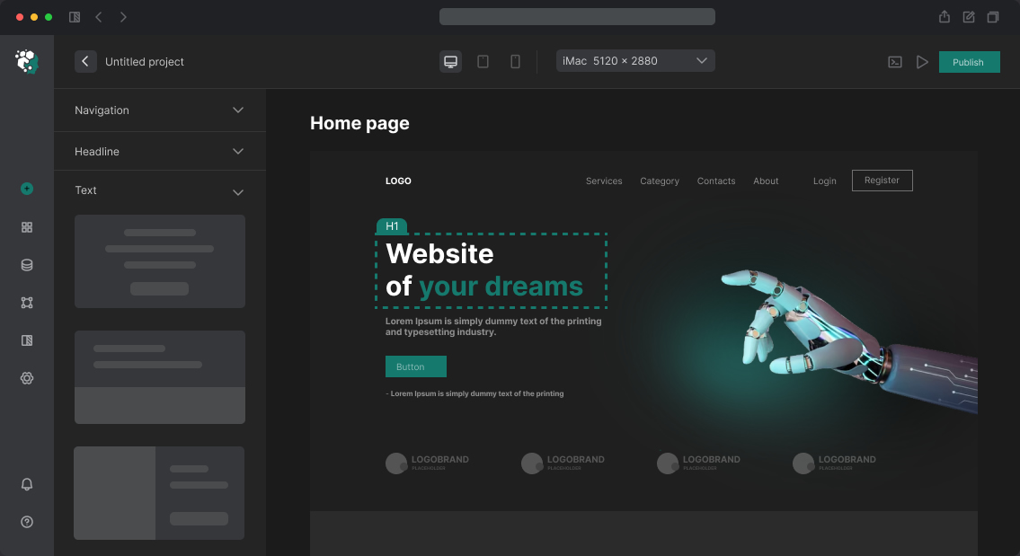
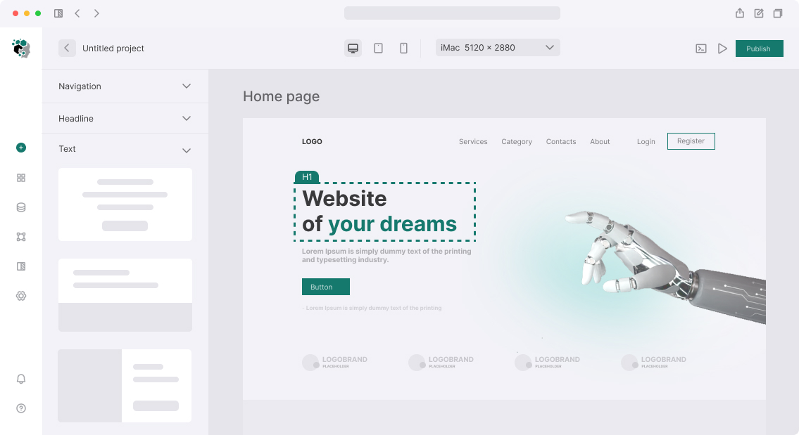
Skeleton Component Anatomy
A skeleton consists of gray rectangles and circles that repeat the shape of real content:
- Rectangles of varying widths — for text lines (100%, 80%, 60% width)
- Squares or border-radius rectangles — for images
- Circles — for avatars
- Rectangles of appropriate size — for buttons and badges
Color: neutral gray. In Light Mode — #E5E7EB (gray-200 in Tailwind), in Dark Mode — #374151 (gray-700). Shimmer animation adds a moving gradient overlay: from rgba(255,255,255,0) through rgba(255,255,255,0.4) back to transparent, with animation-duration ~1.5s and linear timing.
Deeper: Designing Shimmer Animation
Shimmer is created through CSS @keyframes + background-size + animation. Example implementation using CSS custom properties:
@keyframes shimmer {
  0%   { background-position: -200% 0; }
  100% { background-position: 200% 0; }
}

.skeleton {
  background: linear-gradient(
    90deg,
    var(--skeleton-base) 25%,
    var(--skeleton-shine) 50%,
    var(--skeleton-base) 75%
  );
  background-size: 200% 100%;
  animation: shimmer 1.5s infinite linear;
}
Key design point: all skeleton elements on one screen should be synchronized — one animation moves "left to right" simultaneously across all blocks. This is achieved through a single animation-delay: 0 on all elements or through CSS Custom Properties on the parent container.
In Figma, the skeleton component is built using Variants: State=Loading (gray blocks) and State=Loaded (real content). When passing to developers — it's a single React component with a isLoading: boolean prop.
Skeleton-to-Content Correspondence
Skeleton accuracy is important. If a skeleton shows three lines of text but the actual heading is one line, there's a sharp jump when transitioning — a layout shift. This worsens CLS (Cumulative Layout Shift) and subjective perception of speed.
For each content block, we design a skeleton respecting the height:
- Product card: photo placeholder with same height as img; three text lines of appropriate height; button
- Table row: exact number of cells, correct row height
- Feed post: avatar circle, two headline lines, three text lines
Timeline
Design of skeleton system for typical web application (10–20 components) — 2–4 days: inventory of loaded blocks, development of base skeleton component with animation, creation of variants for all blocks, dark mode adaptation.