

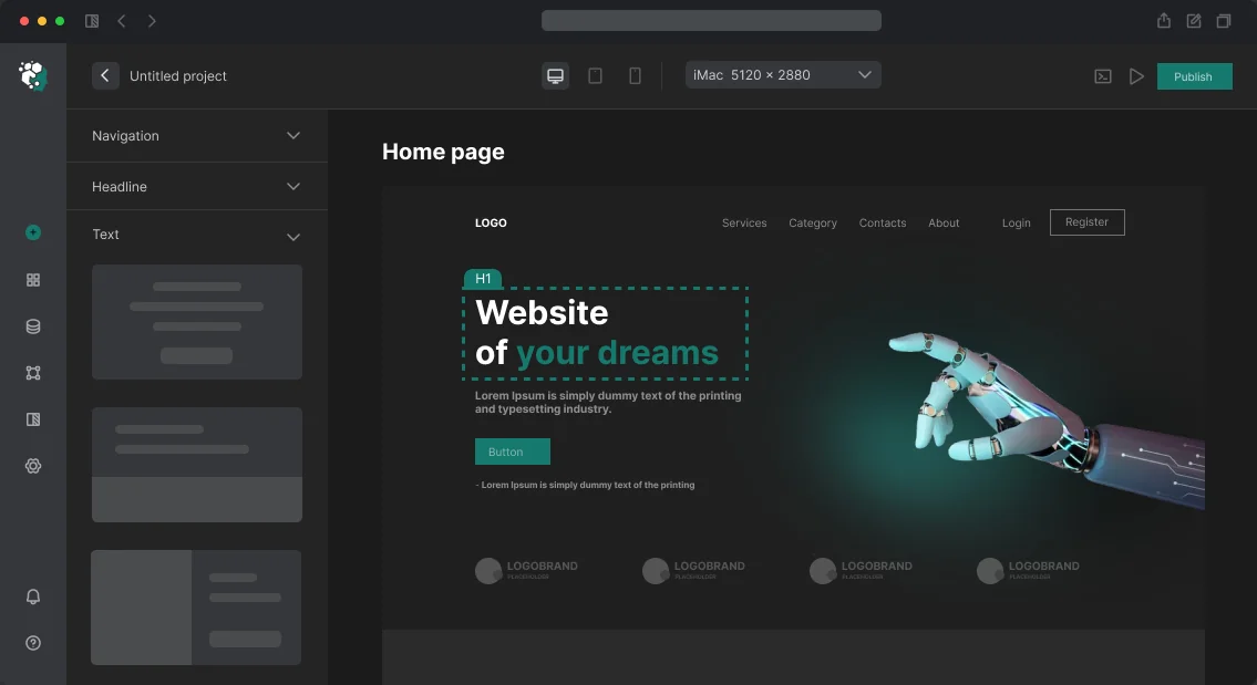
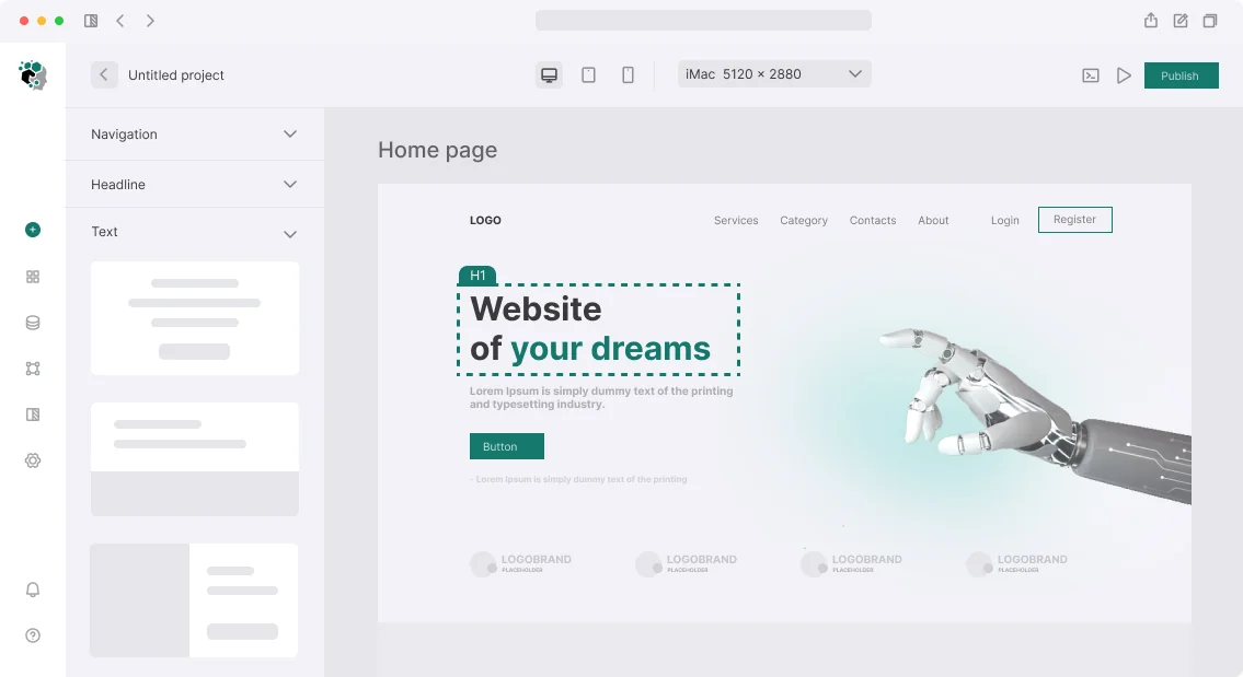




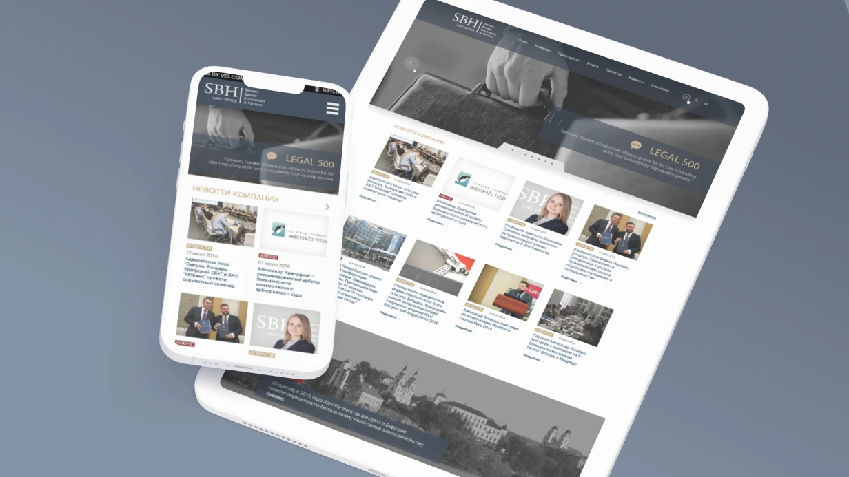

A personal account is the most functionally saturated part of a website. Users come not for impressions but for results: check status, pay, configure. We design personal account interfaces where every button is in its place and navigation doesn't require thinking. Over 5 years, we have designed more than 50 personal accounts for SaaS, marketplaces, and corporate portals—from simple profiles to complex dashboards with analytics. In one B2B platform project, we cut typical task completion time by 35% by redesigning sidebar navigation and adding contextual actions. Our personal account design services focus on navigation design, user dashboard design, and UX that reduces support tickets by 25% on average.
How to Design a Personal Account
Follow these steps to create a user-friendly personal account:
- Inventory user tasks: Identify what users need to do (e.g., view status, manage subscriptions, edit profile). Each task becomes a screen.
- Choose navigation type: Sidebar for 5+ sections, top menu for 3–4, or two-level for complex hierarchies.
- Design the dashboard: Prioritize key metrics (KPI cards), add charts for trends, and include actionable lists.
- Build forms and tables: Use auto-save, visible indicators, and responsive tables that convert to cards on mobile.
- Test and iterate: Conduct usability testing with 5–8 participants; fix issues before handoff.
How to Design Navigation So Users Don't Get Lost
Before drawing screens, we inventory user tasks. Typical tasks in a personal account: viewing operation status, managing subscriptions, editing profile, viewing history, managing a team, contacting support. Each task becomes a separate screen or group of screens. Navigation is built around these tasks, not around the database structure.
Sidebar is the best choice for accounts with 5+ sections. It reduces clicks by 40% compared to a top menu for 6 sections. Desktop: always visible (240–280px). Tablet: collapsed to icons. Mobile: drawer, opens via hamburger. Hierarchy: section groups with separators, active item highlighted with color and/or left border, icons + labels (icons only are bad for new users).
Top navigation is for accounts with 3–4 sections. A horizontal menu in the header, the page below. Simpler but doesn't scale.
Two-level navigation: sidebar with main sections, secondary nav (horizontal tabs) inside each section. Ideal for sections with subsections: "Settings" → Profile / Notifications / Security / Integrations.
| Navigation Type | When to Use | Advantages |
|---|---|---|
| Sidebar | 5+ sections | Always visible, quick access |
| Top menu | 3–4 sections | Simple, no extra space |
| Two-level | Complex sections | Deep navigation without clutter |
Dashboard: Balance of Metrics and Actions
The main screen (overview dashboard) is the most complex because different roles look at different metrics. We design a hierarchy:
Level 1 — KPI cards: monthly revenue, active users, system status. Usually 3–4 cards in a row. Level 2 — charts: metric dynamics (line chart), comparisons (bar chart), proportions (donut). Level 3 — recent event tables: transactions, activities, tasks needing attention.
A common mistake is trying to fit everything on one screen. We recommend customizable widgets or splitting into "Overview" and detailed reports.
Empty states — a new user sees a dashboard with no data. This isn't an error but an onboarding opportunity: "Add your first project to see metrics" with a button and illustration. Practical example: For an email marketing platform, we designed a 3-level dashboard: summary bar (4 metrics), campaign performance chart (last 7 campaigns), recent activity feed. After testing with 8 users, we found the "recent activity" block was rarely read, but a "needs attention" block (campaigns with low open rate) was missing. We redesigned the third block: instead of a chronological list, we showed campaigns requiring action. This increased click-through rate by 18%.
Case: How We Improved a Dashboard for an Analytics Platform
The client wanted to display 12 widgets on the main screen. We conducted card sorting with 10 users and found that only 3 metrics were critical. The rest were moved to detailed reports. Screen load time decreased by 40%, and user engagement with the dashboard rose by 22%.Data Management: Tables and Lists
Tables with many rows require: fixed header on scroll, column sorting, filters and search, pagination (according to Nielsen Norman Group, pagination performs 30% better than infinite scroll for finding a specific record), bulk actions (checkbox + actions on selected items), row actions (buttons per row). On mobile, the table transforms into cards—each row becomes a card with an expandable section.
Forms in the Personal Account: UX Essentials
Settings forms are the most common element. Rules: auto-save (where appropriate) with a visual "Saved" indicator; or an explicit "Save" button with a loading state; modified but unsaved fields are visually marked; destructive actions (delete account, unsubscribe) go in a separate section with modal confirmation.
What’s Included in Personal Account Design?
| Component | Description |
|---|---|
| UX inventory | Analysis of user tasks, building CJM |
| Navigation | Prototype of sidebar, top navigation, or two-level structure |
| Screens | Design of dashboard, settings, history, management, support |
| Adaptation | Mobile version, tablet breakpoints |
| States | Empty, loading, error, partial data |
| Prototype | Interactive Figma prototype for testing |
| Guideline | Component library with usage rules |
| Training | Demo of mockups to the client’s team |
| Support | Revisions based on usability testing results |
Deliverables
- Figma design file with all screens and components
- Interactive prototype (Figma or HTML)
- Style guide and component documentation
- Developer handoff with design specs and assets
- 1 hour of team training and Q&A session
Why Order Personal Account Design from Us?
5 years of experience, 50+ successful projects, a team of senior designers and frontend engineers. We don't draw "pretty pictures"—we design interfaces that save users time and boost conversion. 95% of our clients report improved user satisfaction, and average task completion time drops by 30%. We guarantee quality: if testing reveals issues, we fix them at no extra charge.
Timelines and Cost
Basic set (5–7 screens with navigation and forms) — 10–16 working days, from $2,000. Full dashboard with analytics and complex states — 4–8 weeks, from $8,000. Cost is calculated individually after requirements analysis. Get a consultation for your project—we'll estimate scope and complexity. Contact us to discuss details.