

Why Your Project Needs a Professional UI Kit
Imagine: a designer spends an hour fine-tuning padding for every new button, a developer rewrites styles for each screen, and the result still doesn't match the mockup. According to Nielsen Norman Group, teams without a unified UI kit spend 30% more time on layout and element alignment. A component library eliminates this pain — all visual decisions are fixed in one place, and layout speed increases by 2–3 times. Using a UI kit is 3x faster than ad-hoc styling and reduces style errors by 40% compared to no kit. We have created UI kits for 20+ products, from startups to enterprise systems, and we know how to avoid common pitfalls. Our web application UI expertise ensures design consistency.
What's in a UI Kit
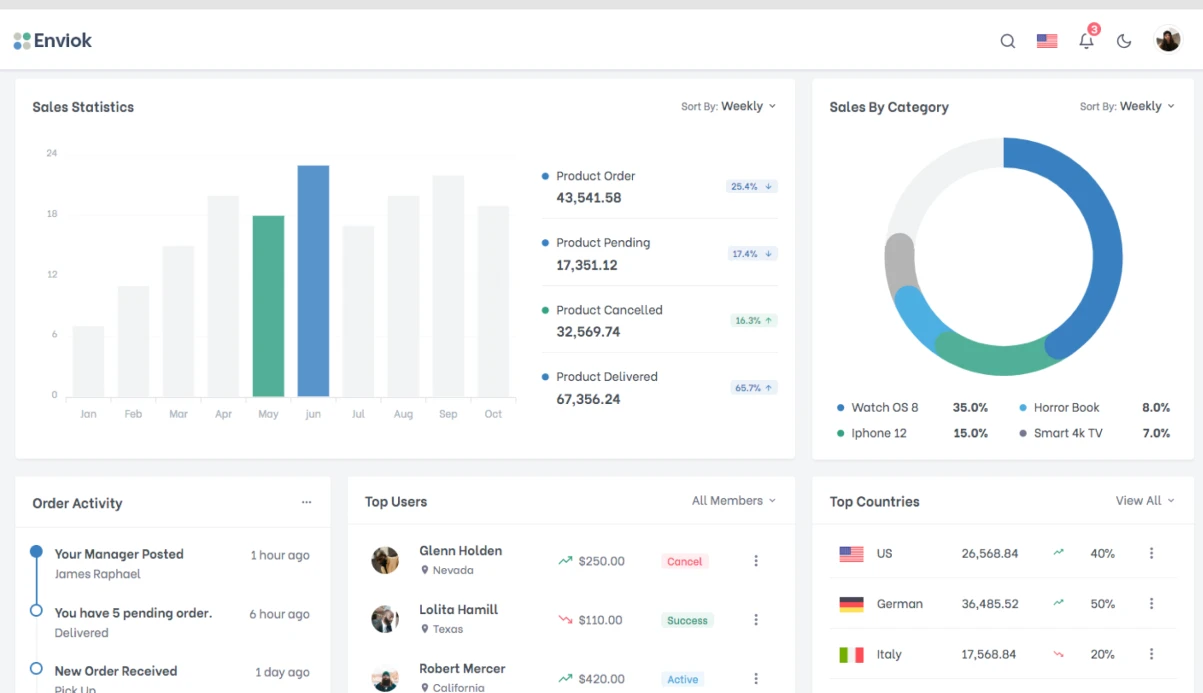
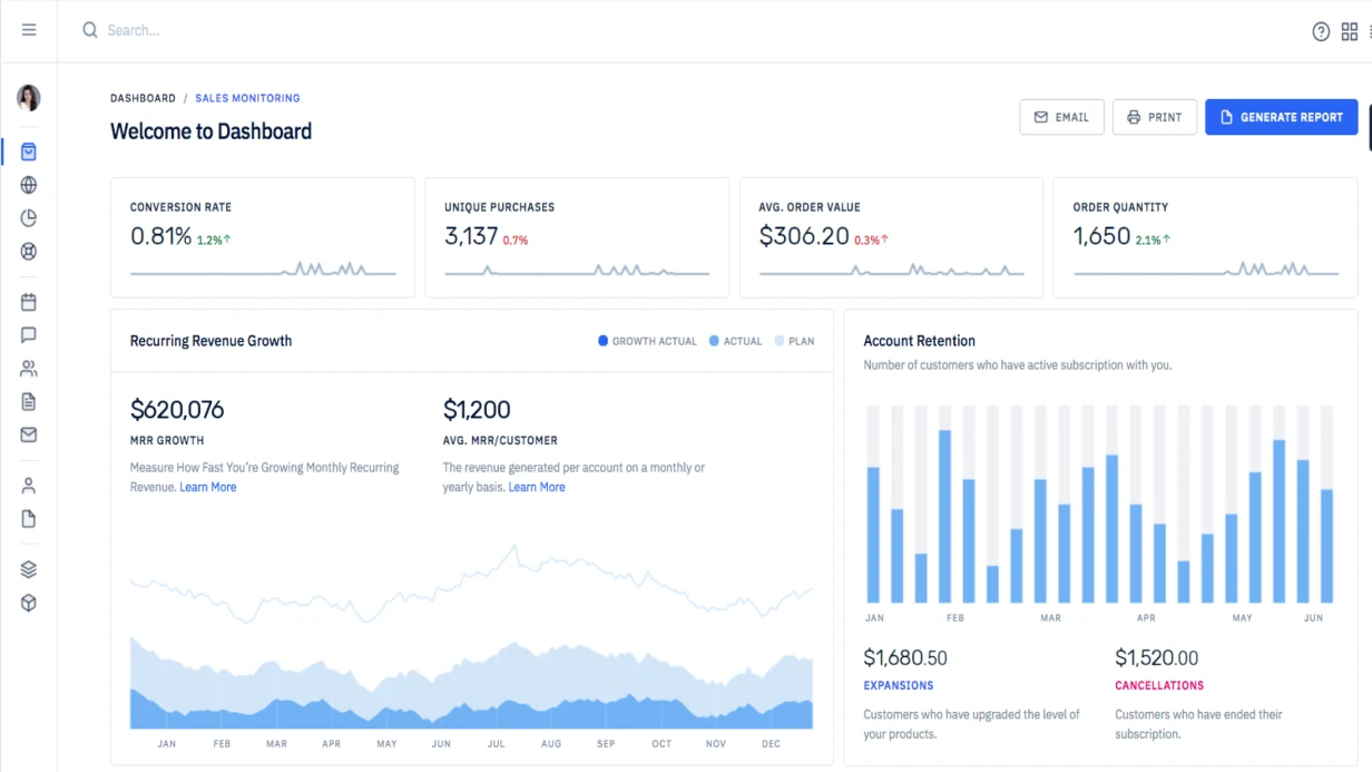
Foundations — color palette (primary, secondary, neutral + semantic colors with shades 50–950 analogous to Tailwind), typographic scale (H1–H6, body texts, code blocks with font-family, line-height, letter-spacing), grid (columns, gutters, margins for each breakpoint), border radii, shadows (elevation system), and iconography. This follows atomic design principles, building from atoms to molecules to organisms.
Atomic components — 5 button variants (primary/secondary/ghost/destructive × states), 8 input types (text, email, password, number, textarea, select, checkbox, radio, toggle, date picker), badges, tags, chips, tooltips, alerts, avatars, progress bars, spinners. That's over 50 base components, each with 4 states, yielding more than 200 variants.
Composite components — cards (4 styles: basic, with image, with action), navigation (breadcrumbs, tabs, pagination, stepper), tables with sorting and pagination, modal windows, drawers, dropdown and context menus.
How Components Are Organized in Figma
Proper component structure determines ease of use months later. The modern approach is Component Properties (introduced by Figma). Using a button as an example:
| Property | Type | Example value |
|---|---|---|
| Variant | Text | Primary, Secondary, Ghost |
| State | Text | Default, Hover, Active, Disabled |
| Size | Text | SM, MD, LG |
| Icon Left | Boolean + Instance swap | true → icon:search |
| Icon Right | Boolean + Instance swap | false → none |
| Label | Text | "Click me" |
This allows changing any property via the right panel without manually switching variants. Result: instead of 4 × 5 × 3 = 60 separate components — one component with Properties. All components use Auto Layout, ensuring they adapt to content changes.
What Are Design Tokens and Why Are They Needed?
Design tokens are named variables for all visual values. Instead of #3B82F6, we write color.primary.500. This bridges Figma and code: a designer changes a token — the developer receives updated CSS variables via Style Dictionary. The chain: Figma Variables → JSON → Style Dictionary → tokens.css → components update automatically. Tokens cover colors, spacing, typography, shadows, and more, ensuring interface design consistency.
Development Stages and Benefits
- Audit of current interfaces — collect existing components, identify inconsistencies.
- Definition of visual language — color palette, typography, spacing, shadows.
- Creation of atomic components — buttons, inputs, icons. Each component with full state set.
- Assembly of composite components — cards, tables, modals.
- Configuration of design tokens — export to code via Style Dictionary.
- Documentation and deliverables — usage guidelines plus all files.
- Handoff to development — integration with the frontend framework.
| Metric | Without UI Kit | With UI Kit |
|---|---|---|
| Time to layout a new screen | 3–5 days | 1–2 days |
| Frequency of style errors | High | Low (40% fewer) |
| Designer approval | Every screen | Once per component update |
| Annual developer time saved | — | ~$10,000 |
Our certified team has delivered 20+ projects with a 100% satisfaction rate. Typical investment: $5,000–$15,000, recouped in 3–4 months.
UI Kit Documentation and Deliverables
Without documentation, a UI kit is used incorrectly. Minimum set:
- Cover page — version, responsible person, last update date.
- Usage guidelines for each component: when to use, when not to use, examples of correct and incorrect usage.
- Changelog — what changed in each version.
As part of our service, you receive:
- Editable Figma file with all components and Auto Layout.
- Design tokens exported as JSON and CSS custom properties.
- Comprehensive usage documentation (with examples).
- One training session for your team (up to 2 hours).
- Two weeks of post-launch support for questions.
We guarantee high-quality deliverables and offer revision until you're satisfied.
Our Experience and Results
We have been building UI kits for over 5 years. Our solutions are implemented in 20+ products, from startups to enterprise systems. One case: for a fintech application, we consolidated 200+ disparate components into a single library, reducing the time to launch new screens by 45%. According to our practice, implementing a UI kit pays for itself within 3–4 months due to reduced layout and approval time. Timelines for a medium project: 4–6 weeks; cost is calculated individually after an audit. No risk: our proven methodology ensures success.
How to Get Started
Contact us — we will analyze your project and propose the optimal UI kit composition. Get a consultation today.