


Creating Wireframe-Prototypes for Website Pages
Wireframe is a black-and-white structural page diagram without visual design: only blocks, their placement, typographic hierarchy and basic interactive elements. Term "prototype" in wireframe context means clickable connection of such diagrams, not separate static mockup.
Wireframe is a communication tool and logic verification, not artistic artifact. Its task is to fix structural decisions before designer spends time on color, fonts and illustrations.
Levels of Detail
Three levels are distinguished:
Low-fidelity (lo-fi) — rough sketches, rectangles with captions, sometimes hand-drawn. Created in hours, changed without regret. Fit primary structure approval with client and team.
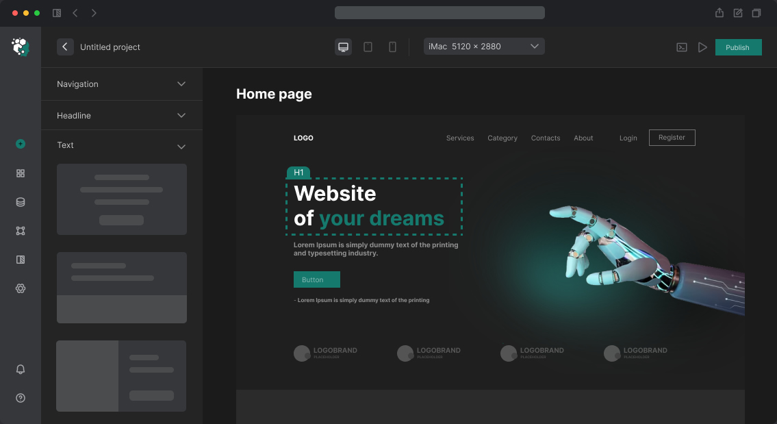
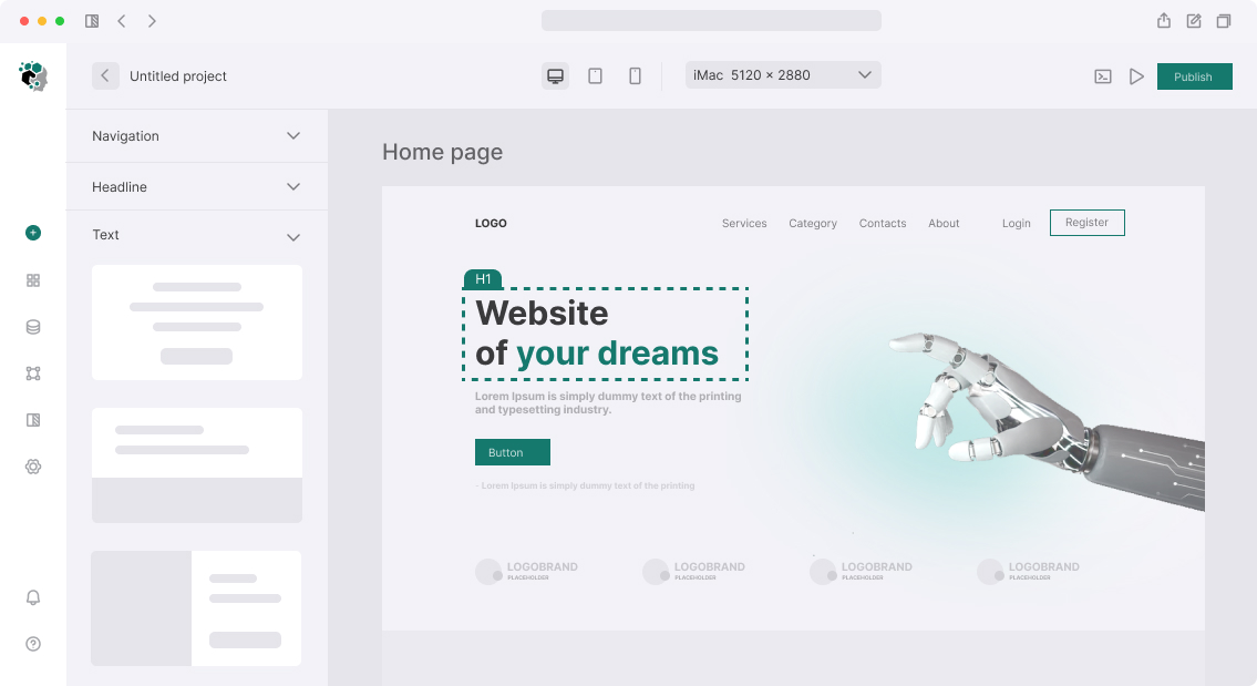
Mid-fidelity — structured diagrams in Figma or Balsamiq. Correct block proportions, real button labels and titles, typographic levels indicated by size. Gold standard for most projects.
High-fidelity wireframe — detailed diagram with real content, precise sizes, sometimes with conditional color scheme (shades of gray). Blurs border with UI design, so used less often — when client can't "read" lo-fi or for complex interfaces like dashboards.
What's Thoroughly Worked Out in Wireframe
Wireframe covers decisions that later become very expensive to change in design or code:
Content hierarchy — what comes first, what secondary, what hidden behind accordion or tab. Example: social proof block — reviews or client logos — first screen or after service description? This is decided in wireframe, not in design.
Form composition — how many fields, in what sequence, what in one line, what split into steps (wizard/stepper). For long forms (registration, checkout) wireframe shows entire step sequence.
Empty states and edge cases — what's shown if no data (new user, empty cart, no search results). This is often forgotten then done on the fly.
Adaptation — desktop wireframe and mobile wireframe can differ greatly. Not "shrink and move" but rebuild content priorities.
Clickable Wireframe-Prototype
When wireframe diagrams are linked with transitions, a prototype results — it can be clicked and user scenarios checked. In Figma this is done through Prototype mode: connect buttons to pages, add overlays for modal windows, set transition animations (optional).
This stage is convenient for quick user testing: give 5–7 real users specific task and see if they succeed without hints. Navigation errors and unclear labels are discovered immediately — before designer spent 40 hours on full UI.
Example: for freelance marketplace, found on wireframe prototype that 4 of 6 testers couldn't find "Respond to project" button — it was hidden behind "Details" tab. Moved to task first screen, before tabs. In final design this point wasn't reworked.
Tools
- Figma — market standard, convenient for team work and passing to developers
- Balsamiq — specialized tool for lo-fi, imitates "drawn" style
- Axure RP — for complex interactive prototypes with conditional logic (show/hide, variables)
Timeline
Wireframe of typical corporate page (home, services, contacts) — 2–4 working days. Complete wireframe-prototype of 10–15 page site — 7–14 working days. Complex product interfaces (dashboards, cabinets) — 3–5 weeks.