

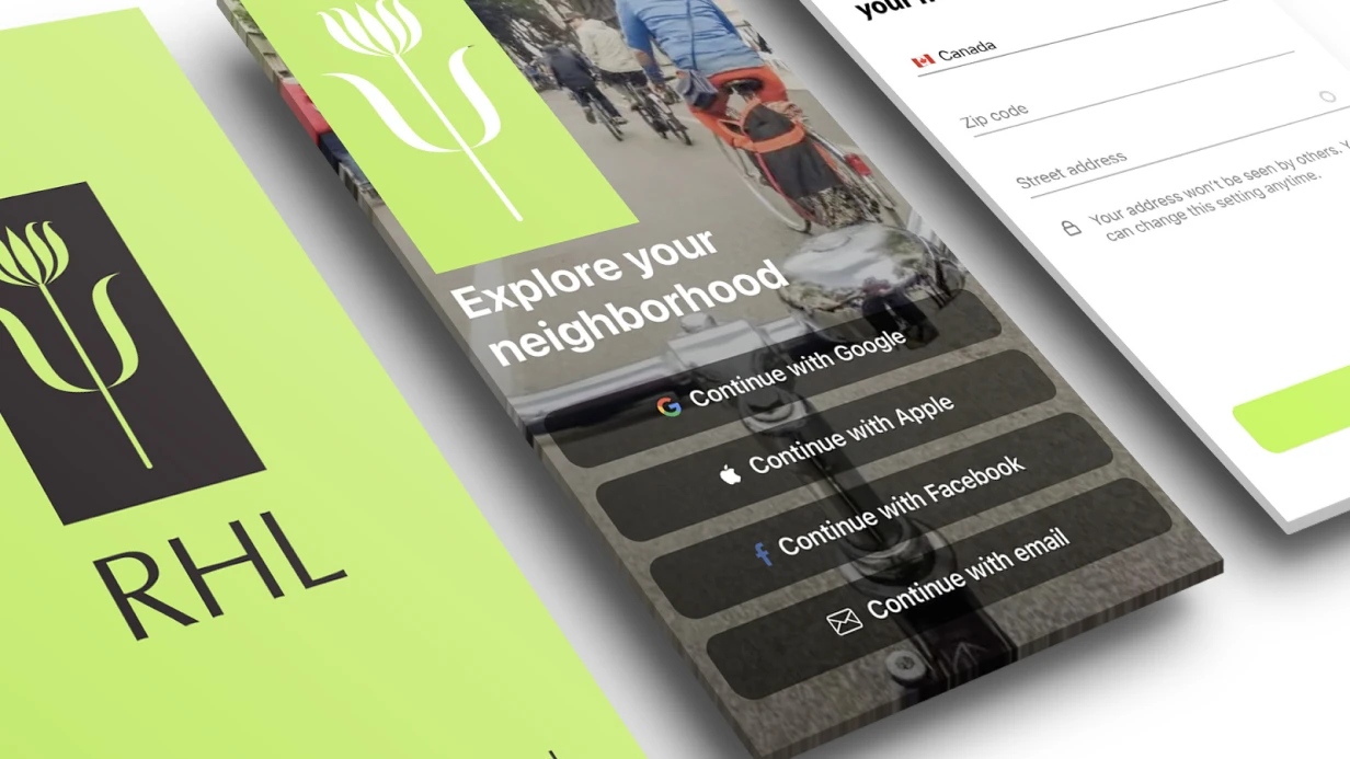
UX/UI Design for Mobile Applications
A designer sends a mockup — beautiful, with gradients and custom components. A developer opens it and understands: the button is 36pt, the tap target is 20pt. On an iPhone SE, it physically can't be tapped with a thumb. A bottom sheet covers content when the keyboard appears. Navigation is built against native iOS patterns. Apple rejects the app or users leave after a week — depends on luck with review.
Mobile UX/UI isn't web design adaptation. It's a separate discipline with specific platform constraints.
Human Interface Guidelines and Material Design 3: Why Deviating Is Expensive
Apple HIG and Google Material Design 3 aren't aesthetic recommendations. They're documented user expectations shaped by years of system app use.
HIG defines: minimum tap target 44×44 pt, safe area insets for notch and Dynamic Island, standard gestures (swipe back on iOS, back gesture on Android 10+). Ignoring safe area — common mistake. safeAreaLayoutGuide in UIKit and safeAreaPadding in SwiftUI exist for this. A designer who didn't add safe area padding in Figma guarantees a bug during implementation.
Material Design 3 brought Dynamic Color — color scheme generated from user wallpaper through MaterialTheme.colorScheme in Jetpack Compose. An app ignoring dynamic colors on Android 12+ looks foreign. Not critical for niche products, but noticeable in mass markets.
Most painful deviations from platform guidelines we see:
- Custom navigation over system. iOS users expect swipe back from anywhere on the left edge. Custom NavigationController without interactive gesture breaks this. Android users expect system back button — a custom back button in the left corner doesn't fully replace it.
- Modal windows instead of navigation push. Bottom sheet is appropriate for actions, not content navigation.
- No haptic feedback. UIImpactFeedbackGenerator on iOS isn't decoration, it's part of interface feedback. Buttons, swipes, confirmations without tactile response feel broken.
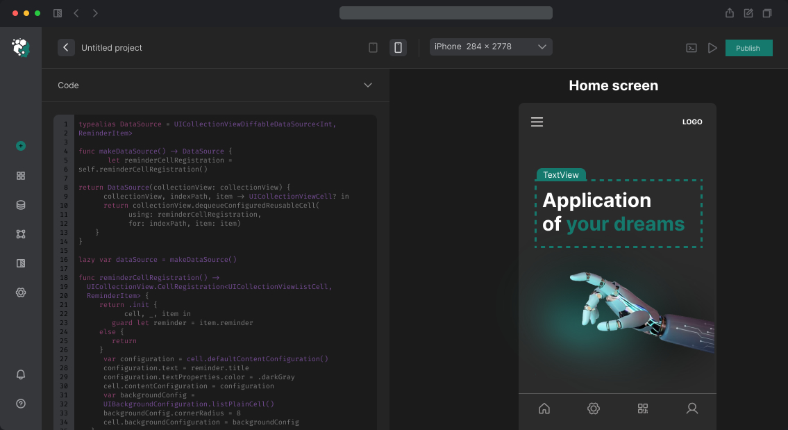
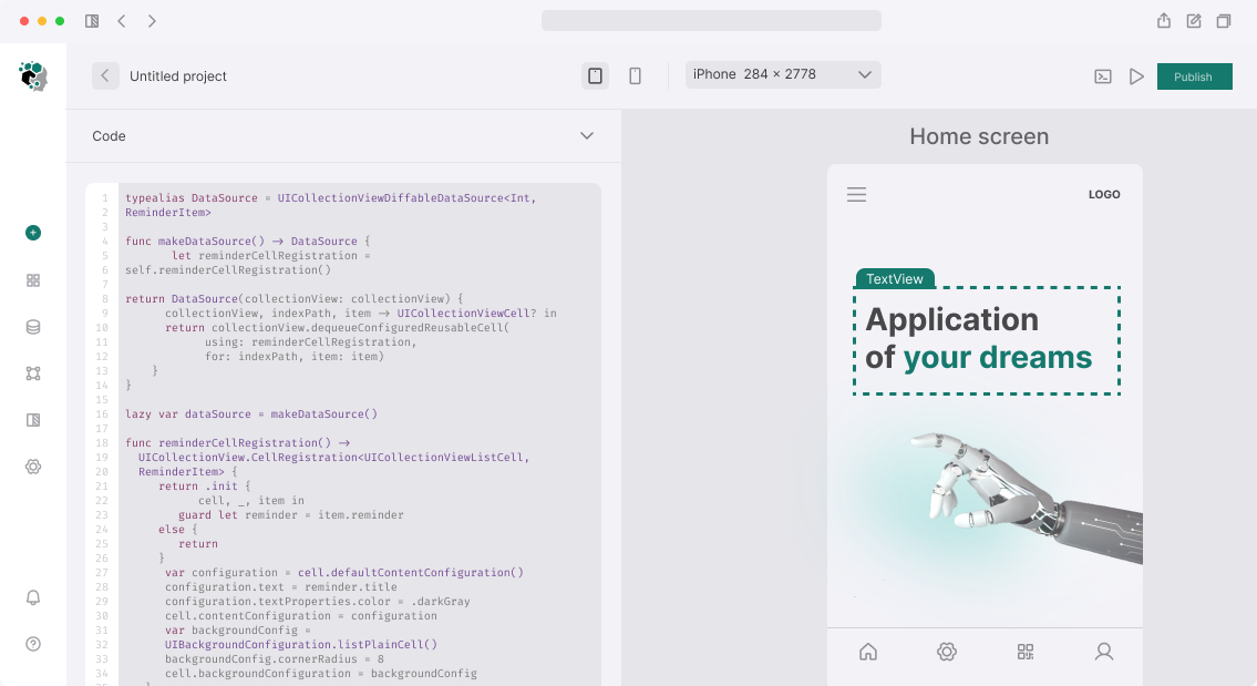
Figma as Primary Tool: How to Maximize It
Figma Variables API (appeared in Figma 2023) changed workflow. Design tokens — colors, typography, radii, spacing — stored as variables and exported directly to code through figma-tokens or style-dictionary. This eliminates manual value transposition and synchronization drift between design and implementation.
Auto Layout with wrap and spacing between elements lets you build components that behave like flex containers. Developers open components and see not static artifacts but behavior descriptions at different content sizes.
Component Properties — variants, boolean toggles, instance swaps — build entire design systems in Figma. A button with 4 states (default, hover, pressed, disabled), 3 sizes, and 2 icon variants — one component, not 24 frames.
Figma Prototype with Variables creates interactive prototypes with real state: showing how screens change at different variable values. This isn't just a "clickable mockup" but a full UX testing tool.
Prototyping and UX Testing Before Development
The most expensive error in mobile products — develop a feature, launch it, and discover users don't understand how it works. A Figma prototype during testing costs zero development hours. Remaking a finished screen costs days.
For usability testing, use Maze (task tests on prototypes — users complete scenarios, you get heatmaps and mis-click rates) or UserTesting sessions. Key metrics — task completion rate and time on task, not "like it / don't like it."
A/B testing on mobile is harder than web: App Store doesn't let you change UI without updating. So test hypotheses on prototypes before release, not through production experiments.
Animations: Between Lively Interface and Battery
Animations in mobile are feedback. Elements don't appear instantly — they reach the right state in 200–350 ms. This gives the brain context to understand what happened.
iOS: withAnimation in SwiftUI, UIViewPropertyAnimator in UIKit for interactive animations with interruption capability. Spring animations with dampingRatio — foundation of most Apple transitions.
Android: AnimatedVisibility, animateContentSize, Crossfade in Compose. MotionLayout for complex scenes with multiple transformations.
Flutter: AnimationController + Tween, Hero animations between screens, Lottie for After Effects exports. Lottie especially efficient for onboarding illustrations and empty states.
Key constraint — 16 ms per frame (60 fps) or 8 ms (120 fps on ProMotion devices). Animations must run on GPU through CALayer/RenderThread, not CPU through layoutSubviews. Profiling through Core Animation instrument in Xcode — mandatory before releasing animated screens.
Accessibility: Not Optional
VoiceOver on iOS and TalkBack on Android used by a few percent of users — in absolute numbers for major apps that's thousands. Beyond that, App Store rejections for accessibility happen, though rarely.
Minimal checklist:
- All interactive elements have
accessibilityLabel - Text contrast not less than 4.5:1 (WCAG AA)
- Dynamic Type supported — interface doesn't break at max font size
- VoiceOver focus passes through screen in logical order
SwiftUI automatically generates accessibility tree from component semantics. UIKit requires manual accessibilityTraits, accessibilityHint, grouping through shouldGroupAccessibilityChildren.
Process and Timelines
UX/UI design passes stages: research and competitive analysis → user flows and wireframes → design system → UI mockups → prototype → testing → handoff to development.
Timeline estimates:
| Volume | Timeline |
|---|---|
| Redesign of 3–5 screens | 1–2 weeks |
| MVP (10–15 screens) | 3–5 weeks |
| Full product (30+ screens) | 6–10 weeks |
Cost calculated after requirements analysis — number of screens, component complexity, need for design system or working with existing.