

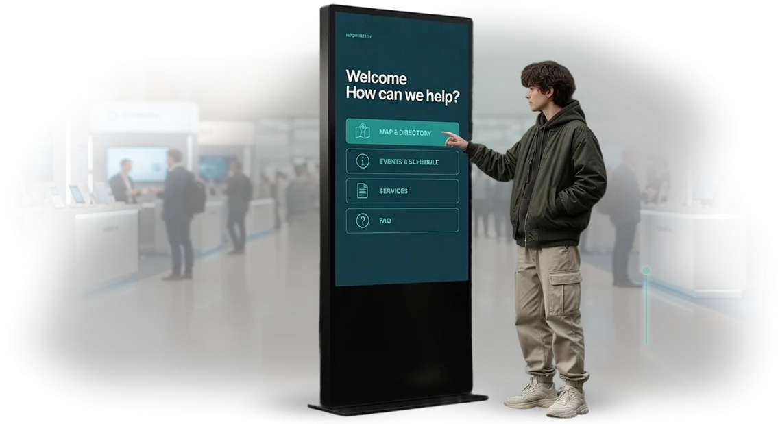
Interactive kiosk for the metro: why passengers leave for competitors
There is passenger traffic at the station, but it is of little use if a person does not understand where to go. They stop at the map, look around, search for an employee with their eyes — and at that moment decide that it is easier to call a taxi or walk. So the station loses a passenger who was already ready to use it.
A familiar picture: signs are outdated, the map hangs off to the side of the route, and there is no one to ask.
People approach the ticket offices and station attendants with the same questions — where is the transfer, which exit leads to the right street, how to get to the railway station.
Staff turn into an information desk, and the line grows precisely during rush hour, when every second counts.
An interactive kiosk for the metro removes this burden. Passengers build their own route, see their exit and transfer, and get an answer in their native language — without a line and without searching for an employee. Navigation in the metro stops depending on whether a person noticed a sign.
For the station this is a direct benefit: fewer lost passengers, calmer work for station attendants, more even distribution of people across exits and transfers. We build such systems for a specific station — with its map, flows, and the points where people most often get lost.
What the customer gets: reach, awareness, staff relief
An interactive metro kiosk is not just a screen with a map. It is a point of contact with the passenger that simultaneously relieves staff, strengthens brand awareness, and brings leads for ancillary services. Let's break down exactly what the customer gets as a result.
Passenger reach. The entire flow of the station passes through the kiosk — local residents, tourists, and transit passengers alike.
A single screen in the concourse comes into contact with thousands of people daily, and interactive navigation holds attention longer than a static sign. The customer gets reach without having to pay extra for advertising.
Staff relief. Typical questions — "how do I get there," "where is the transfer," "when is the next train" — are handled by the kiosk. Station employees stop being an information desk and focus on safety and order. This reduces shift fatigue and the number of conflict situations during peak hours.
Metro brand awareness. Every contact with the kiosk is a contact with the carrier's brand. A polished interface, a consistent style, and useful information create the impression of modern and caring infrastructure. The passenger remembers not a sign but an experience — and talks about it.
Leads for ancillary services. The kiosk can gently offer what is needed here and now: card top-ups, tourist routes, parking, nearby cafes.
This turns an information point into a source of additional inquiries and sales, and the customer sees a measurable flow rather than an abstract "awareness."
Manageability and analytics. The customer sees which sections are in demand, where passengers stop, and what they ignore. This makes it possible to update content based on real demand rather than guesswork, and to keep the kiosk useful throughout its entire service life.
The bottom line: a single infrastructure element addresses several tasks at once — reach, staff relief, brand, and leads. We design such kiosks for a specific station and passenger flow so that each of the benefits works measurably rather than remaining in a presentation.
Interactive kiosk formats for metro tasks
The kiosk format is determined not by area, but by the task it addresses. In the concourse, a passenger has just entered and is disoriented — they need station navigation and exits to the city. On the platform, they are waiting for a train and are ready to absorb short prompts.
At interchange hubs, the task is more complex: a person is looking for how to transfer to another line without losing time. The choice of format determines how many passengers will actually use the kiosk rather than walk past it.
| Format | For whom | What it gives the customer |
|---|---|---|
| Concourse kiosk | Incoming flow, tourists, passengers with reduced mobility | Relieves the load on staff at the turnstiles: route to the exit, schedule, neighborhood map |
| Platform kiosk | Passengers waiting for a train | Short prompts in 20-30 seconds: time to train, transfers, nearest cars |
| Interchange kiosk | Transit flow at hub stations | Guides step by step through the transfer, reduces the number of those who get lost and miss connections |
| Mobile stand | Peak days, repairs, temporary traffic patterns | Quickly repositioned for a changed flow without reworking the system |
What to consider when choosing a format
Look at three things: the flow density at peak hours, the average time a passenger is willing to spend, and where they need to go after the kiosk. If a person is in a hurry, the screen must respond in a matter of seconds, otherwise they will not use it.
We help you get through this choice: we look at the specific station and propose a format that will pay off in terms of load, rather than simply taking up space.
A combination of formats often works better than one: a kiosk in the concourse sets the general direction, while stands at the transfers guide the passenger to the right line. Such a set covers a person's entire route through the station — from entrance to boarding.
How the project works: from brief to launch and support
An interactive kiosk project for the metro is not "install a screen and forget about it." What matters here is both the navigation logic for the passenger and how the system will withstand the flow of people during rush hour.
That is why we work in transparent stages: at every step you understand what is happening and what you will get as a result.
How the process is structured
- Brief and task analysis. We discuss whom we are guiding through the station — a passenger with a transfer, a tourist, a person with luggage — and what result is needed: reduce the load on duty staff, speed up orientation, relieve the information desk.
- Plan and navigation structure. We show the screen layout and scenarios: how a passenger finds the line, the exit, the desired facility. This is also where we define what the user sees on the first screen.
- Approval. You approve the logic, texts, and appearance before assembly begins. Edits at this stage cost the least — afterward we change things not "on the fly" but according to plan.
- Implementation. Our engineers build the interface, connect route and schedule data, and test it against real passenger scenarios.
- Kiosk launch. We install the system on the device and check it on site: response speed, readability, behavior under a large flow of people.
- Support. After launch, we monitor operation, update data, and refine scenarios when the station or routes change.
What this gives the customer
You get a predictable schedule and clear control points instead of a "black box." Each stage ends with a result that can be reviewed and accepted: first the structure, then the layout, then a working kiosk.
And support means the system remains up to date even after handover — the passenger does not run into an outdated map.
What the delivery includes: a complete package for the customer
We hand over to the customer not "hardware and files," but a working navigation service: kiosks ready for installation, the software with a map and routes, trained staff, and a complete set of documentation.
You don't need to assemble contractors piece by piece — everything needed to launch navigation in the metro comes as a single package.
- Ready-made interactive kiosks — assembled, configured, and tested for your site: enclosure, touchscreen, mounts for specific installation points.
- Navigation software — a map of stations and transfers, route building, search by facilities, and hints for passengers in Russian and English.
- Data content and structure — we enter stations, exits, concourses, elevators, and infrastructure so that the route guides a person from point A to point B without errors.
- Documentation set — operating instructions, connection diagram, maintenance and map update regulations that are clear to your technical service.
- Staff training — we conduct sessions for operators and the support service: how to update data, respond to failures, and keep statistics on requests.
- Warranty and support — warranty coverage, remote monitoring of kiosk status, and navigation updates when the metro layout changes.
- Handover and launch — installation, configuration, final testing, and handover of the finished solution to your team with acceptance certificates and management access.
Such a package covers the entire path from kiosk delivery to the first passenger who found the right exit. You get a ready-made solution rather than a set of disconnected tasks, and you launch navigation in the metro within the agreed timeframe.
Case Study: How Interactive Kiosks Offloaded Staff at a Station
Task
A large station with high passenger traffic — several exits, a transfer, retail rows nearby.
Passengers constantly stopped the attendants at the turnstiles and on the platform: how to get to the right line, where the nearest street exit is, how to top up a travel card, where the elevator for a mother with a stroller is.
Employees answered from memory, got distracted from monitoring, and were exhausted by the end of the shift, and some questions still went unanswered during rush hour.
We proposed closing typical questions with interactive kiosks — a project for a network of stations — and took on the development of a navigation system for touch screens.
What We Did
We built a station map with routes to exits, transfers, elevators, and ticket offices. We designed scenarios for a passenger in a hurry: the answer is found in 2–3 taps, large labels, contrasting prompts, clear navigation without training.
We separately worked out the behavior during rush hour so that the kiosk remains responsive under a dense flow of people.
Before launch, we conducted tests on real passengers: we watched where people freeze, which wordings confuse them, how much time it takes to find an exit. Based on the results, we rewrote the prompts and simplified the first screens.
Results
- Requests to attendant staff for typical questions — down 40%.
- Passenger satisfaction with navigation increased: in surveys, it was noted as clear and fast.
- Employees returned to their tasks — monitoring and helping where a person is truly needed.
- The station received a ready-made solution that scales to other locations without reworking for each one.
Six months later, the client returned with an expansion: new stations and scenarios were added. For us, this is the main indicator — the result turned out to be so tangible that the project was continued.
How to choose the right format for the task?
The format of an interactive kiosk for the metro is determined by two things: how many people pass by and what you want to get from them. Start with passenger traffic — it determines the screen size, the number of devices, and the durability margin of the enclosure.
At a station with heavy traffic during peak hours, response speed and clear navigation from the first seconds matter more, while at interchange hubs with long waiting times, passengers are willing to linger and explore more information.
The second criterion is the client's goal. If the task is to relieve staff and reduce the number of repetitive questions, the kiosk should answer them on its own: exit layout, time until the next train, route to the desired line.
If the goal is navigation for city visitors, we focus on large hints and clear scenarios that require no preparation. When there is also a need to inform about fares, events, or nearby services, we add blocks that do not interfere with the passenger's main path.
The third criterion is operating conditions. In the metro, the device is affected by dust, vibration, temperature fluctuations, and a constant flow of people.
That is why we select the enclosure and touchscreen for the real environment, not for an exhibition hall — so the kiosk works for years without frequent repairs.
The fourth criterion is how the kiosk fits into your processes. We think through who updates information and how often, whether synchronization with the schedule is needed, and how request statistics are collected. This affects the format more than appearance.
We do not sell a single universal template. Describe the passenger traffic, goals, and conditions at your stations — we will come back with a recommendation on the format, number of devices, and a launch plan.
Common customer concerns before ordering kiosks
The concerns are almost always the same, and that's normal: an interactive kiosk for the metro operates in a place where there is no room for downtime. A passenger won't wait for the screen to reboot, and on-site staff won't figure out the settings.
That's why we design the system from the start so that a failure of one element doesn't stop navigation, and updates don't require an engineer to visit every station.
Below are answers to the questions most often asked before the start. If yours isn't here, we'll discuss it separately: we have dozens of launches in high-traffic locations behind us, and almost every fear has already been overcome by someone.
What happens if a kiosk breaks down during rush hour?
The equipment is designed for continuous operation in a flow of people, and navigation is structured so that if one unit fails, the others continue to display routes.
We build in remote monitoring: the system reports the problem itself, and most situations are resolved without a visit to the station. For critical cases, there is a response protocol and backup solutions.
How do you update content — maps, routes, announcements?
Content is changed through a control panel: edits are made centrally and appear on all kiosks at once. There's no need to reflash each screen or stop operations.
On-site staff can fix an announcement, while major changes — new lines, transfers, seasonal maps — we make together with you and test on a staging environment.
Is internet required for the kiosk to work?
Basic navigation works without a network: routes are stored on the device itself, so a passenger will get an answer even during connectivity issues. Internet is needed for updates, statistics, and remote monitoring — when it returns, the system synchronizes itself. This removes the main risk of underground spaces, where the signal is unstable.
What guarantees are there that the system won't become outdated in a year?
We hand over the system together with documentation and train your team so that edits and further development remain in your hands. The warranty covers the operation of the hardware and software, and post-launch support is a separate transparent protocol.
If passenger flow grows or new stations are added, the system can be expanded without rebuilding from scratch.
Let's discuss your task — we'll come back with an estimate and a plan
When passenger traffic grows and signs and announcements stop coping, the question of "how to help people quickly find the right exit or line" becomes a task that cannot be postponed.
An interactive kiosk for the metro addresses it directly: passengers build their own route, see the time until the next train, and don't distract staff.
To understand exactly what is needed at your stations, it's enough to describe the task — we'll come back with a project estimate and a work plan.
To order a kiosk with confidence, it's important to see in advance how it will work at your locations. So the first step is a short, focused conversation: which stations, how many screens, which passenger scenarios are the priority.
Based on the results, we prepare a navigation prototype that can be shown to the team and management before development starts.
What you'll get after reaching out
- A project estimate — timelines and scope of work for your stations, with no hidden stages.
- A work plan — from prototype to launch, with clear checkpoints at every step.
- A navigation prototype — how a passenger will build a route and find an exit, even before development.
- A scenario breakdown — which passenger questions the kiosk will cover and which will remain with staff.
- Placement recommendations — where the kiosk will be visible and in demand during peak hours.
- A transparent cost breakdown — what the work consists of and what is included in post-launch support.
Describe the task in whatever form is convenient — the number of stations, desired scenarios, timeline targets. We'll study the inputs and come back with an estimate, a plan, and a prototype proposal.
This kind of conversation saves time for both sides: you immediately see the scope and logic of the project, and we hit your objectives more precisely.