

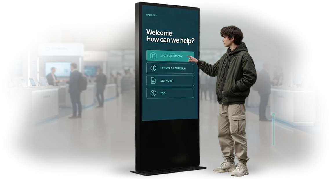
Information Kiosks in a Scientific Style: Are You Losing Visitors?
Information kiosks stand in the lobby, but visitors pass by indifferently — you lose visitors at the very moment they are ready to learn more about you?
A boring interface, overloaded screens, and inappropriate design create a barrier: the guest doesn't understand why to approach and doesn't get a quick answer to their question.
Instead of an engaging dialogue — lost attention, long lines at the information desk, and missed opportunities for the brand.
This problem is especially noticeable in scientific and educational spaces: museums, exhibition halls, educational centers.
A visitor comes for an impression and gets another "screen with text" — without scientific styling, without interactivity, without a desire to linger.
Interactive stands, meanwhile, can hold attention several times longer than ordinary posters, but only when the interface is clear at first glance and arouses genuine curiosity.
Wedesign information kiosks that solve this problem: scientific interface design, logical navigation, and well-thought-out interaction scenarios.
Instead of abstract buttons — visual hints, instead of long texts — short semantic blocks that lead the visitor to the needed information in seconds.
This is not just beautiful design, but a working tool for attracting visitors that pays off through increased engagement and repeat visits.
A visitor who quickly finds an answer through an interactive stand is a guest who recommends you to friends and returns again. A scientific-style kiosk becomes part of the impression of the space: it is noticed, talked about, it makes navigation self-service and relieves staff.
Thus, an information stand turns from a technical element into a full-fledged tool that works for reputation and attracts new visitors.
What Proper Interface Design for a Touchscreen Kiosk Provides
A touchscreen kiosk works only together with its interface: even reliable equipment brings no benefit if the guest doesn't know where to start.
Proper interface design is a bridge between your content and the visitor, who decides within the first seconds whether to spend time interacting.
That's why we view the screen not as a display window, but as a full-fledged communication tool, where every decision affects the final result.
The first benefit — increased guest engagement. When large clickable areas, clear labels, and sequential steps require no thought, visitors start using the kiosk more readily.
Simplicity lowers the entry barrier: a person isn't afraid to make a mistake and is more likely to reach the target action — whether it's viewing an exhibit, registering, or choosing a service.
As a result, the kiosk transforms from a "pretty screen" into a working channel that is actually used.
The second benefit — easy navigation. A clear section structure and logical transitions save guests' time and reduce the load on your staff, who would otherwise answer the same questions.
A well-thought-out information hierarchy helps visitors quickly orient themselves even within large volumes of data, meaning they get the needed answer and carry away a positive impression of your organization.
In addition, interface design strengthens style recognition. The kiosk becomes part of your branded space: the same colors, fonts, and visual techniques as in the rest of your communication create a cohesive image.
When a guest sees in front of them an aesthetically designed interface familiar in style, they subconsciously perceive your brand as professional and caring, which increases trust in the content.
Finally, proper design increases time at the stand. By holding attention through clear scenarios and visual hierarchy, the kiosk allows visitors to study your material more deeply rather than skim it in ten seconds.
Every additional moment of interaction means more contacts with information, more chances of being remembered, and, consequently, a measurable increase in the efficiency of the entire space.
We design interfaces with exactly these goals in mind — so that the kiosk benefits you, not just decorates the lobby.
Kiosk Formats in a Scientific Style for Your Event's Tasks
Each event solves different tasks: one project is to show exhibits in action, another is to establish dialogue between conference participants, a third is to let visitors explore materials at their own pace.
A scientific-style kiosk takes on the role of a clear guide: it explains complex things in simple language while maintaining academic accuracy. The choice of format determines how quickly a guest gets oriented and how deeply they engage.
In a museum environment, a kiosk replaces paper labels — visitors choose their own viewing scenario. At an exhibition, it holds traffic: suggests details, shows diagrams, offers tour routes.
At a conference, it simplifies navigation and takes over some of the organizers' questions. Therefore, the first question in the brief is always: "What should the guest do when approaching the screen?"
Below are typical scenarios for which we design the interface, along with the benefits for your side.
| Format | For whom | What it gives the client |
|---|---|---|
| Museum kiosk | Museums, planetariums, science centers | The guest chooses their own route and depth of immersion — this reduces the load on tour guides and increases viewing time |
| Exhibition stand | Scientific exhibitions, interactive expositions | Holds attention at the stand for 5–7 minutes, collects contacts of interested visitors, and answers typical questions for booth staff |
| Conference kiosk | Business events, symposia, scientific-practical forums | Participants quickly find the program, map, speakers, and materials — less chaos at the registration desk, higher event loyalty |
After launch, the kiosk continues to work as an element of navigation and education.
We select the right format based on the size of the venue, the number of guests, and the interaction scenario, so that the kiosk doesn't look like a superfluous decorative element but solves a concrete task of the event.
Stages of Kiosk Interface Development: From Brief to Launch
Kiosk interface development is not just drawing screens but a structured process that directly affects how visitors perceive the exposition. Especially when it comes to scientific topics: accuracy of presentation, structure, and ease of navigation are essential.
We work according to a transparent scheme so that at each stage you understand what is happening and what result you will get.
- Brief and task immersion. We capture the kiosk's goals, the visitor profile, usage scenarios, and the scientific topic. Already at this stage it is clear which information will be primary.
- Research and content structuring. We study your materials, divide them into logical blocks, and design the section structure. This is the foundation that saves visitors from confusion.
- Interface prototype. We assemble a diagram of screens and transitions — the "skeleton" of the future kiosk. You see the navigation logic and can adjust it before drawing begins.
- Design concept in a scientific style. We develop the visual language: layout, graphics, fonts. The style emphasizes the research atmosphere and makes the material understandable.
- Layout approval. We show the finished screens and make edits based on your feedback. Once the layout is approved, the interface matches expectations exactly.
- Implementation and testing. We assemble the interface on professional equipment, check sensor performance, response speed, and text readability. We fix any issues before launch.
- Project launch and support. We install the kiosk, test it in real conditions, and remain available after opening. If you need to add content — we are there.
What Is Included in the Delivery of a Kiosk Design Project
A kiosk design project is not just a few pictures but a working tool for launching the device. You receive a complete package that can be handed over to developers, approved by management, and used in further operation.
- Mockups of all kiosk screens in a scientific style — from the main menu to sections with detailed information. You see in advance what the device will look like and approve the solution before programming begins.
- Interactive interface prototype — a clickable model that makes it easy to check navigation logic and visitor scenarios. It is sufficient for testing and quick edits even before technical development.
- User guide — a clear instruction for working with the kiosk for your employees and guests. It reduces the number of inquiries in the first month and simplifies commissioning.
- Source files in an editable format — you're not dependent on the contractor: you can make changes yourself or hand the project to another team without loss of quality.
- Adaptation to the target screen resolution — the interface is guaranteed to display correctly on the selected equipment, without distortions or "shifted" elements.
- Interaction scenarios and explanatory note — a description of operating logic and development requirements. This eliminates ambiguity and accelerates coding.
As a result, you get a transparent design project that can easily be used both as a technical specification and as a basis for presenting the project to management. All materials come in a structured form and are ready to be put into work.
Case Study: How We Made a Kiosk for a Museum
Museum visitors rarely read long labels and descriptions — they want to quickly understand an exhibit and move on. Our task was to create an information kiosk that doesn't repel with academic texts but instead draws people into the exposition.
We chose a scientific interface style: strict structure, clear navigation, visual diagrams instead of walls of text.
How We Built the Museum Project
Instead of listing facts about exhibits, we divided the content into short semantic blocks: "what is before you," "why it matters," "how it connects to other halls." This approach turns the kiosk from a reference book into a mini-tour that the guest leads themselves. The interface indicates where to tap and doesn't let even first-time touchscreen users get lost.
After launching the museum project, we measured the changes. The kiosk stand's attendance grew by 40% — people began to approach, stop, and return to the screen several times.
Average interaction time doubled, and guests started asking staff questions that hadn't come up before: the interface didn't just provide information; it sparked interest in the topic.
What the Growth in Engagement Brought
The growth in stand attendance is not just a number in a report. For the museum, it means the exposition began working more efficiently without expanding space or hiring additional guides.
And for the brand, it means the museum's perception became modern: the visitor carries away the impression "this is interesting and clear."
Of course, the interface could have been done in an "ordinary" style — with large buttons and bright pictures.
But it was the scientific style that produced the desired effect: it created trust in the content and emphasized the museum's status as a place where the subject is well understood. The kiosk became not a technical accessory but part of the exposition — and visitors felt it.
How to Choose the Right Kiosk Format?
Choosing a kiosk format starts not with screen size or appearance, but with the task the kiosk should solve at your event.
For a scientific conference, exhibition, or open lecture, the scenarios may differ: an interactive program, zone navigation, research demonstrations, contact collection, or surveys. So first determine the goal, and only then look at the type of enclosure and placement method.
A scientific design style means strict typography, calm colors, a clear data presentation structure, and minimal distracting elements. But even the neatest design won't work if the kiosk is placed in the wrong location.
For a lobby with a large flow of people, a floor-standing kiosk is more convenient — it doesn't create queues and allows several visitors to approach at once.
For an exposition in a limited space, a compact tabletop version is easier to place on a registration desk or near a poster area.
Pay attention to the interaction scenario. If a visitor should spend several minutes at the screen studying materials, choose a format with a large screen and comfortable standing position.
If the kiosk is needed for quick information or session registration, a device with a simple interface and single-touch operation will do.
For a scientific event, it's important that the interface doesn't overwhelm visitors: short texts, clear labels, data visualization instead of long descriptions.
Content is equally important. A kiosk is not just a stand with a screen but a point of contact with your program. Think in advance about which materials will be available: schedule, abstracts, location map, surveys.
Based on that, we'll propose the navigation structure and the appropriate format. Sometimes a single touchscreen is enough; in other cases, two displays are more effective: one for an overview, the second for detailed study.
The bottom line is simple: the best format is the one that matches your goal, audience, and venue.
We'll help you choose it at the brief stage, design a scientific-style interface, and prepare the kiosk for operation — so everything works at your event right away and without surprises.
Common Concerns When Ordering a Kiosk
Every client before launching a touchscreen kiosk asks the same questions: what if visitors don't like the interface, will it be difficult to change something after launch, and will it be left without support.
That's normal — the answers to these questions determine whether you get a working point of contact with your audience or just an expensive tablet in the hall.
We've gathered the three most common concerns people bring to us, and we explain how they are addressed in practice.
What if visitors don't like the interface?
We don't hand over a kiosk "into the void" — first we study your audience: who comes, what tasks they solve, where difficulties arise. We design the interface in a scientific style: clear structure, large touch targets, short texts without overload.
After launch, we look at touch analytics and adjust the logic if necessary. If a visitor doesn't understand the screen at first glance, we see it immediately and fix it within a few days — not after six months.
Can changes be made after the kiosk is launched?
Yes, and that's a standard process. A touchscreen kiosk lives for years, and business needs change. That's why we build in the ability to update the interface without a full redesign: change blocks, add a section, update contacts, modify a promotion.
For you, this means the kiosk always reflects current reality and doesn't freeze at the moment of installation. Usually, changes are made remotely within a few business days.
What will support look like after launch?
Each project has its own communication channel with our team — a chat or email where you can send any questions. We monitor kiosk operation, update the software, and ensure the equipment runs stably.
If something happens, we respond within an agreed timeframe and restore operation without prolonged downtime. You don't need to understand the technical side — just report the issue, and we handle it.
Order a Turnkey Kiosk Interface Development
Ordering a kiosk "turnkey" frees you from coordinating a designer, a programmer, and a hardware contractor. We take on the entire cycle: from the initial brief to installation and technical support.
You don't need to dive into the details — just formulate the task, and we'll propose a solution that fits your budget and timeline.
Here's what's included in the interface development for a scientific-style touchscreen kiosk:
- User scenario audit — we understand how visitors will interact with the kiosk: navigation, information search, multimedia.
- Prototyping — we show an interactive mockup of screens before design begins, so you can see the operating logic and make changes.
- Interface design in scientific aesthetics — strict typography, restrained palette, diagrams, and data visualizations that build trust with your audience.
- Adaptation to any touchscreen — the interface works correctly on different diagonals and resolutions, accounting for touch (not mouse) interaction.
- Layout approval — you receive finished screens for sign-off and understand exactly how the final product will look.
- Handover of layouts to developers — all documentation is packaged clearly for programmers, eliminating unnecessary questions and delays.
After delivering the design, we don't disappear. We provide a guarantee on the result: we make edits free of charge if something goes wrong, and remain available for consultations. You won't have to find another specialist to "finish" the project.
Leave a request — we'll call you back within one business day, clarify the tasks, and give you the timeline. Turnkey kiosk design development is something we do regularly, so you'll get a predictable result without surprises.