

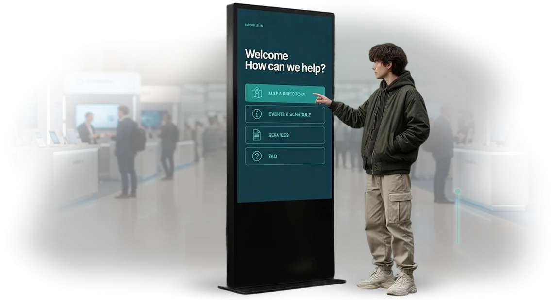
Developing Kiosk Interfaces in a Modern Minimalist Style
A user approaches a touchscreen kiosk with one goal — to quickly get a service or information.
When the kiosk interface is overloaded with small buttons, outdated graphics, and a mess of elements, the person gets lost: they make navigation errors, waste time, and become irritated.
Some visitors leave without understanding anything, and for business this means queues, dissatisfied customers, and underutilized equipment potential.
Modern minimalism in interface design solves this problem at its root. We remove everything unnecessary: large touch zones, one clear scenario per screen, and natural hints guide the user without instructions.
A person understands the kiosk interface in seconds, and the device itself looks neat, expensive, and inspires trust in the brand.
For a business owner, this approach delivers measurable results: session time shrinks, the share of completed operations grows, and the information kiosk starts working at full capacity.
A minimalist interface is easily mastered by both young visitors and older people — this is especially important for points with high customer traffic.
At our team we design kiosk interfaces in a modern minimalist style. Our solutions are tested on real user scenarios, so the interface remains simple and functional at the same time.
If your current kiosk interface scares off visitors or harms your company's image, we will help fix it in a short time.
Benefits of a Minimalist Interface for Touchscreen Kiosks
A minimalist touchscreen kiosk interface is not just a fashion trend but a working tool that directly affects revenue. When a visitor approaches the screen, they have no time or desire to figure out a complex structure.
The simpler and more intuitive the navigation, the faster they perform the target action — register, book, place an order, or find the needed information.
Simplicity is trust. An interface without visual noise and unnecessary details is perceived as "professional" and "reliable." A person subconsciously trusts a neat and clear screen more than an overloaded one.
As a result, you get increased conversion without extra spending on advertising and acquisition — people willingly use the kiosk and return to it again.
That is why we at our team develop interfaces in a modern minimalist style. It is a well-thought-out architecture where every button and every screen works toward the business goal.
Attention Retention and Increased Engagement
Minimalism helps focus attention on the main thing. The guest is not distracted by secondary blocks but performs the action you need.
Short scenarios and large control elements reduce fatigue and increase engagement — a person does not abandon what they started halfway but reaches the result.
Brand Consistency
A unified visual language with your website or corporate identity creates a holistic impression of the company. The kiosk becomes not a standalone device but part of the brand. This strengthens brand recognition, forms familiarity and memorability. Visitors identify your brand and become more loyal to you in the future.
Reducing Staff Workload
When the interface is intuitively clear, customers stop asking the same questions. Employees are not distracted from their direct duties, which reduces staff workload and saves time. Resources are freed up for more important tasks — service, sales, and caring for visitors.
A minimalist interface is a comprehensive solution that works for your conversion, reputation, and image. You get a convenient tool that pays off through faster service and increased customer loyalty.
Kiosk Formats to Match Your Style and Tasks
Choosing a touchscreen kiosk format is not just "which screen is larger" but finding a solution that is convenient for guests and appropriate for your space. The size and installation location determine how easily visitors will notice the device and start using it.
At the same time, all models can easily fit a modern minimalist style: clean lines, a neat case, and no visual noise.
Compare the main types of kiosks and choose the one that best suits your task.
| Format | Who it's for | What it gives the customer |
|---|---|---|
| Kiosk stand | Office lobbies, shopping centers, restaurants | A bright showcase for information and navigation, replaces a live reception |
| Mini-kiosk | Cafés, pharmacies, administrator zones | Saves space, provides quick access to menus, promotions, and booking |
| Floor-standing kiosk | Exhibitions, train stations, clinics | Stable, convenient for long scenarios: search, booking, checkout |
| Outdoor kiosk | Facades, entrance groups, streets | Works in any weather, protected from dust and sun, attracts passersby |
| Touch panel | Waiting areas, elevators, corridors | Mounted on the wall, takes up no floor space, suitable for short scenarios |
We adapt each format to your corporate identity: case color, logo, materials, and even the nature of the lighting. The technical core remains reliable: we work with professional Elo touchscreens that respond precisely to touch and withstand intensive use in public places.
If you are unsure which option is right for you, we will help you decide at a preliminary meeting and suggest an optimal configuration for your space and tasks.
How We Design a Kiosk Interface
Every kiosk project starts with a simple question: what exactly should a visitor do at the screen and how will this help your business.
We have broken the work into clear stages, at each of which you see an intermediate result and can make edits — without surprises at the end or losing your budget.
-
Brief for development and immersion in the task. We record the kiosk's goals, the visitor profile, and usage scenarios: where the screen stands, what the person wants to find out, what action should be the outcome. We hand you a document with the work plan and deadlines.
-
Interface prototype. We draw a diagram of screens and navigation logic in simple mockups. You see how a visitor will move from first touch to the desired result and approve the structure before resources are invested in design.
-
Design approval. We develop the visual design in a modern minimalist style — large elements that are convenient for fingers, concise texts, and brand colors. At this stage, you receive high-quality mockups and can request edits if something does not match your expectations.
-
Navigation testing. We build an interactive version and test it on real users — not engineers, but people who see the kiosk for the first time. We look at which step they hesitate and simplify those places before the screen reaches your lobby.
-
Kiosk launch. We install the software, configure remote content updates, and connect monitoring. You get a working kiosk with instructions for staff.
-
Support and development. After launch, we stay in touch: to fix content, add a new screen or section, or resolve an unusual situation. This is usually included in the contract, so you are not left alone with the equipment.
This approach delivers the main thing — predictability. You are aware of every stage, control deadlines, and end up with a kiosk that visitors actually use rather than walk past.
What Is Included in the Interface Solution Delivery
One of the customer's main fears is receiving "raw mockups" after handover and having to deal with them on their own. To prevent this, we record in advance the full list of what you will receive in the end.
All files and documents remain with you: you control the quality and can pass them to any development team.
- Design mockups of all screens — an interface in a modern minimalist style, adapted to your kiosk scenarios and corporate identity. The mockups are convenient for approval and for showing to management before programming begins.
- Interactive prototype — a working clickable model that can be tested with real users. Any edits are made before the code stage, not after — this saves budget and time.
- Documentation package — a description of the structure, transition logic, and kiosk behavior scenarios. This is a base for updates: in a year you will know exactly what and where to change without opening the code.
- Operator manual — a short and clear instruction for your employees. How to update the schedule, add a promotion, replace news, or restart the kiosk — without calling a developer.
- Development files — prepared source files in standard formats. Any programmers or contractors can accept them, so you are not tied to our company forever.
- Integration materials — a connection diagram to your systems, whether it be a schedule, news feed, or product catalog. The kiosk works with current data, not static uploads.
You receive not just a "picture" but a complete package for launching, approving, and developing the project.
The delivery scope is fixed in the contract — you know in advance what you are paying for, and we are responsible for making sure all elements come together into a working solution.
Case Study: Growth in Engagement Through a Clear Interface
Shopping mall visitors do not read instructions. If a kiosk interface makes people think — they leave for a neighboring stand or simply pull out their phones.
We encountered this in a real project: a navigation kiosk in a large shopping center displayed a map, but guests could not quickly find the store they needed and abandoned the session halfway.
The task was simple in words and difficult in practice: to make an interface that is understandable from the first screen even to someone approaching the kiosk for the first time. We redesigned it, removed unnecessary items, added large tap zones, and clear labels.
The launch showed that the main thing is not the number of functions, but the predictability of each step.
Real Launch Metrics
After the update at the Meridian shopping center, the average interaction time with the kiosk nearly doubled — from 40 seconds to 75. The abandonment rate, when a person approached but did not start using it, dropped from 25% to 9%. For the kiosk owner, this means more satisfied visitors and fewer calls to administrators.
The numbers accumulated over the first month of operation — without additional advertising or changing the kiosks' locations. Only the interface changed: clear visuals and logic that do not hide the needed button.
Metrics like these show that UI/UX design is an investment in customer behavior, not just a "pretty picture."
Customer Feedback
The shopping center's marketing director noted that guests began using the kiosk more often as an independent tool rather than approaching the information desk. "We used to think the problem was the content, and we kept expanding the map.
It turned out that simply making the interface simpler was enough — and engagement grows on its own."
This project is part of our portfolio of touchscreen kiosk cases. We take the same approach into new work: first we analyze real user scenarios, then we design an interface that solves the task without unnecessary hints.
Answers to Common Customer Concerns
Customers often postpone launching touchscreen kiosks because of typical fears: equipment failures, long timelines, operational complexity, and the risk that the interface will not fit the brand style. In practice, these concerns are addressed at the design stage. Below are answers to the questions we hear most often.
Will the kiosk work reliably? Who maintains it after launch?
We are responsible for the solution's performance across its entire life cycle. We use professional equipment and a server architecture that withstands peak loads — in waiting areas, at information desks, or in office lobbies.
Support and monitoring are included in the contract: we respond to requests within a few hours, and many issues are resolved remotely without visiting the site.
How long will implementation take, and will we miss deadlines?
A typical project from brief to launch takes 3-4 weeks. We set stages and checkpoints in advance, so you see results within a week — in the form of a working prototype.
No "surprises" at the end: we discuss all risks before development begins, including integration with your systems and equipment.
How difficult is it to integrate the kiosk into current processes?
The kiosk does not require replacing your infrastructure. We integrate it with existing databases, booking systems, or inventory management — through proven data exchange tools.
Staff only need one day of training for an employee: the interface is understandable without instructions, and the admin panel is designed so that content can be changed without a programmer.
Will the interface look "like everyone else's" or fit our brand?
We design the interface to match your corporate identity: colors, fonts, tone of communication. To do this, we create several design options in a modern minimalist style — clean, without unnecessary details, with an emphasis on action. The kiosk becomes an extension of your brand, not a foreign device in your interior.
How to Choose a Kiosk Format for Your Business Specifics?
There is no universal kiosk that works equally well in any business. The format is determined by the specifics of your task: the size of the space, the usage scenario, and the flow of visitors.
We help customers independently assess these three criteria and choose a design that solves the problem without overpaying.
The size of the space is the first constraint. In a spacious shopping mall lobby or hotel reception, a floor-standing kiosk is appropriate — visible from afar and becoming a point of attraction.
In compact areas — at an administrator's counter, in a waiting zone — a wall-mounted or tabletop format is more effective.
The usage scenario will tell you what functionality is needed: building navigation, service catalog, booking an appointment, visitor registration, or collecting feedback.
Visitor flow determines the requirements for speed and simplicity of the interface. If hundreds of people pass by the kiosk every day, the interface must work in 10–15 seconds, without training or staff hints.
In places with lower traffic — a showroom, clinic, or business center — a more detailed scenario with a catalog and in-depth information is possible.
The business industry will indicate priorities: for retail — providing information about products and promotions; for cafés and restaurants — menus and reservations; for the service sector — booking and service descriptions.
The project budget is best assessed after the first three criteria are defined — then you pay for a solution, not for rework.
We recommend a format that matches your tasks and make it in a modern minimalist style: a neat, laconic design that fits the interior and does not go out of date for years. Leave a request — in 20 minutes we will analyze your scenario and offer the best option.
Let's Discuss Your Project and Offer a Solution
Every project starts with a conversation: tell us how you envision your kiosk, who it is for, and what tasks it should solve.
We do not sell "boxed" solutions — we need to understand the specifics of your business in order to offer an interface that will be convenient for your visitors.
To make the dialogue as productive as possible, we have prepared a simple checklist. When you contact us, you will receive:
- Consultation — we discuss the tasks, audience, and expectations for the kiosk; you will learn how an interactive interface can improve service.
- Cost estimate — a transparent estimate before work starts, without hidden payments or imposed options.
- Custom project — the design and logic of the interface are created from scratch for your brand and usage scenarios, not copied from standard templates.
- Implementation timeline — before signing the contract, we provide realistic deadlines and stages so you can plan the launch.
- Site audit — we will check the installation location, lighting, dimensions, and possible obstacles so that the kiosk works without issues from day one.
After the first discussion, we prepare a preliminary proposal with a description of the solution and an approximate cost — this takes just a couple of days. All that remains is for you to make a decision.
Write to us via the form on the website or in a messenger — attach a photo of the site and briefly describe the task. We will respond within one business day and suggest a time for a consultation.