

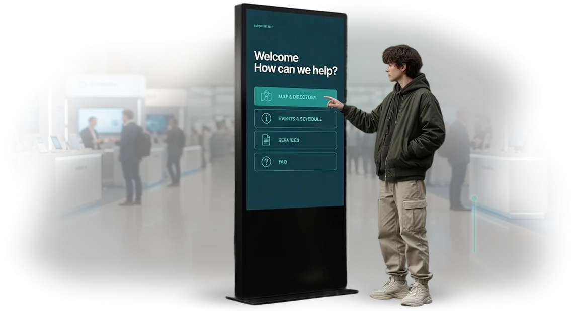
High-tech style kiosk: why guests leave without a purchase
A visitor approaches the kiosk, sees an overloaded screen, and within a couple of seconds decides there's no time to figure it out. They leave — and with them goes the sale you've already paid for through rent, equipment, and traffic.
Meanwhile, staff are torn between the floor and endless "where do I tap" prompts instead of selling.
The root of the problem is almost never the hardware, but the touchscreen kiosk interface. When the screen looks like a spaceship control panel, the visitor gets lost: too many buttons, unclear wording, small tap targets.
A person shouldn't have to learn — they should intuitively understand the first step. If that doesn't happen, the kiosk becomes an expensive screen that people walk right past.
High-tech style isn't about "cramming the screen with effects." It's about the feeling of a modern, smart device that's pleasant and easy to interact with: clean structure, large clear actions, instant response to touch, tasteful animation that guides rather than distracts.
Such an interface is understood at first glance and inspires trust — and trust converts directly into completed actions.
We solve this problem: we design touchscreen kiosk interfaces where the visitor's path is obvious and the scenarios are built around real situations on the floor.
As a result, customer loss drops, the share of those who reach the goal grows, and the burden on staff decreases — employees stop being a living instruction manual for the screen.
What a business gets from a well-designed kiosk interface
A well-designed kiosk interface is not a decoration but a working tool that directly affects a location's revenue.
When a visitor finds what they need in a couple of taps and places an order themselves, the share of self-service purchases grows, and staff stop being an "information desk" and focus on what genuinely requires a human.
In a high-tech style, the interface looks modern and inspires trust — and trust converts directly into a willingness to make a purchase.
Queues are one of the main reasons customers leave without waiting to be served. A kiosk with a clear flow offloads the traffic: some visitors serve themselves without joining the common line.
This noticeably cuts waiting time and reduces the load on staff during peak hours, when every minute counts.
A well-thought-out interface gently guides a person toward additional items — offering related products, services, or upgrades at the right moment. This way the average check grows without pressure on the customer and without extra effort from staff.
And a unified visual style across all screens works toward brand recognition: the visitor remembers how interacting with your location looks and feels.
A separate benefit is manageability. You change the assortment, promotions, or seasonal offers, and the kiosks update centrally, without retraining staff or reprinting materials.
The business gets a tool that scales to new locations and formats while preserving a recognizable and convenient experience for every visitor.
Kiosk formats for your venue's needs
The kiosk format determines not only the appearance of the area, but also how visitors interact with it.
A floor-standing kiosk greets guests at the entrance and works as a standalone point of attraction, a wall-mounted one saves space in narrow passageways and at reception desks, a built-in one integrates into existing furniture or a wall and doesn't clash with the interior design, and a mobile stand easily moves between halls and events. We select the format to match the venue's scenario, not the other way around.
| Format | For whom | What it gives the business |
|---|---|---|
| Floor-standing kiosk | Shopping malls, museums, exhibition halls, banks | A noticeable entry point, relieves consultants, keeps visitor flow moving without queues |
| Wall-mounted kiosk | Clinics, offices, hotels, pickup points | Saves space, fits neatly into the interior, serves visitors in a targeted way |
| Built-in kiosk | Showrooms, restaurants, premium spaces | Preserves design integrity, works as part of the furniture, doesn't take up extra space |
| Mobile stand | Conferences, presentations, seasonal promotions | Quickly repositioned for an event, scales reach without permanent installation |
How to choose a format
We look at traffic, area, and the task: where visitors linger, how much time they have, whether they need a guide or a self-service scenario. If the area is narrow, we'll suggest a wall-mounted or built-in option; if flexibility for events is needed, a mobile stand.
Often two or three formats are combined at a venue: one greets the flow, another serves in a targeted way.
What this gives the client
Each format addresses its own task: in some cases visibility matters, in others saving a meter, in others mobility for the season. We select a solution to match the layout and scenario so the kiosk delivers results rather than just taking up space. Next, we'll discuss the task and come back with an estimate and a plan for your venue.
How a project works: from task to launched kiosk
A kiosk project is not about "drawing beautiful screens" — it is about getting the device to a state where it runs reliably without your involvement: in a lobby, at an exhibition, on a sales floor.
That is why we guide the client through clear stages with fixed approval points — you always see what is happening and what comes next.
How the process is structured
- Brief and goals. We break down the task: who your visitors are, what they should get from the kiosk, which actions count as success — a request, navigation, browsing a catalog. The output is a short description of scenarios that both sides agree on.
- Kiosk prototype. We assemble the logic of screens and transitions: how a visitor starts, where they go, where they might get confused. We approve the prototype before visual design — edits at this stage cost the least.
- Interface design. We draw the screens in a high-tech style: large elements for finger input, readable labels, polished animation. Design approval happens based on mockups, not "in words."
- Build and content. We move the mockups into a working application and connect your content — catalog, map, schedule, integrations with internal systems.
- Tests on the real device. We test on the same screen and under the same conditions where the kiosk will be installed: lighting, finger, gloves, long operation without a reboot.
- Kiosk launch. We install, configure, and train your team on basic actions. We are present at the start to resolve the first questions.
- Support. After launch, we stay in touch: content updates, refinements, response to requests. Most clients come back with new locations and new scenarios.
What this gives the client
You get a predictable schedule and clear control points instead of a "black box." Each stage ends with a result you can review and accept — a prototype, mockups, a working device.
If the task changes along the way, we honestly say how it will affect the timeline instead of silently shifting it.
What is included in the delivery: a package for the client
The client receives not a set of files, but a product ready to launch: an interface that has already been tested on real scenarios, and clear documentation for the team.
Below is exactly what is included in the kiosk delivery and why each item is needed by you, not by the developer.
- Design mockups of all screens — an approved look in a high-tech style: the start screen, navigation, service cards, waiting and completion screens. You see the final look before assembly begins and make edits at the stage when it costs nothing.
- Interactive prototype — a clickable version of the interface that can be "poked" with a finger on a tablet. It lets you verify the logic before development starts and show management a result rather than a description.
- Ready kiosk interface — an assembled and configured solution for your scenario: menu, search, sections, feedback forms, integration with your data. It works on a touch screen without delays or "sticking."
- Operation manual — a clear document for the administrator: how to update content, restart the kiosk in case of a failure, add a new section. Without calling an engineer for every little thing.
- Staff training — we conduct a session with your team: we show how to manage content and what to do in a non-standard situation. Employees start their shift confident, not by "trial and error."
- Warranty and support — we fix the warranty period for the interface and accompany the launch: we help during the first weeks of operation, when real visitor scenarios come to light.
- Transfer of rights and source files — all materials remain with you. You are not tied to us and can develop the kiosk on your own or with another team.
Such a package closes the main risk of the project: the kiosk launches not "however it turned out," but as intended, and your team immediately knows what to do with it.
Case Study: How a Kiosk Interface Increased the Share of Self-Service Orders
The client is a fast-food restaurant chain with more than 40 locations. Guests were reluctant to approach the self-service kiosks: the interface looked outdated, and the path to payment seemed long and confusing.
As a result, the registers were packed, there were queues at the counters, and the equipment sat idle. We took on a complete overhaul of the interface — from the structure of the screens to the visual style.
What We Did
We analyzed exactly where guests were abandoning their orders and restructured the flow: the essentials on the first screen, large clear buttons, a minimum number of steps to payment.
The design was executed in a high-tech style that reads at first glance and requires no instructions.
The Result
After launch, the share of self-service orders through the kiosk tripled, and the queues at the registers noticeably decreased. The equipment stopped sitting idle: guests began approaching the kiosks first.
A repeat order for new locations in the chain confirmed that the solution works not only in a single location.
The fast-food restaurant chain noted that guests mastered the kiosks without prompts from staff — this relieved the burden on employees and sped up service during peak hours.
How to choose the right kiosk format for the task?
Choosing a kiosk format starts not with the hardware, but with answering three questions: who will use it, what the person needs to accomplish at the screen, and where the kiosk will be placed.
If you define the usage scenarios upfront, the format is selected almost automatically — the screen size, input method, and interface layout are all tailored to them.
The first reference point is foot traffic and visitor behavior. In a high-traffic area where people linger for a minute, one scenario works: large prompts, minimal steps, quick results.
Where a person sits down and works through a task thoughtfully — in a bank branch, a clinic, or at an exhibition — the interface is built differently: more explanations, step-by-step navigation, and the ability to go back without losing data.
The second reference point is the installation location. At the entrance, a kiosk more often serves as a navigator and welcome point; in the waiting area, it entertains and informs; at the checkout or service counter, it reduces the load on staff.
This determines how noticeable the screen needs to be, whether protection from bright light is needed, and how to position the elements so that both an adult and a person in a wheelchair can reach them.
The third reference point is what you want to get out of it: applications, bookings, payments, feedback, or simply information delivery.
For each outcome, we offer a specific format and are honest about where it won't work — for example, when the flow is too small for a stationary point and a mobile solution is more advantageous.
We analyze your task, look at the actual visitor flow, and propose two or three options with the pros and limitations of each. That way you choose a format consciously, not based on a picture from a catalog.
Common customer doubts before starting
Before starting, almost every customer asks the same questions — and that's normal. A kiosk stands in a busy place, works without an operator, and must look appropriate even a year after launch.
Below are honest answers to what worries people most: reliability, content updates, non-standard requirements, and warranty.
What if the kiosk breaks down in the middle of a shift?
We design the interface so that a failure doesn't turn into downtime: the screen reports the problem itself, and critical scenarios keep working. At launch, you receive instructions for on-site staff and a clear course of action.
If something fails, our engineers connect remotely and resolve the issue without waiting for an on-site visit.
Who updates content and prices after launch?
We build content updates into the interface from the very start — you or your employee change texts, prices, and sections through a simple panel, without a programmer. If you need regular edits for promotions or seasons, we take that on by agreement. Content doesn't "freeze" — the kiosk stays up to date.
We have non-standard requirements — will you take that on?
Yes, non-standard tasks are our everyday work. Unusual logic, integration with your accounting system, a specific scenario for visitors — we analyze the task and propose a solution rather than forcing you into a template. The high-tech style of the interface is preserved, not sacrificed to functionality.
What guarantees that everything will work as promised?
We fix the result in the contract: exactly what the customer will receive and in what timeframe. After launch, we support the kiosk and are responsible for its stable operation.
Over years of practice, the share of repeat requests and renewals is the best indicator that customers remain satisfied.
If a doubt remains unaddressed — describe the task, and we'll come back with an estimate and a plan for your scenario.
Let's discuss your task and come back with a plan
Describe the task — how many kiosks, where they will be placed, what a visitor should do at them. We will come back with a timeline estimate and a project plan, not generic promises. That way you will immediately see what the work consists of and when you will get the first result.
What happens after a development request
First, a short breakdown: which scenarios the kiosk covers, who uses it, and what counts as success — growth in the number of inquiries, relieving the front desk, brand awareness. Then we put together a project plan with stages, timelines, and areas of responsibility.
Next — an interface prototype in a high-tech style: you see the navigation, screens, and logic before assembly begins, and edits at this step cost the least.
What you will get
- A timeline estimate and work stages for your task
- A project plan with clear checkpoints
- An interface prototype tailored to your brand and visitor scenarios
- Design in a high-tech style — taking into account lighting, distance, and how people actually approach the screen
- Post-launch support: content updates, refinements, maintenance
We run projects remotely and stay in touch at every stage — you don't need to understand the technical side. Describe the task in your request: we will come back with an estimate, a plan, and a prototype proposal.